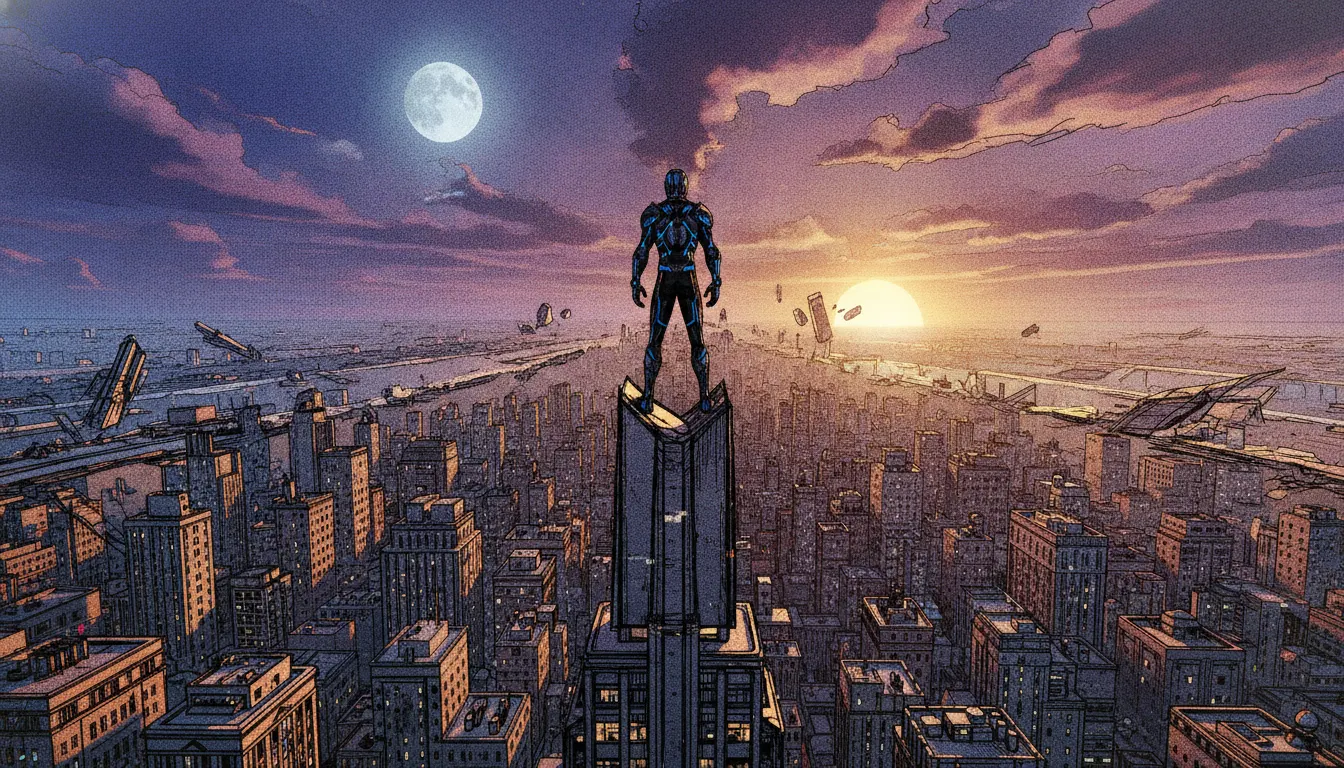
Spider-Man: Into the Spider-Verse
Phil Lord + Christopher Miller / Sony Pictures Animation · 2018
Original film establishing the halftone-3D hybrid - Academy Award for Best Animated Feature 2019
Into the Spider-Verse hybrid 2D-over-3D comic-printed look. Halftone dot pattern, off-register CMYK chromatic shift, ink-line on rendered geometry.
The moves a human crew would use to get here. Cue applies them for you, and knowing their names is how you ask for a change.
CMYK-style dot printing patterns rendered on 3D character and environment surfaces, simulating commercial printing at cinema quality
Fast motion rendered as single extreme distortion drawings rather than motion blur - the hand-animation smear translated to 3D
Characters animated at 12fps (on twos) while environments render at 24fps, creating moving-illustration aesthetic
Each Spider-Person's dimension has a completely distinct visual style - watercolor, noir, manga, blueprint - achieved through per-character rendering
CMYK channel offset simulating printer misregistration, particularly visible in halftone areas and color edge bleeds
Comic speech bubbles and sound effect typography rendered as three-dimensional objects in the film space, not 2D screen overlays
Key emotional or action beats rendered with split-panel comic book framing overlaid on the 3D scene
Spider-Man: Into the Spider-Verse (2018) and its sequel Spider-Man: Across the Spider-Verse (2023) represent the most significant aesthetic innovation in American theatrical animation since Pixar's Toy Story (1995). Directed by Bob Persichetti, Peter Ramsey, and Rodney Rothman (2018) and Joaquim Dos Santos, Kemp Powers, and Justin K. Thompson (2023), produced by Phil Lord and Christopher Miller through Sony Pictures Animation, the films synthesize comic book print techniques with 3D CGI in a hybrid that had never been achieved at feature scale.
Sony Imageworks' technical directors developed custom rendering pipelines for both films. The core innovation is rendering 3D CGI characters with the visual grammar of hand-drawn comics: Ben-Day halftone dots visible on characters (particularly in Miles Morales's New York), motion blur replaced by 'smear frames' (a single high-distortion drawing during fast movement, rather than temporal interpolation), and speech bubble text appearing in three-dimensional space.
Different characters from different dimensions have deliberately distinct visual styles: Miles Morales's primary Brooklyn dimension uses dense urban halftone and expressive comic linework; Gwen Stacy's dimension uses watercolor washes and musical score notation as environmental texture; Peter B. Parker's dimension uses a more conventional, slightly beaten-down version of standard animated film aesthetics; Spider-Man Noir is rendered in genuine black-and-white; Peni Parker's world uses clean Japanese mecha anime aesthetics.
The films deliberately simulate printing artifacts: misregistered color separation (CMYK channels slightly offset, particularly in the halftone dots), color bleeding at edges, and the physical imprecision of mass-print comic reproduction. This is applied to 3D renders at enormous detail - the halftone patterns are geometrically correct, scaling with distance, appearing on every surface.
Into the Spider-Verse introduced selective on-2 animation (12 frames per second) for Miles Morales and the Spider-People, while background environments render at full 24fps - creating a moving-illustration effect that suggests the characters exist at a different temporal frequency than their environment. This technically demanding choice requires planning every shot for the dual-frame-rate interaction.
The films sparked immediate industry discussion about post-Pixar realism as the dominant 3D aesthetic. Across the Spider-Verse (2023) pushed further: each dimensional sequence has a distinct complete visual language, including a sequence in a dystopian future dimension using architectural blueprint drafting aesthetics. The films won Academy Awards for Best Animated Feature in 2019.
Phil Lord + Christopher Miller / Sony Pictures Animation · 2018
Original film establishing the halftone-3D hybrid - Academy Award for Best Animated Feature 2019
Joaquim Dos Santos + Kemp Powers + Justin K. Thompson / Sony · 2023
Sequel expanding to six distinct dimensional visual languages within a single film
Sony Pictures Animation · TBD
Concluding chapter of the Miles Morales trilogy, production ongoing
Mike Rianda + Jeff Rowe / Sony / Netflix · 2021
Lord and Miller produced - applies similar graphic-hybrid energy to family comedy
Joel Crawford / DreamWorks · 2022
Direct aesthetic response - adopted hand-drawn 2D frame principles in 3D production after Spider-Verse
Edgar Wright / Universal · 2010
Live-action predecessor integrating comic book visual grammar into photographic film
Tango Gameworks · 2023
Video game applying comic-print graphic overlays to 3D environments, citing Spider-Verse as influence
A Look is not a filter. It is a set of stored decisions the pipeline reads before it makes a single frame, so two videos in the same Look actually match.
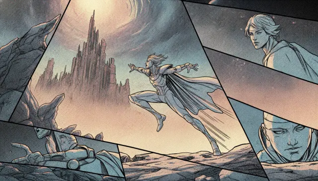 Feature 3DSony Spider-Verse Comic 3D
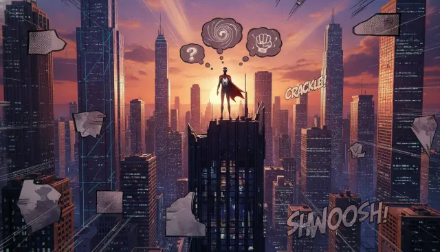 Comic Influenced 3DInto The Spider-Verse Detail
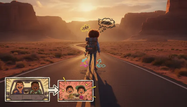 Indie 3DMitchells vs Machines Comic
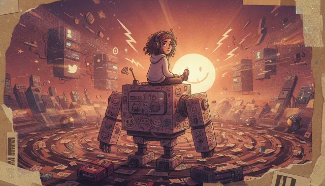 Indie 3D ExpansionMitchells vs Machines Comic 3D
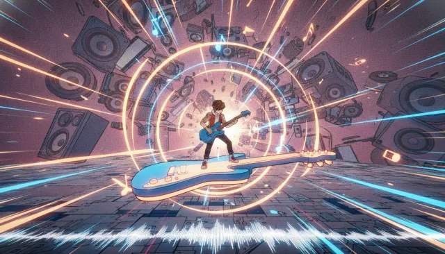 Comic Influenced 3DHi-Fi Rush Comic Game
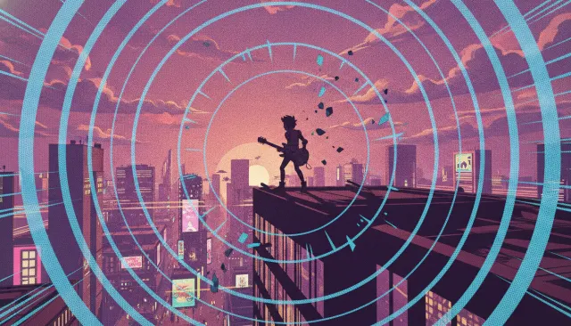 Indie ModernHi-Fi Rush Comic Stylized 3D
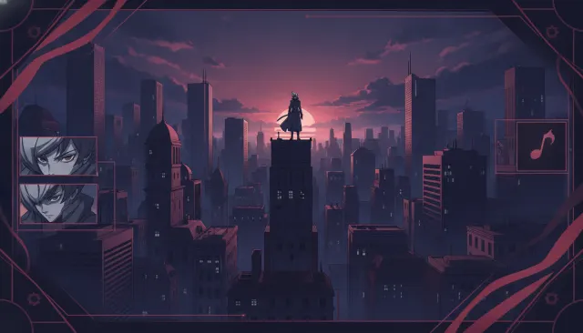 Cel Shaded 3DPersona Stylish Anime 3D
 Comic Influenced 3DHades Comic Game 2.5D