Mad Men Season 1
Matthew Weiner / Phil Abraham · 2007
The defining season establishing the teal-tan office palette, period costuming, and tableau cinematography that made the show a visual benchmark
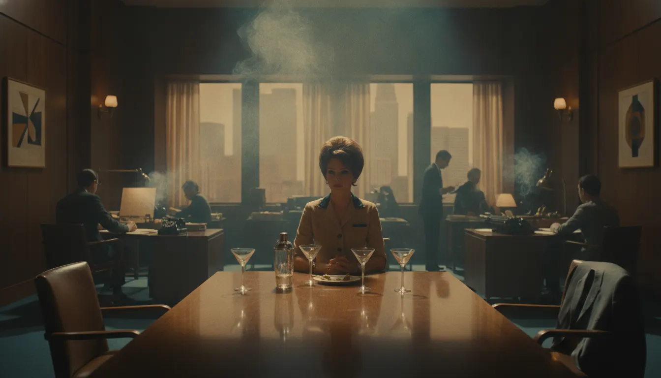
Mad Men 1960s Madison Avenue. Phil Abraham saturated tan-and-teal office, cigarette smoke wisps, three-martini lunch, sharp suit and sheath dress.
The moves a human crew would use to get here. Cue applies them for you, and knowing their names is how you ask for a change.
The Sterling Cooper office tones: seafoam teal upholstery, tan wood paneling, amber whiskey, and ivory wall surfaces.
Practical smoke from cigarettes used as a practical diffusion element that adds period authenticity and atmospheric softness.
Precisely researched mid-century wardrobe - sheaths, suits, pencil skirts - that functions as visual characterization.
Minimal camera movement, allowing the precisely dressed environment and actors to register without interruption.
Amber and gold light from practical desk lamps, bar carts, and window-filtered afternoon sun that warms the teal-dominant palette.
Protagonists placed in center frame for scenes of professional control, with off-center framing signaling instability.
Period furniture - Eames chairs, Saarinen tables, tulip chairs - used as environmental shorthand for 1960s modernity and sophistication.
Matthew Weiner's Mad Men (AMC, 2007-2015) is the most widely cited template for prestige television period recreation. Set in the Madison Avenue advertising world of the 1960s, the series used its cinematography and production design to construct a version of the decade that was simultaneously historically detailed and visually heightened - more saturated, more precise, and more deliberately composed than any actual footage from the period.
Cinematographers Phil Abraham and Christopher Manley developed the show's visual language across seven seasons. Their approach used a teal-and-tan palette that referenced Kodachrome slide film from the 1960s without attempting a literal film emulation. The Sterling Cooper office environment - tan wood paneling, seafoam and teal upholstery, amber whiskey glasses, cigarette smoke wisps - became immediately recognizable as a specific chromatic world.
The series deliberately avoided the desaturated, handheld aesthetic of prestige dramas like The Wire or The Sopranos, instead choosing a mode that was crisp, still, and composed. Sets were dressed with period-accurate furniture and accessories, and the costume department under Janie Bryant created a wardrobe - sheaths, suits, pencil skirts - that became a cultural touchstone for 1960s fashion revival.
Directors on Mad Men - including series creator Weiner, Jennifer Getzinger, and Michael Uppendahl - used formal composition to externalize characters' psychological states. Don Draper frequently occupies center frame in symmetrical compositions, signaling his control; when that control slips, the camera repositions. The office, the apartment, and the suburban home are distinct visual registers that shift color temperature and composition to mark the divide between professional performance and private reality.
The series' visual aesthetic drove a cultural revival of 1960s modernism. Eames chairs became ubiquitous in offices. Mid-century architecture photography surged on social media. Cocktail culture and the three-martini lunch re-entered the cultural conversation. Mad Men demonstrated that a television series could function as a design document, not merely reflecting a period but constructing a usable version of it.
Mad Men established several conventions of prestige television cinematography: the tableau composition, the deliberate pace, the period-exact production design, and the use of color as character. Its influence can be traced through Halt and Catch Fire (AMC, 2014), The Americans (FX, 2013), Mindhunter (Netflix, 2017), and dozens of period dramas that adopted its method of using visual precision as a form of dramatic argument.
Matthew Weiner / Phil Abraham · 2007
The defining season establishing the teal-tan office palette, period costuming, and tableau cinematography that made the show a visual benchmark
Matthew Weiner / Christopher Manley · 2010
Mid-series peak developing the color language through the 1960s cultural revolution, adding outdoor LA and counterculture visual registers
AMC / Christopher Cantwell · 2014
1980s-set tech drama that adapted the Mad Men prestige visual grammar to the early Silicon Valley era
FX / Joe Weisberg · 2013
1980s Cold War drama using similarly deliberate composition and period-accurate production design
Netflix / David Fincher · 2017
1970s-set crime drama using institutional period interiors and color precision in the prestige television tradition
A Look is not a filter. It is a set of stored decisions the pipeline reads before it makes a single frame, so two videos in the same Look actually match.
 Cinema EraNew Hollywood 1970s
 Period PieceDownton Abbey 1920s Warm Prestige
 Architectural RealestateJulius Shulman Mid Century Modern
 Vintage NewsroomVintage Newsroom
 Director AestheticMalick Terrence Spiritual
 Photographic EraKodachrome 1950s Saturated
 Cinematographer AcclaimedLinus Sandgren La La Land Pastel