Downton Abbey (Series 1-6)
Julian Fellowes / Nigel Willoughby (DP) · 2010-2015
Defining Edwardian warm-prestige television visual grammar
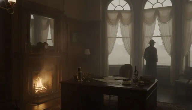
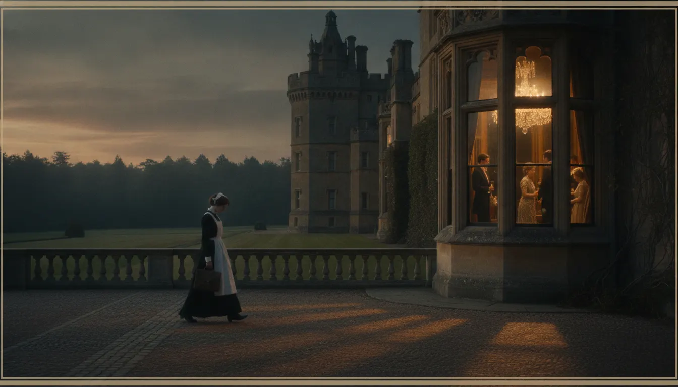
Downton Abbey 1920s warm prestige. Highclere Castle interior, warm chandelier and window key, upstairs-downstairs costume, locked-off polite framing.
The moves a human crew would use to get here. Cue applies them for you, and knowing their names is how you ask for a change.
Period chandeliers, candelabras, and table lamps supplemented to extend their warm tonal character without contradicting their direction.
Tall period windows used as primary daylight key in drawing-room and dining scenes, with warm reflector fill from below.
Wide static masters establishing hierarchical room architecture before closer shots settle on individual subjects.
Service and servant spaces lit tighter and cooler; family spaces warm, expansive, and formally composed - camera participates in class architecture.
Actual historic building's plaster, wood, and textile surfaces provide visual authenticity that set construction cannot replicate.
Camera moves only when motivated by character action or emotional revelation, maintaining the restrained vocabulary of period decorum.
ITV's Downton Abbey (2010-2015), created by Julian Fellowes and photographed primarily by cinematographer Nigel Willoughby, established the template for early-20th-century British period drama that has dominated prestige television production for the subsequent decade and a half. Its visual grammar - warm chandelier interiors, 'upstairs/downstairs' spatial architecture, locked-off polite framing, and Highclere Castle's actual rooms as set - became the global reference for the Edwardian-to-Roaring-Twenties prestige aesthetic.
The production's decision to film at Highclere Castle in Hampshire (the actual residence used as both interior and exterior) rather than build replica sets is fundamental to the aesthetic. Highclere's 19th-century Victorian baronial interior provides a visual authenticity - the patina of plaster, the specific curve of staircases, the proportions of service corridors - that set construction cannot replicate. Costume designer Susannah Buxton's collaboration with Willoughby treated the castle's existing décor as a color palette anchor: the warm tones of period textiles, wood paneling, and stone became the chromatic foundation for every scene.
Willoughby's approach to the interior scenes centers on practical source augmentation: chandeliers, candelabras, and table lamps that actually exist in Highclere's rooms were supplemented with HMI and tungsten fixtures positioned to extend the warm tonal character of the practical sources without contradicting their direction. The result is a lighting grammar that feels period-authentic rather than cinematically constructed.
Daytime dining and drawing-room scenes use the castle's tall sash windows as key sources, with warm reflectors or tungsten supplementary light from below to fill the shadows. The consistent warm tone (approximately 3200-4200K throughout most interiors) provides the visual unification that audiences recognize as the Downton palette.
Willoughby and director Brian Percival established a compositional vocabulary that reflects the social world the drama depicts: restrained, symmetrical, with subjects properly positioned within the social space. Wide masters establish the hierarchical architecture of a room before closer shots settle on individual characters. Camera movement is minimal and motivated - a gentle push-in during an emotional revelation, a lateral reframe as a character moves to the window - but never expressive or interpretive.
This 'polite framing' convention extends to the upstairs/downstairs spatial division. Servant spaces (below stairs, service corridors) are tighter, less warmly lit, and compositionally denser. Family spaces are expansive, warm, and formally composed. The camera itself participates in the class system.
Downton Abbey created the template subsequently used by The Crown (Netflix, 2016-2023), Bridgerton (Netflix, 2020-), The Gilded Age (HBO, 2022-), Belgravia (ITV, 2020), and dozens of international period drama productions. The warm-prestige grammar is now a genre convention in its own right.
Julian Fellowes / Nigel Willoughby (DP) · 2010-2015
Defining Edwardian warm-prestige television visual grammar
Simon Curtis / Ben Smithard (DP) · 2022
Feature film extension; 1920s French Riviera expanding the palette
Peter Morgan / Various DPs / Netflix · 2016-2023
Mid-century British royal prestige extending Downton's warm-interior grammar
Shonda Rhimes / Various DPs / Netflix · 2020-present
Regency period warm-prestige with contemporary casting strategy
Daisy Goodwin / ITV · 2016-2019
Victorian royal prestige; direct Downton visual vocabulary inheritance
Julian Fellowes / ITV · 2020
Fellowes's direct Downton successor; 1840s London period grammar
A Look is not a filter. It is a set of stored decisions the pipeline reads before it makes a single frame, so two videos in the same Look actually match.