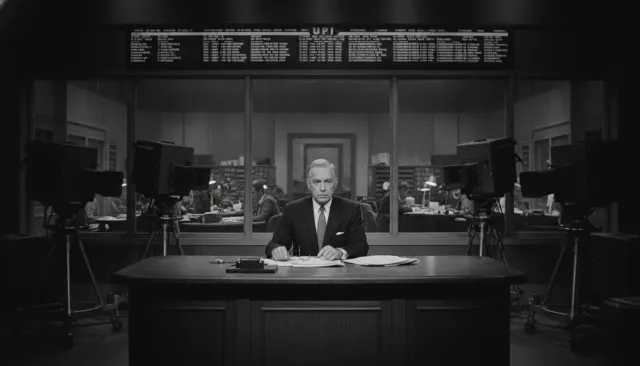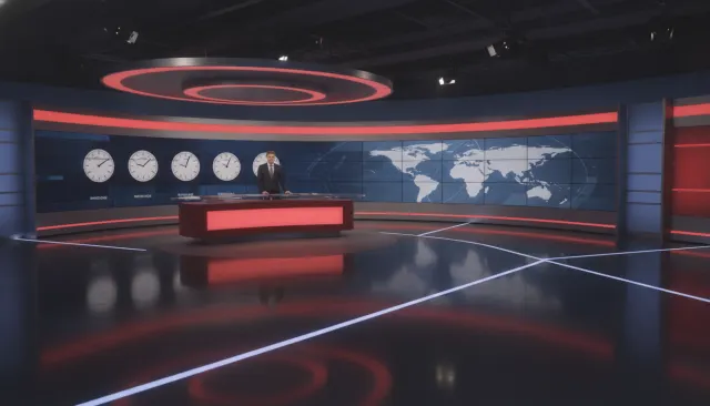
CBS Evening News with Walter Cronkite
CBS News · 1962
The definitive vintage newsroom template; Cronkite's anchor desk grammar defined the form for two decades
1970s-80s broadcast TV. 4:3 CRT scanlines, saturated primaries, chunky cards.
The moves a human crew would use to get here. Cue applies them for you, and knowing their names is how you ask for a change.
Vertical-pillarbox or native 4:3 framing with curved-edge barrel distortion simulation, restricting composition to the television frame.
Color bleeding at sharp edges between saturated hues, particularly at text-background boundaries, simulating composite video encoding.
Horizontal scan line texture at 50% opacity over the frame, with brightness modulation that creates the CRT phosphor band pattern.
Network graphic color schemes - red/white/blue, institutional blue/yellow - pushed past naturalistic saturation for CRT display optimization.
Period-accurate lower-third graphics in thick fonts with hard color-block backgrounds, simulating character generator technology of the era.
Shadowless studio illumination designed for video cameras of limited dynamic range, producing flat but technically clean anchor framing.
The vintage newsroom look draws from the visual grammar of broadcast television news in its 1970s and 1980s analog peak: 4:3 aspect ratio, cathode ray tube display characteristics, oversaturated primary colors, physical lower-third graphics, and the accumulated visual texture of magnetic video tape. It is a look that communicates authority, breaking news energy, and the institutional credibility of the pre-digital broadcast era.
Broadcast television in the 1970s and 1980s was transmitted and displayed through analog systems that produced a distinctive set of visual artifacts. NTSC composite video encoded color and luminance together in a single signal, producing a characteristic color bleeding at sharp edges (chroma fringing) and a slightly soft overall image. CRT displays added raster scan lines (525 lines in NTSC, visible as horizontal striping on close inspection), a curved screen geometry that introduced barrel distortion at frame edges, and a phosphor glow that created a warm, slightly fuzzy halo around bright objects.
The image quality ceiling of the era was defined by these technical limits - broadcast television could not resolve fine detail and could not display colors without bleeding at boundaries. Graphic designers working in television in this era calibrated their work to these constraints: lower-third chyrons used thick fonts that could survive chroma bleed, and color choices favored saturated primaries that read cleanly on consumer television sets.
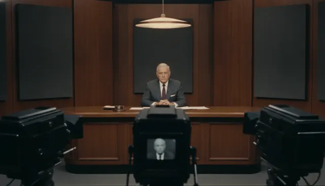
The typical 1970s-1980s broadcast news set was designed for the 4:3 frame and the technical limitations of studio production: a raised anchor desk in front of a blue or gray background, with a rear-projection window (the "box" over the anchor's shoulder) displaying graphics or location footage. Studio lighting was high-key and flat - shadows were undesirable because they complicated the technical lighting needed for studio-quality video. Sets often featured prominently placed monitors, physical maps or boards, and the organized clutter of working journalism (copy paper, teleprompter units, earpieces visible).
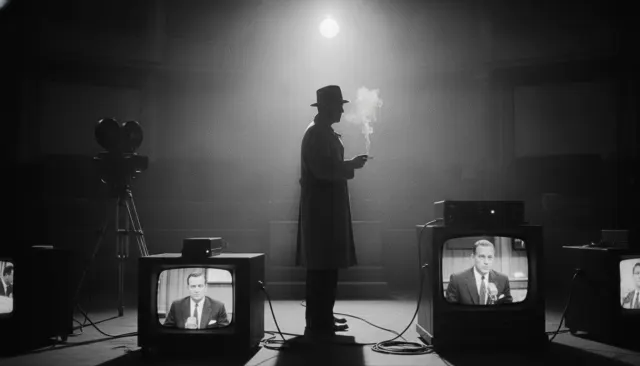
The graphic design of broadcast news in this era is as recognizable as the camera work. Network lower-thirds used Arial-adjacent sans-serif or blocky serif fonts in bold color blocks - NBC's red-white-blue palette, CBS's institutional blue, ABC's yellow-black combinations. Wire service copy on teletypes, physical prop newspapers, and the physical analog world of information transmission surrounded anchors.
The vintage newsroom look is used in political satire, nostalgic editorial content, parody news formats, and any content that wants to invoke the institutional authority and analog warmth of pre-digital broadcast news. It contrasts usefully with contemporary flat-design news graphics to create temporal contrast.
CBS News · 1962
The definitive vintage newsroom template; Cronkite's anchor desk grammar defined the form for two decades
NBC News · 1971
Peacock-palette newsroom aesthetic with the color graphic conventions of the early color television era
Sidney Lumet · 1976
Paddy Chayefsky's satire using the vintage newsroom grammar as its primary visual world
James L. Brooks · 1987
The most authentic fictional representation of 1980s network news production grammar
George Clooney · 2005
Black-and-white recreation of 1950s CBS newsroom demonstrating the grammar in historical reconstruction
Aaron Sorkin · 2012
Modern drama using vintage newsroom grammar as aspirational contrast to contemporary tabloid news culture
A Look is not a filter. It is a set of stored decisions the pipeline reads before it makes a single frame, so two videos in the same Look actually match.