BBC News at Ten
BBC News / Various design directors · 1967-present
Flagship evening bulletin; defining British broadcast news grammar
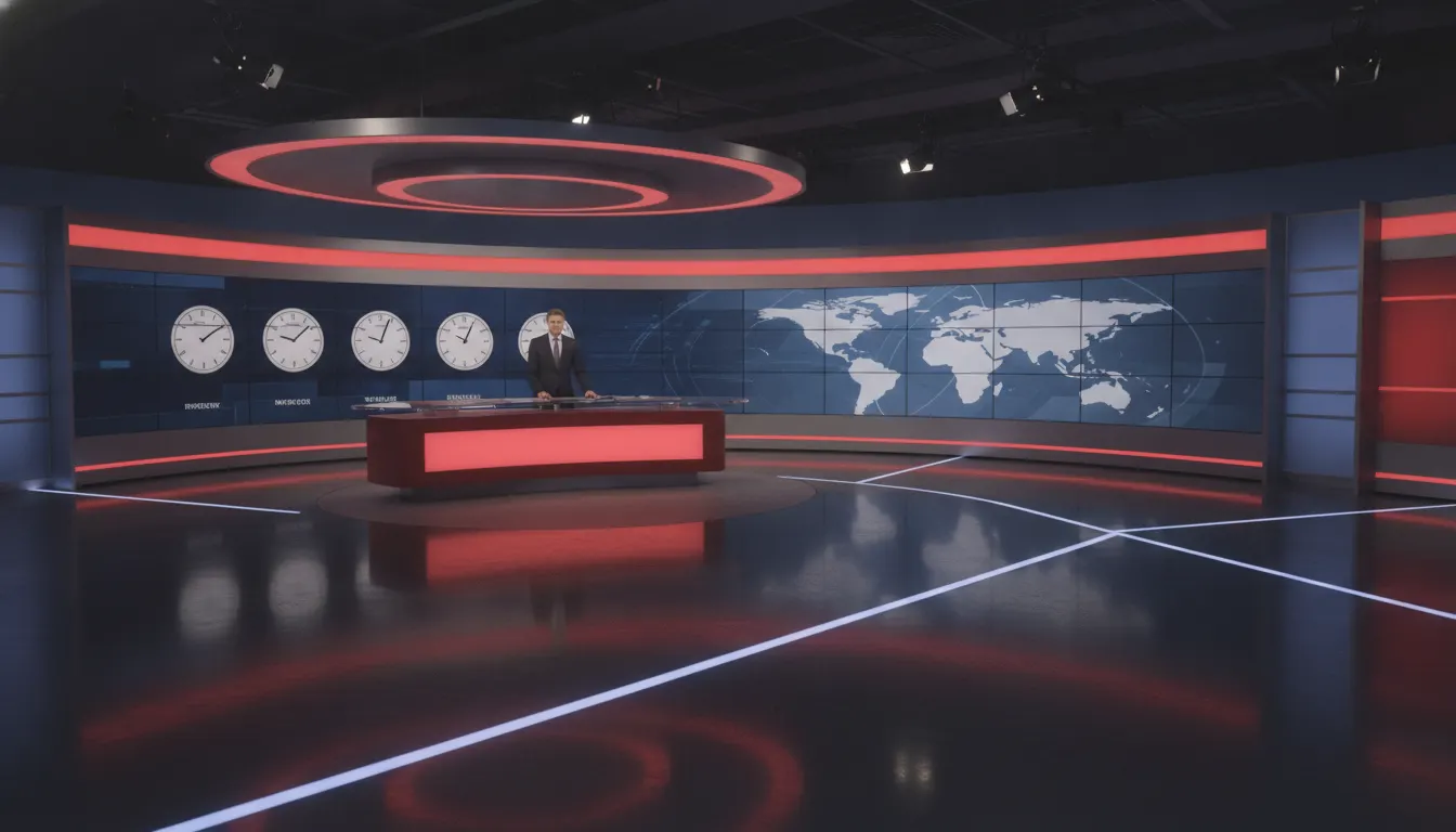
BBC News modern broadcast aesthetic. Red branding, polished glass-desk studio, world-clock backdrop, restrained authority.
The moves a human crew would use to get here. Cue applies them for you, and knowing their names is how you ask for a change.
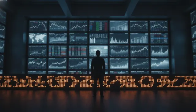
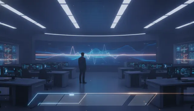
Large curved LED displays showing maps, data visualizations, and breaking footage behind the presenter desk.
RGB 187/29/16 red as the primary graphic identifier across chyrons, lower thirds, and on-screen branding.
Custom BBC typeface in bold/regular weight hierarchy with red border strip for maximum broadcast legibility.
Camera pulling back to reveal active working newsroom behind studio, arguing scale of journalistic resource.
Multiple time-zone clocks visible in studio background, signaling international scope and 24-hour operation.
Low presenter platform with reflective desk surface creates visual elevation while maintaining ground-level authority.
The BBC News visual identity is the most globally recognized television news aesthetic in the world - a brand system refined over seven decades that communicates authority, impartiality, and institutional gravity through a carefully controlled vocabulary of graphics, color, typography, and studio architecture.
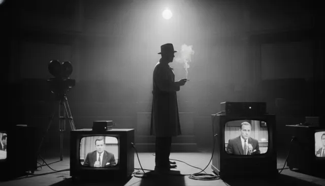
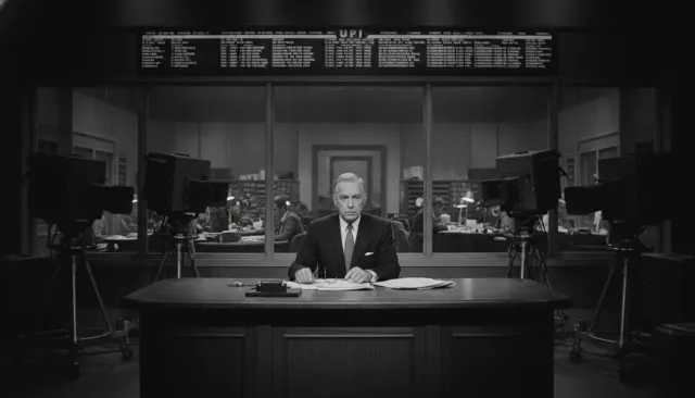
BBC News broadcasting began in 1954 as a television extension of radio news. The early aesthetic was austere: anchor at desk, monochrome camera, minimal graphic support. The 1970s introduced the first color news sets and the early iteration of what would become the BBC's signature red-and-white brand.
The current visual language crystallized through a series of major rebrands. The 2007 rebrand introduced the glass-and-screen studio architecture that became the BBC News flagship: large curved LED walls displaying maps, data, and breaking footage, a polished presenter desk at ground level, and a backlit world-clock display connecting London to global bureaus. Graphic designer Martin Lambie-Nairn created much of the foundational BBC brand logic.
The 2019 rebrand updated the typography (Reith Sans, designed specifically for BBC by Dalton Maag) and simplified the graphical system to work across digital and broadcast simultaneously. The on-screen graphics moved toward a cleaner, more restrained aesthetic calibrated for second-screen legibility.
The BBC News at Ten set in Broadcasting House (refurbished 2013) uses a glass-walled, two-level studio that incorporates the actual BBC newsroom into the background. The camera can pull back to show hundreds of working journalists - a deliberate visual argument about institutional scale and resource. This architecture-as-authority convention has been copied by news organizations worldwide.
The color palette is anchored by BBC red (RGB: 187, 29, 16) against white and deep gray-black. Accent blues for weather and data. The restrained palette communicates institutional neutrality - no warm tones that might suggest emotional editorialization.
The BBC chyron system uses Reith Sans in a bold/regular weight hierarchy with a thin red left-border strip. Location slugs appear in uppercase. The information hierarchy is strict: primary headline, secondary location, tertiary attribution. The system is calibrated for maximum legibility at standard-definition transmit resolution while retaining quality at 4K.
The BBC News aesthetic has been directly referenced by Al Jazeera English (launched 2006), France 24, DW English, and dozens of national broadcasters seeking international credibility. The glass-studio, LED-wall, desk-at-ground-level architecture is now the global default for aspirational news broadcast design.
BBC News / Various design directors · 1967-present
Flagship evening bulletin; defining British broadcast news grammar
BBC Design / Dalton Maag (Reith Sans) · 2019
Typography and digital-first graphic system overhaul
Al Jazeera / BBC News alumni · 2006
BBC News aesthetic exported and adapted for global Arabic-context broadcasting
Populous Architecture / BBC · 2013
Newsroom-as-backdrop architecture; most imitated news studio design globally
A Look is not a filter. It is a set of stored decisions the pipeline reads before it makes a single frame, so two videos in the same Look actually match.