Bloomberg Terminal
Bloomberg L.P. · 1982-present
Foundational dark-mode financial data interface; defines professional market information aesthetics
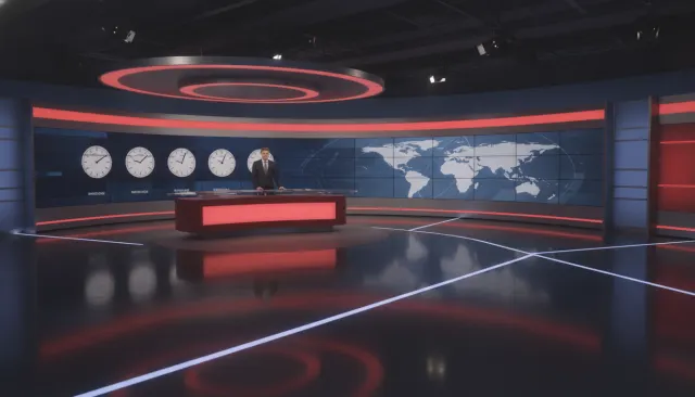
Bloomberg TV financial broadcast. Dark-mode terminal palette, orange ticker, multi-window split, market-data dense.
The moves a human crew would use to get here. Cue applies them for you, and knowing their names is how you ask for a change.
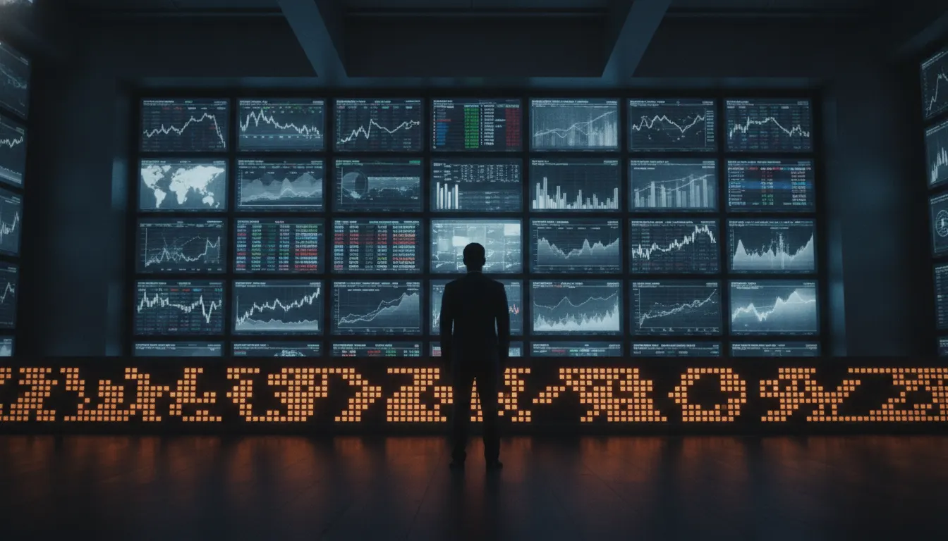
Near-black backgrounds with orange, white, and accent-color data text mimicking original Bloomberg CRT phosphor display.
Simultaneous multiple data panels, charts, and ticker feeds occupying the frame as argument for analytical depth.
Real-time price data color-coded with red-for-down and green-for-up following universal financial market convention.
Data visualization panels appearing over interview footage, treating statistical evidence as rhetorical move.
Bloomberg orange as the primary brand identifier across all contexts, connecting terminal heritage to broadcast identity.
Continuous scrolling market-data ticker along the bottom of frame, signaling real-time information environment.
Bloomberg's visual identity - anchored in the orange-on-black data terminal palette that financial professionals have used since the Bloomberg Terminal's launch in 1982 - constitutes the most powerful brand in financial information design. Its aesthetics have migrated from the Bloomberg Terminal to Bloomberg Television to Bloomberg Businessweek to a globally recognized vocabulary for communicating financial authority.
Michael Bloomberg founded Bloomberg L.P. in 1981 after leaving Salomon Brothers, and the Bloomberg Terminal launched in 1982 as a dedicated hardware unit providing real-time market data. The original terminal used amber phosphor on black CRT displays - not a design choice but a hardware default. Bloomberg retained and systematized this palette as the company scaled: it became the signature of the product, then of the brand.
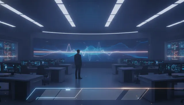
The terminal's information architecture - simultaneous multi-window data display, dense ticker feeds, color-coded alert states - developed the visual grammar of financial information density that Bloomberg Television and Bloomberg Businessweek subsequently translated into broadcast and print.
Bloomberg Television launched in 1994 and was built to serve the same professional audience as the terminal. The studio aesthetic deliberately references terminal aesthetics: dark backgrounds, orange accents, dense data overlays, split-screen market feeds running simultaneously with presenter segments. The visual argument is density equals expertise - if you can read a Bloomberg screen, you are a professional.
The graphic system uses a proprietary dark-mode palette that pre-dates the consumer dark-mode trend by two decades. Orange and white text on near-black backgrounds, with data tickershowing red-down and green-up in real time. Charts appear as overlay panels mid-conversation, treating data visualization as a rhetorical move within the interview format.
Bloomberg Businessweek's design under Creative Director Richard Turley (2011-2014) became one of the most acclaimed art-direction eras in magazine history. Turley's covers used bold primary-color backgrounds, maximalist typography, and deliberately provocative graphic design that contrasted aggressively with the terminal's data-dense aesthetic. The tension between the digital terminal dark-mode and the print magazine's saturated pop design articulated Bloomberg's dual identity: analytical rigor and editorial personality.
The Bloomberg terminal aesthetic has become the default visual grammar for fintech products, trading apps, crypto dashboards, and financial technology brand design. The association between dark backgrounds, dense data, and financial authority is now so established that any product wanting to signal professional-grade financial capability reaches for this palette.
Bloomberg L.P. · 1982-present
Foundational dark-mode financial data interface; defines professional market information aesthetics
Bloomberg Media · 1994-present
24-hour financial broadcast; terminal aesthetics translated to video format
Richard Turley (Creative Director) · 2011-2014
Most acclaimed business magazine art direction era; maximalist cover design
Bloomberg Media · 2020-present
Terminal palette adapted for climate and sustainability data journalism
A Look is not a filter. It is a set of stored decisions the pipeline reads before it makes a single frame, so two videos in the same Look actually match.