PORTRAIT TRADITIONS · CONTEMPORARY · INTERNATIONAL
Lifestyle Editorial Portrait
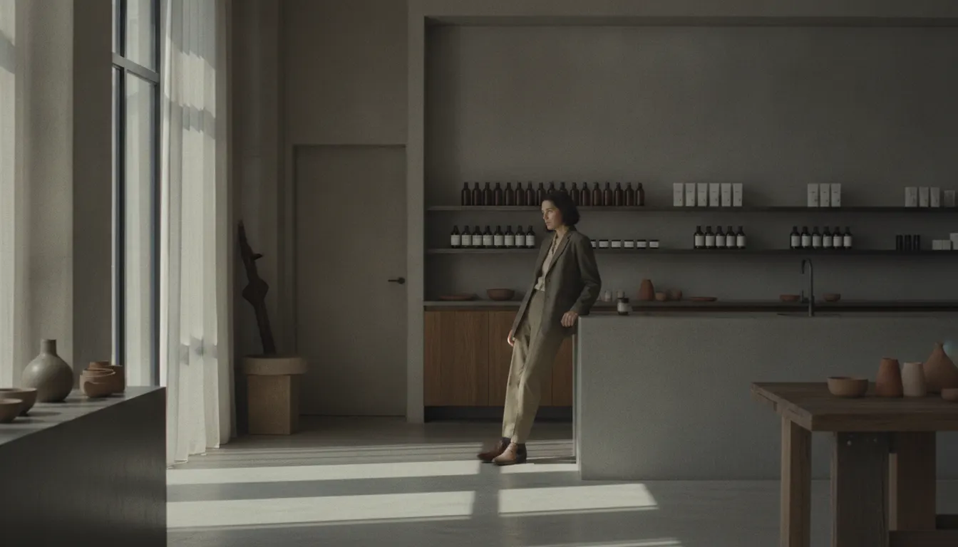
Contemporary brand lifestyle portrait. Aesop-store soft window, founder leaning on counter, Kinfolk-considered styling, muted tonal palette.
lifestylekinfolkmutedconsidered
LUT lifestyle-muted-tonal
WHEN TO USE
- Brand campaigns requiring authentic, approachable human representation
- Editorial profiles in magazines, newspapers, and online publications
- CEO and executive portrait photography for press and internal use
- Product-in-use photography where a human subject contextualizes the product
- Social media content for personal brands, wellness, and lifestyle companies
- Book jacket and speaker photography requiring warmth and presence
WHEN NOT TO USE
- Hard news or documentary work where staging would compromise credibility
- High-fashion or luxury brand contexts requiring more formal visual authority
- Technical or scientific documentation
- Abstract or conceptual art photography
SIGNATURE TECHNIQUES
How the look is made.
The moves a human crew would use to get here. Cue applies them for you, and knowing their names is how you ask for a change.
- 01Natural window light or open shade as primary source
softbox as fallback
- 02Environmental context suggesting lifestyle without being literal documentation
- 03Subject directed to authentic
feeling but technically useful positions
- 04Wide aperture
f/1.8-f/2.8, background soft enough to separate subject clearly
- 05Processing
warm skin tones, lifted blacks, slight haze in highlights
- 06Eye
level or slight low camera angle - the subject is not looked down upon
- 07Casual wardrobe briefing
what people actually wear, not what they wear for events
HISTORY & CONTEXT
Where it comes from.
Lifestyle Editorial Portrait
Lifestyle editorial portrait photography occupies the middle ground between photojournalism's candid documentary observation and fashion photography's controlled studio production. It borrows the spontaneous energy of the former and the considered light quality of the latter, producing images that feel authentic and unstaged while being the product of careful preparation.
What Distinguishes the Style
The lifestyle editorial portrait is defined by its relationship to environment. Unlike the studio portrait, which strips context entirely, or the environmental portrait, which shows the subject in their workplace or home, the lifestyle editorial portrait creates or selects an environment that suggests how the subject lives without being slavishly literal. A chef is photographed at a market rather than a stove; a musician is shot in a rehearsal space rather than on stage; a tech founder stands in their office but the office has been cleared of everything except a single interesting desk.
The light is almost always natural or natural-seeming - window light, open shade, golden hour on location. Hard studio flash conflicts with the authentic register the style requires; even when artificial light is used, it is shaped to mimic natural light. Reflectors and foam-core fill rather than strobe.
The Editorial Context
Lifestyle editorial portraits appear in magazine profiles, brand campaign photography, book jacket photos, and the 'About' pages of websites. They serve a different function from news or documentary portraits: rather than reporting on a person, they construct an impression of how the person wants to be seen (or, in the editorial context, how the publication wants its readers to see them). This constructedness is the fundamental distinction from photojournalism.
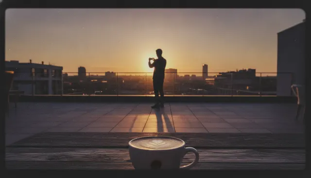
The aesthetic reached its current dominant form through the convergence of two trends in the 2010s: the VSCO editing aesthetic that naturalized faded, warm film-like processing, and the rise of Instagram as a primary publishing platform that rewarded consistent, aspirational visual identities.
Post-Processing Signature
Lifestyle editorial processing tends toward warmth in skin tones, slightly lifted blacks, reduced clarity or texture, and a matte-finish grade that creates separation from documentary photography's higher contrast. Color palette varies by brand - some editors prefer cool and Nordic, others warm and Mediterranean - but all share a preference for consistency and a restrained, non-aggressive grade.
NOTABLE WORKS
Where you have seen it.
Martin Schoeller's environmental celebrity portraits for New Yorker and GQ
Kinfolk magazine portraiture, 2011-2016 (canonical lifestyle editorial register)
Bon Appetit magazine chef portraits, 2014-2019
New York Times Magazine profile photography tradition
THE RECIPE
The exact knobs
the renderer turns.
A Look is not a filter. It is a set of stored decisions the pipeline reads before it makes a single frame, so two videos in the same Look actually match.
SettingValue
GradeColour LUT applied to every frame
lifestyle-muted-tonalTransitionHow one shot becomes the next
dissolve cuts · 460ms · ease-in-outKen BurnsCamera move applied to stills
Slow push · 0.022 · rule-of-thirdsTypographyDisplay / body / mono pairing
Cormorant · Inter · JetBrains MonoMusic moodWhat the bed under the voice sounds like
ambient-piano · soft-folk-instrumentalPrompt suffixAppended to every shot prompt in this Look
contemporary brand lifestyle portrait Aesop Kinfolk, founder leaning counter, soft window light, muted tonal palettePALETTE
Primary
#A89B82
Secondary
#8A7460
Accent
#6E5A48
Text/Light
#1F1A14
Text/Dark
#F0E5D2
BG 900
#1A1410
BG 800
#2A2218
RELATED LOOKS
Next to it on the shelf.
 Fashion EditorialHarpers Bazaar Richard Avedon
 Fashion EditorialAnnie Leibovitz Celebrity Portrait
 Photographic EraInstagram 2010s VSCO Filter
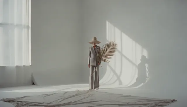 Fashion EditorialIrving Penn Still Life Fashion
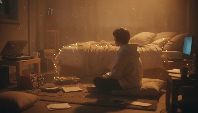 Lo Fi BedroomLofi Bedroom
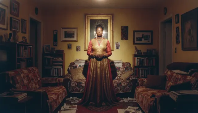 Photographers Color ModernDeana Lawson Staged Color Portrait
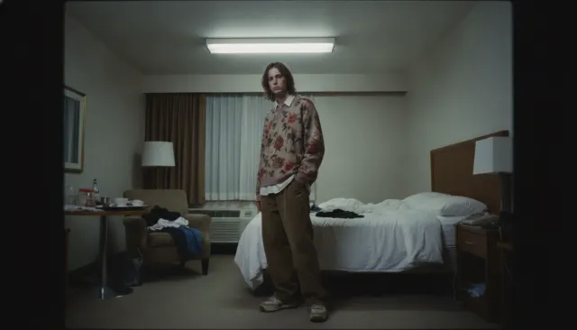 Fashion EditorialJuergen Teller Flash Snapshot
Your first cut
is on us.
+ New videoFree plan · no card · 1080p export