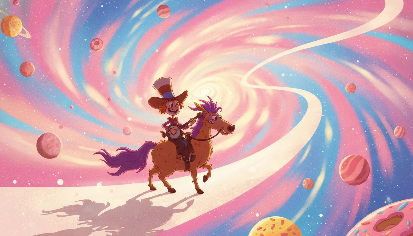
Wander Over Yonder Season 1-2
Craig McCracken / Disney Television Animation · 2013
Complete series - 'The Prisoner', 'The Picnic' as standout character episodes
Craig McCracken Disney Channel space-cowboy traveler comedy. Bright candy galaxy palette, banjo-strumming optimist hero and his trusty steed Sylvia, flat geometric alien worlds.
The moves a human crew would use to get here. Cue applies them for you, and knowing their names is how you ask for a change.
Wander's floppy hat, stretchy arms, and round body combine 1930s rubber-hose animation elasticity with flat-fill CN-era graphic design
Hero characters (Wander, Sylvia) use round, warm forms; villain characters (Lord Hater) use angular, aggressive geometry - visual alignment encoding
Space environments rendered in warm pinks, purples, and oranges rather than cold vacuum blues and blacks - humanizing the space setting
Each alien world has a distinct color temperature and architectural vocabulary, allowing visual range within a consistent character design system
Wander's body deforming under physical forces - squashing on landings, stretching in excitement - more elastically than McCracken's earlier geometric work
Wander Over Yonder premiered on Disney Channel on August 16, 2013, created by Craig McCracken - the same creator behind The Powerpuff Girls (Cartoon Network, 1998-2005) and Foster's Home for Imaginary Friends (Cartoon Network, 2004-2009). The show ran for two seasons through 2016, with Disney cancelling it despite a passionate fan campaign. Produced at Disney Television Animation.
Where The Powerpuff Girls used radical geometric minimalism as a signature aesthetic, Wander Over Yonder represents McCracken's evolved approach: retaining the flat-fill, strong-outline DNA but adding more warmth, more expressive anatomy, and a space-adventure palette. The show draws from 1930s rubber-hose animation (Wander's floppy hat and bouncy limbs), mid-century science fiction design (Sylvia's dinosaur anatomy), and McCracken's established CN flat-graphic vocabulary.
Wander himself is a pure embodiment of optimism: his orange body, enormous hat, and bouquet of shaggy fur are designed to communicate warmth and energy from any distance. Sylvia, his dinosaur-horse companion, uses rounder, more muscular forms. Lord Hater and Commander Peepers - the recurring villains - use angular, aggressive geometry, encoding their antagonist roles in shape language.
The show's setting across different alien planets and space environments allowed the background design team to deploy a wide visual range: planets with distinct color temperatures, alien architectures from Art Deco spacecraft to organic rock formations. This variety within a consistent character design system is one of the show's visual achievements.
The 1930s rubber-hose influence is particularly evident in Wander's movement: his arms stretch and compress, his body squashes under physical impact in ways that suggest the Felix the Cat and early Mickey Mouse animation traditions. But this is combined with the flat-fill, heavy-outline aesthetic McCracken developed at Cartoon Network.
The show's cancellation after two seasons despite critical praise and fan engagement is one of the more discussed decisions in 2010s Disney TV animation. The '#SaveWanderOverYonder' fan campaign generated significant online attention. McCracken's subsequent return to animation work and the show's continued cult following demonstrate the durability of the aesthetic even in a single-network context.
Viewed across his three major shows, McCracken's progression is visible: Powerpuff Girls (radical geometric minimalism, Cartoon Network 1998), Foster's Home (warmer, more expressive, CN 2004), Wander Over Yonder (space-adventure warmth, Disney 2013). Each show refines rather than abandons the core flat-fill, strong-outline approach, developing it toward greater expressiveness while maintaining graphic clarity.
Craig McCracken / Disney Television Animation · 2013
Complete series - 'The Prisoner', 'The Picnic' as standout character episodes
Craig McCracken / Cartoon Network · 1998
McCracken predecessor - geometric minimalism compared to Wander's warmer rubber-hose approach
Craig McCracken / Cartoon Network · 2004
Direct predecessor showing the evolution toward warmer forms that Wander advances further
Alex Hirsch / Disney Channel · 2012
Disney Channel contemporary demonstrating the range of aesthetics within the same network
Daron Nefcy / Disney Channel · 2015
Disney Channel successor show with similar girl-protagonist-in-magical-world energy but different visual approach
A Look is not a filter. It is a set of stored decisions the pipeline reads before it makes a single frame, so two videos in the same Look actually match.
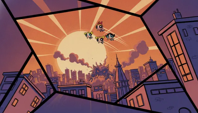 Cn 90S RevivalPowerpuff Girls CN 90s
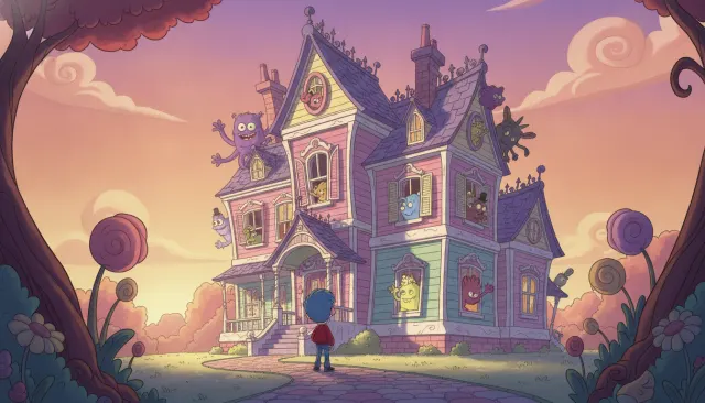 Kids Cn Comedy ClassicFoster's Home Craig McCracken Pastel
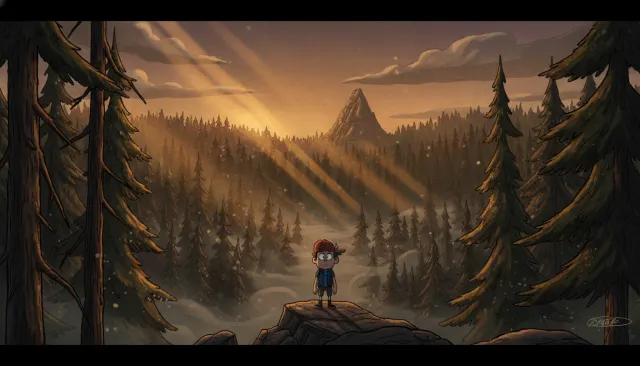 Cn Modern PastelGravity Falls Mystery Line
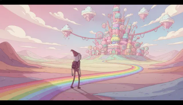 Cn Modern PastelAdventure Time Pastel
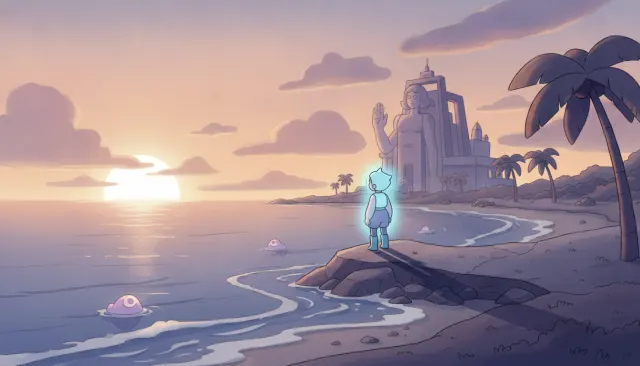 Cn Modern PastelSteven Universe Soft Magic
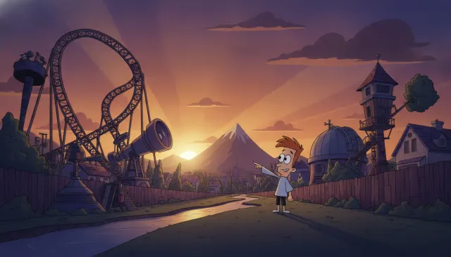 Kids Disney Channel ModernPhineas and Ferb Stylized Suburban
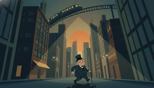 Classic Western CelUPA Modernist Mid-Century