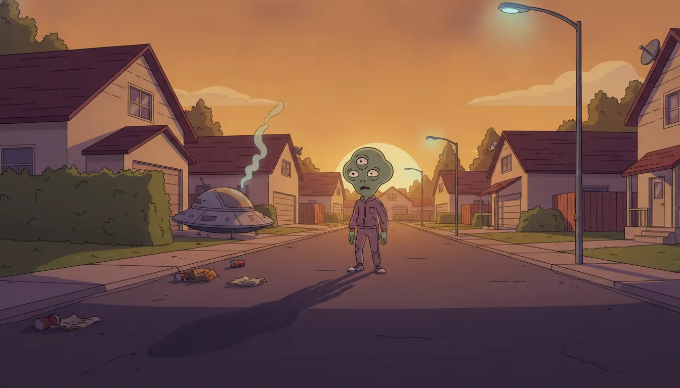
Solar Opposites Season 1
Justin Roiland + Mike McMahan / Hulu · 2020
Debut season establishing the alien-suburban flat sitcom aesthetic with early Wall storylines
Justin Roiland and Mike McMahan suburban alien sitcom. Stylized flat cul-de-sac with Rick-and-Morty sketch DNA but tighter Hulu-era line.
The moves a human crew would use to get here. Cue applies them for you, and knowing their names is how you ask for a change.
Deliberately imperfect outlines with flat color fills, sharing the Rick and Morty visual vocabulary - imprecise line quality as aesthetic choice
Main characters in alien colors (red, yellow) with conventional human-ish proportions placed in thoroughly domestic American environments
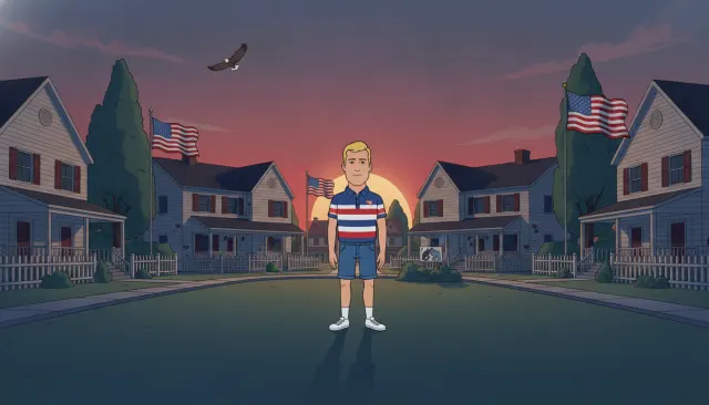
House, neighborhood, and interiors use consistent flat-fill suburban design anchoring the alien comedy in familiar American domestic space
Subplot environments inside the wall rendered with warmer palette and more detailed production design, contrasting with the flat exterior world
Korvo/Terry suburban plot uses one visual tone; wall civilization sequences use a distinct warmer, more detailed aesthetic within the same episode
Solar Opposites premiered on Hulu on May 8, 2020, created by Justin Roiland and Mike McMahan. The series is produced by Justin Roiland's SolarMation and 20th Television Animation. Following Roiland's departure from Rick and Morty in 2023, the show continued under showrunner Mike McMahan and a broader writer's room into Seasons 4 and 5 (2024-2025).
The show shares its visual language almost entirely with Rick and Morty - this is by design, not coincidence, as both shows share the same creator and production pipeline. Characters use the same deliberately imperfect Roiland line quality: slightly uneven outlines, flat color fills, limited shading. The alien main characters - Korvo (red alien), Terry (yellow alien), Yumyulack and Jesse (the replicants) - are designed with the same 'drawn quickly and left that way' quality.
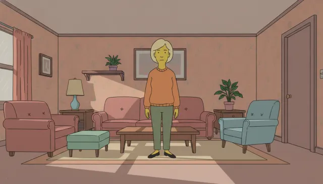
The primary aesthetic distinction from Rick and Morty is tonal: while Rick and Morty's environment design is wildly varied across dimensions, Solar Opposites is firmly anchored in suburban American domestic space. The show's house, neighborhood, and town environments use the same flat-fill suburban aesthetic as The Simpsons and Family Guy - beige houses, green lawns, minivans.
A major subplot across multiple seasons involves a microscopic society living inside the characters' wall - a shrunk-down civilization with Victorian, post-apocalyptic, and eventually complex political layers. These 'Wall' sequences developed their own distinct visual register: a warmer, more detailed environment with its own elaborate production design that contrasts with the flat sitcom exterior world.
Hulu's original animation brief in 2019-2020 allowed Roiland to produce a show with the same Adult Swim DNA but without Cartoon Network/Turner oversight. The show covers adult content more directly than Rick and Morty's Adult Swim slot allowed - more explicit language, more graphic violence - while maintaining the same flat-line visual aesthetic.
Season 4 onward (2024) faced the challenge of maintaining the visual aesthetic without Roiland's involvement. The production has maintained stylistic continuity by retaining the same animation studios and character design team, demonstrating how thoroughly a visual style can be codified and continued independently of its originator.
Justin Roiland + Mike McMahan / Hulu · 2020
Debut season establishing the alien-suburban flat sitcom aesthetic with early Wall storylines
Mike McMahan / Hulu · 2022
Season expanding the Wall subplot into a major narrative with its own distinct visual world
Justin Roiland + Dan Harmon / Adult Swim · 2013
Visual and creative sibling show sharing the identical Roiland line aesthetic
Matt Groening + David X. Cohen · 1999
Tonal predecessor - sci-fi premise with flat-color TV animation aesthetic
Seth MacFarlane + Mike Barker + Matt Weitzman / Fox · 2005
Parallel alien-in-suburban-family sitcom with different visual approach - comparison point for the genre
A Look is not a filter. It is a set of stored decisions the pipeline reads before it makes a single frame, so two videos in the same Look actually match.
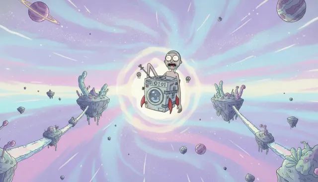 Adult PrimetimeRick and Morty Sketch Sci-Fi
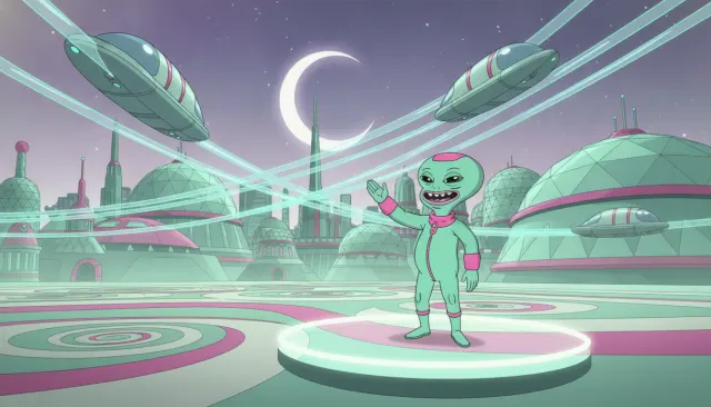 Adult PrimetimeFuturama Retro Sci-Fi
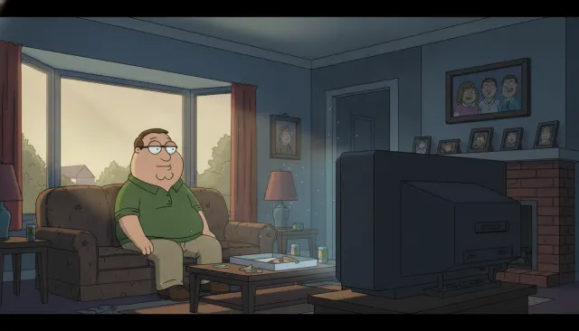 Adult PrimetimeFamily Guy Suburban Flash
 Adult PrimetimeAmerican Dad Suburban
 Adult PrimetimeSimpsons Flat Color
 Adult Shorts AnthologyAqua Teen Hunger Force Cheap Flash
 Adult Primetime ExpansionInside Job Netflix Conspiracy Sitcom