MOBILE CASUAL · CONTEMPORARY · TURKEY
Royal Match Hyper Glossy
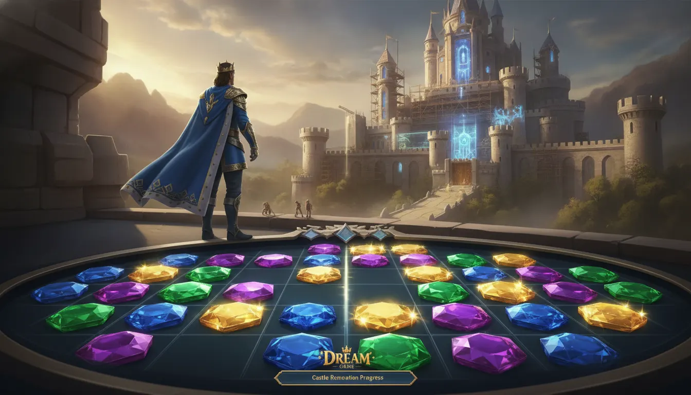
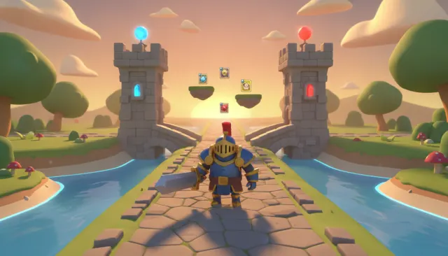
Royal Match Dream Games hyper-glossy match-3 puzzle aesthetic. King Robert castle-renovation meta, ultra-saturated 3D-rendered gemstones, modern UA-optimized polish.
match-3hyper-glossycastlemobile-meta
LUT royal-match-castle-gloss
WHEN TO USE
- Premium mobile game reward screens, special event UI, and in-app purchase promotional assets
- App icon design and App Store screenshot sets targeting top-grossing casual games
- Brand merchandise or physical product packaging that wants an intensely luxurious, premium feel
- Social media ad creatives for mobile games competing in the hyper-competitive casual market
- YouTube thumbnails for mobile gaming channels covering top-grossing free-to-play titles
- Any content signaling maximum abundance, reward, and premium quality to casual audiences
WHEN NOT TO USE
- Game content that values restraint, atmosphere, or realism over instant visual reward
- Editorial or journalism contexts where the hyper-commercial aesthetic would undermine credibility
- Minimalist or brutalist design contexts where surface richness is explicitly avoided
- Content for audiences who associate hyper-glossy UI with dark patterns or predatory monetization
SIGNATURE TECHNIQUES
How the look is made.
The moves a human crew would use to get here. Cue applies them for you, and knowing their names is how you ask for a change.
- 01Near
zero roughness PBR materials creating mirror-reflective metallic surfaces
- 02Specular highlights covering 30
50% of a surface area rather than acting as accent points
- 03Iridescent gradient fills cycling cyan
magenta-gold with chromatic aberration on peaks
- 04Inflated/balloon geometry with surfaces bulging at centers and compressing at contact edges
- 05Subsurface
scattered gem and crystal materials glowing warmly from interior light sources
- 06Environment cube
map reflections visible in rounded UI chrome and button surfaces
- 07Particle systems using additive blending to create luminous overlap effects
HISTORY & CONTEXT
Where it comes from.
Royal Match Hyper-Glossy
If the standard Royal Match glossy puzzle aesthetic represents polished mobile design, the hyper-glossy variant pushes every surface to its maximum sheen. This look characterizes the aspirational tier of casual mobile game art direction - a visual register where every element appears to have been freshly lacquered, dipped in resin, or cast from translucent plastic. It is the aesthetic of premium app icons, deluxe booster packs, and special event reward screens.
What Separates Hyper-Glossy from Standard Glossy
Standard glossy puzzle design uses specular highlights as accent elements. Hyper-glossy design makes the specular highlight the primary visual feature. Surfaces are so reflective that environment reflections are visible in curved geometry. Buttons read as inflated balloons - a design trend popularized by Apple's original iOS skeuomorphism and revived by the casual games industry. Metal UI elements use PBR (physically-based rendering) materials with roughness values close to zero, creating near-mirror surfaces.
The color palette in hyper-glossy contexts shifts from the jewel tones of standard glossy toward iridescent materials: holographic gradients cycling through cyan-magenta-gold, chromatic aberration on highlights that splits white into spectral components, and subsurface-scattered gem materials that glow from within. Dream Games' special event screens and seasonal content consistently demonstrate this escalation.
The Inflation Aesthetic
Hyper-glossy mobile game art has a strong relationship with the "balloon" or "inflated" render aesthetic popularized in CGI between 2019 and 2023. Objects appear to be slightly over-pressurized - surfaces bulge at their centers and compress at their edges in a way that suggests internal gas pressure. This visual metaphor communicates "full," "abundant," and "premium" simultaneously, which maps well onto in-app purchase reward screens.
Production Context
Hyper-glossy assets are typically rendered in Cinema 4D, Blender, or proprietary engines with path-traced or ray-traced lighting passes. Mobile game studios may maintain separate high-end render farms for marketing and UI assets distinct from the game's real-time renderer. The polish gap between a game's running visuals and its App Store screenshots is often largest in the hyper-glossy category.
NOTABLE WORKS
Where you have seen it.
Candy Crush Saga boosters and reward screens (King, 2012-present)
Clash Royale chest opening animations (Supercell, 2016)
Coin Master spin reward UI (Moon Active, 2015)
Pokemon GO legendary raid reward screens (Niantic, 2016-present)
Apple iOS 6 and earlier skeuomorphic UI
the design lineage ancestor
THE RECIPE
The exact knobs
the renderer turns.
A Look is not a filter. It is a set of stored decisions the pipeline reads before it makes a single frame, so two videos in the same Look actually match.
SettingValue
GradeColour LUT applied to every frame
royal-match-castle-glossTransitionHow one shot becomes the next
soft cuts · 180ms · ease-outKen BurnsCamera move applied to stills
Static framesTypographyDisplay / body / mono pairing
Bricolage Grotesque · Inter · JetBrains MonoMusic moodWhat the bed under the voice sounds like
royal-fanfare-puzzle · mobile-meta-orchestralPrompt suffixAppended to every shot prompt in this Look
Royal Match Dream Games hyper glossy match 3, King Robert castle renovation meta, ultra saturated 3D rendered gemstones, modern mobile polishPALETTE
Primary
#9A1B2E
Secondary
#5C1018
Accent
#F8C038
Text/Light
#2A0508
Text/Dark
#FFF1C8
BG 900
#1A0408
BG 800
#2A0810
RELATED LOOKS
Next to it on the shelf.

Your first cut
is on us.
+ New videoFree plan · no card · 1080p export