Clash of Clans (Supercell, 2012)
the defining reference
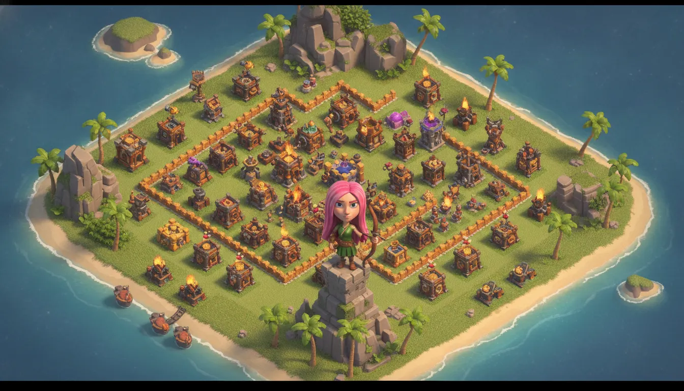
Clash of Clans Supercell cartoony-3D village aesthetic. Big-head barbarian-and-archer characters, isometric village base building, warm tropical island palette.
The moves a human crew would use to get here. Cue applies them for you, and knowing their names is how you ask for a change.
adjacent proportion: heads approximately one-third of body height, simplified chunky limbs
stone, wood, metal each have distinct but uncluttered reads
process outline effects separating characters from environment at small display sizes
degree world projection with strong building silhouette variety for strategic readability
faction coding - each army, faction, or building type has a dominant hue family
small characters dwarfed by oversized buildings creates power/progress narrative
Clash of Clans (Supercell, 2012) pioneered the cartoony 3D aesthetic that became the default visual language of mobile strategy and builder games throughout the 2010s. Supercell's Helsinki-based art team created a system that merged Western cartoon character design traditions with 3D rendering, producing characters and buildings instantly readable at the small sizes required on smartphone screens while retaining enough detail to reward close inspection on tablets.
Characters in Clash of Clans use chibi-adjacent proportions: oversized heads (approximately one-third of total body height), thick simplified limbs, minimal neck. This exaggeration - borrowed from Western animation and character design traditions rather than Japanese chibi - serves the game's scale: characters must read clearly when they are 40 pixels tall on a phone screen. The 3D models maintain these proportions rather than drifting toward realistic anatomy, creating a consistent stylization across hundreds of unit types.
All characters and significant buildings use implicit or baked-in outline effects that separate them from backgrounds. Surface textures are kept clean - minimal noise, clear material read (stone reads as stone, wood as wood) - because at mobile resolutions, muddy textures become illegible grey. This is a functional design decision that also creates the 'clean cartoon' aesthetic.
The game world uses a strict isometric 45-degree projection, with each tile type carefully designed to read clearly in that projection. Buildings have strong silhouette variety - Cannon towers are clearly different from Archer Towers - enabling strategic decision-making from aerial overview. This isometric clarity influenced an entire generation of city-builder and strategy games.
The Barbarian faction uses warm earth tones (brown, tan, orange-red); the Builder Base uses purple and mechanical grey. Goblin green and Wizard purple distinguish unit types from a distance. This systematic color-faction mapping is a key part of visual design for real-time strategy games at any scale.
the defining reference
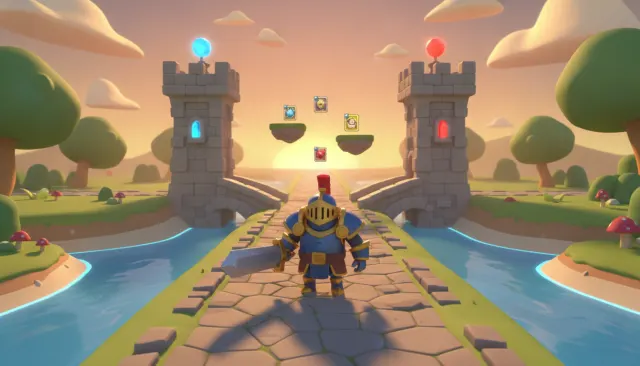
same character library in real-time card-battle context
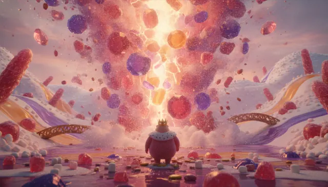
evolution of the cartoony 3D system
same studio, military theme variation
farm builder with parallel visual system
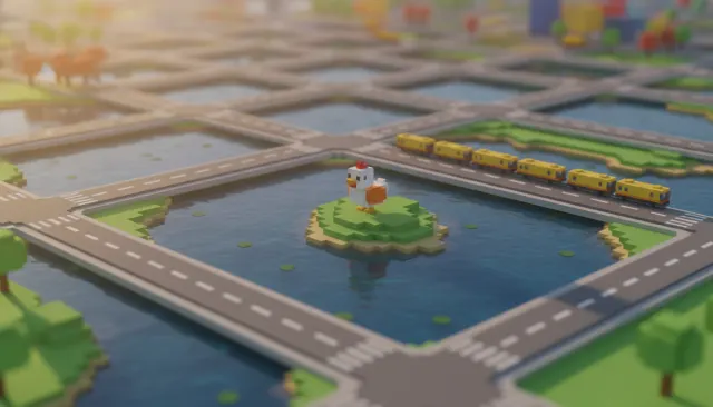
voxel adjacent in the mobile/casual 3D space
earlier cartoony mobile visual language
A Look is not a filter. It is a set of stored decisions the pipeline reads before it makes a single frame, so two videos in the same Look actually match.