CHILDRENS BOOK · 1980S · UK
Quentin Blake Scratchy Line
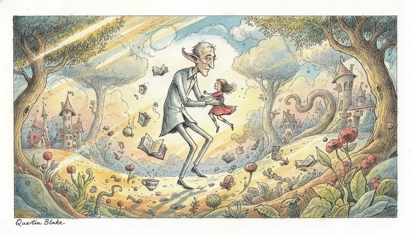
Quentin Blake Roald Dahl scratchy ink line. Energetic loose pen and ink, splash watercolour wash, BFG and Matilda joyfully chaotic.
blakescratchyink-washkids
WHEN TO USE
- Children's content, education, and family-oriented campaigns where warmth, wit, and motion are essential
- British literary or cultural content where the association with Dahl and classic children's books adds instant recognition
- Comedic or anarchic content where the loose, energetic line amplifies the humour
- Animation where the deliberately imperfect, hand-made quality is the desired texture
- Illustrated publishing content -- editorials, chapter openers, decorative spots -- where an authoritative illustrative tradition is needed
WHEN NOT TO USE
- Premium, luxury, or corporate brand content where the loose, scratchy line reads as unpolished
- Serious or solemn subject matter where the anarchic wit undercuts gravity
- Data visualisation or instructional content requiring precision and technical clarity
- International markets where British children's literary associations are not culturally embedded
SIGNATURE TECHNIQUES
How the look is made.
The moves a human crew would use to get here. Cue applies them for you, and knowing their names is how you ask for a change.
- 01Dip
pen ink line with characteristic breaks, gaps, and mid-stroke direction changes giving figures kinetic energy
- 02Loose watercolour washes applied after inking, often overflowing outlines, in muted but warm tones
- 03Figures drawn in exaggerated dynamic poses
- leaning, running, falling -- with limbs and clothes in mid-motion
- 04Faces with simple, expressive features
dot eyes, curved-line mouths, single arched eyebrow to convey emotion
- 05Clothing rendered in loose cross
hatching and gestural strokes rather than precise folds
- 06Generous white space around figures; backgrounds minimal or entirely absent
- 07Line weight variation within a single stroke from pressure changes on the dip pen
HISTORY & CONTEXT
Where it comes from.
Quentin Blake: Scratchy Line
Quentin Blake (born 1932) is the most celebrated British children's book illustrator and one of the most recognisable graphic styles in English-language publishing. His work is the visual incarnation of anarchic wit: lines that wobble and spray, characters that lean and flail, watercolour washes applied with deliberate looseness, the whole system conveying motion and delight even in a still image.
The Roald Dahl Collaboration
Blake's defining professional partnership was with Roald Dahl, beginning with Danny the Champion of the World (1975) and extending through the most beloved works of children's literature. The BFG (1982) -- the Big Friendly Giant with his enormous ears and lopsided swagger -- is perhaps Blake's single most recognisable character design. Matilda (1988) put his expressive line to work on Dahl's most psychologically complex child protagonist. Charlie and the Chocolate Factory (1964 text, Blake's illustrations replaced the original Schindelman illustrations in the UK 1995 Puffin edition), James and the Giant Peach (1961/Blake 1995), The Twits (1980), Fantastic Mr Fox (1970/Blake 1974), and George's Marvellous Medicine (1981) all bear his mark.
Technical Method
Blake works in pen-and-ink with a dip pen, producing his characteristic broken, energetic line. The pen lifts and re-lands mid-stroke, leaving characteristic gaps and directional changes that give figures their sense of barely-contained motion. He then applies loose watercolour washes over the ink -- often staying within the outlines but frequently overflowing them. The colour is always secondary to the line: Blake paints after drawing, and the two layers maintain their independence.
Beyond Dahl
Blake's non-Dahl work includes John Yeoman collaborations, his own wordless picture books (Clown, 1995), and extensive illustration for adult literary fiction including work for The Spectator, Penguin, and Folio Society editions of Voltaire and Cervantes.
NOTABLE WORKS
Where you have seen it.
The BFG (1982, Roald Dahl) -- defining character design
The Twits (1980, Roald Dahl)
Matilda (1988, Roald Dahl) -- Blake's most psychologically expressive Dahl work
Fantastic Mr Fox (illustrated edition 1974, Roald Dahl)
Clown (1995, Blake wordless picture book)
How Tom Beat Captain Najork and His Hired Sportsmen (1974, Russell Hoban)
THE RECIPE
The exact knobs
the renderer turns.
A Look is not a filter. It is a set of stored decisions the pipeline reads before it makes a single frame, so two videos in the same Look actually match.
SettingValue
TransitionHow one shot becomes the next
hard cuts · 160ms · linearKen BurnsCamera move applied to stills
Slow push · 0.02 · centerTypographyDisplay / body / mono pairing
Patrick Hand · Lora · JetBrains MonoMusic moodWhat the bed under the voice sounds like
playful-clarinet · rascally-stringsPrompt suffixAppended to every shot prompt in this Look
Quentin Blake Roald Dahl scratchy ink line, energetic loose pen and ink, splash watercolour wash, BFG Matilda joyfully chaoticPALETTE
Primary
#0A0A0A
Secondary
#F0E6D0
Accent
#F5C144
Text/Light
#0A0A0A
Text/Dark
#FFFFFF
BG 900
#F5EFE0
BG 800
#E8E0CC
RELATED LOOKS
Next to it on the shelf.
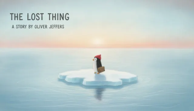 Childrens BookOliver Jeffers Soft Pastel
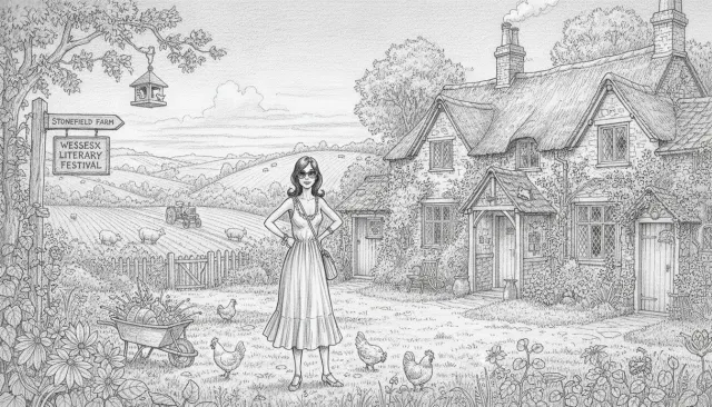 Illustrators ExtendedPosy Simmonds UK Graphic Novel
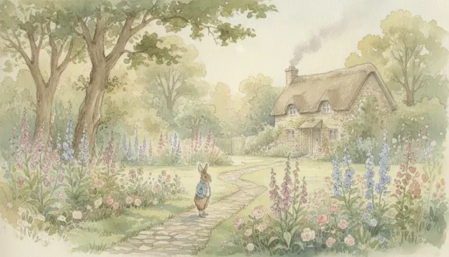 Childrens BookBeatrix Potter Watercolor Storybook
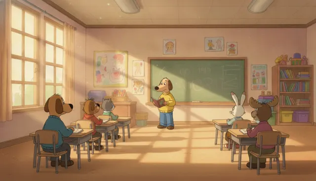 Pbs Kids EducationalArthur PBS Warm Watercolor
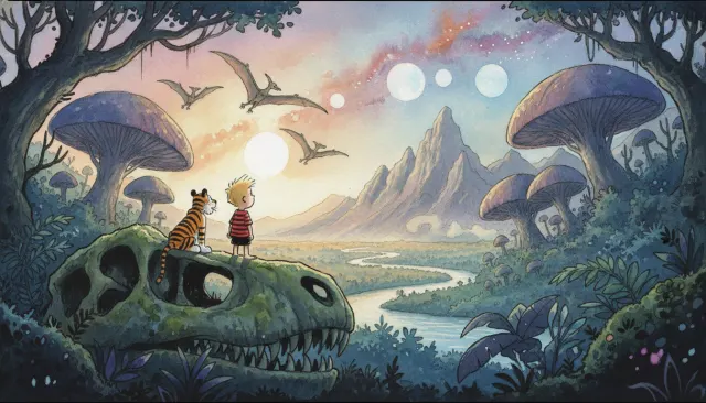 Illustrators ExtendedBill Watterson Calvin Hobbes Painted Sunday
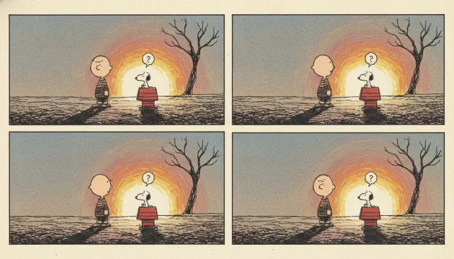 Illustrators ExtendedCharles Schulz Peanuts Minimalist Strip
Your first cut
is on us.
+ New videoFree plan · no card · 1080p export