Arthur
Marc Brown / PBS Kids / CINAR · 1996
The canonical 25-season run that defined PBS Kids warm-watercolor animation
Marc Brown book adaptation, Cookie Jar / Cinar Canadian PBS Kids series. Anthropomorphic aardvark and friends in Elwood City, warm watercolor classroom palette.
The moves a human crew would use to get here. Cue applies them for you, and knowing their names is how you ask for a change.
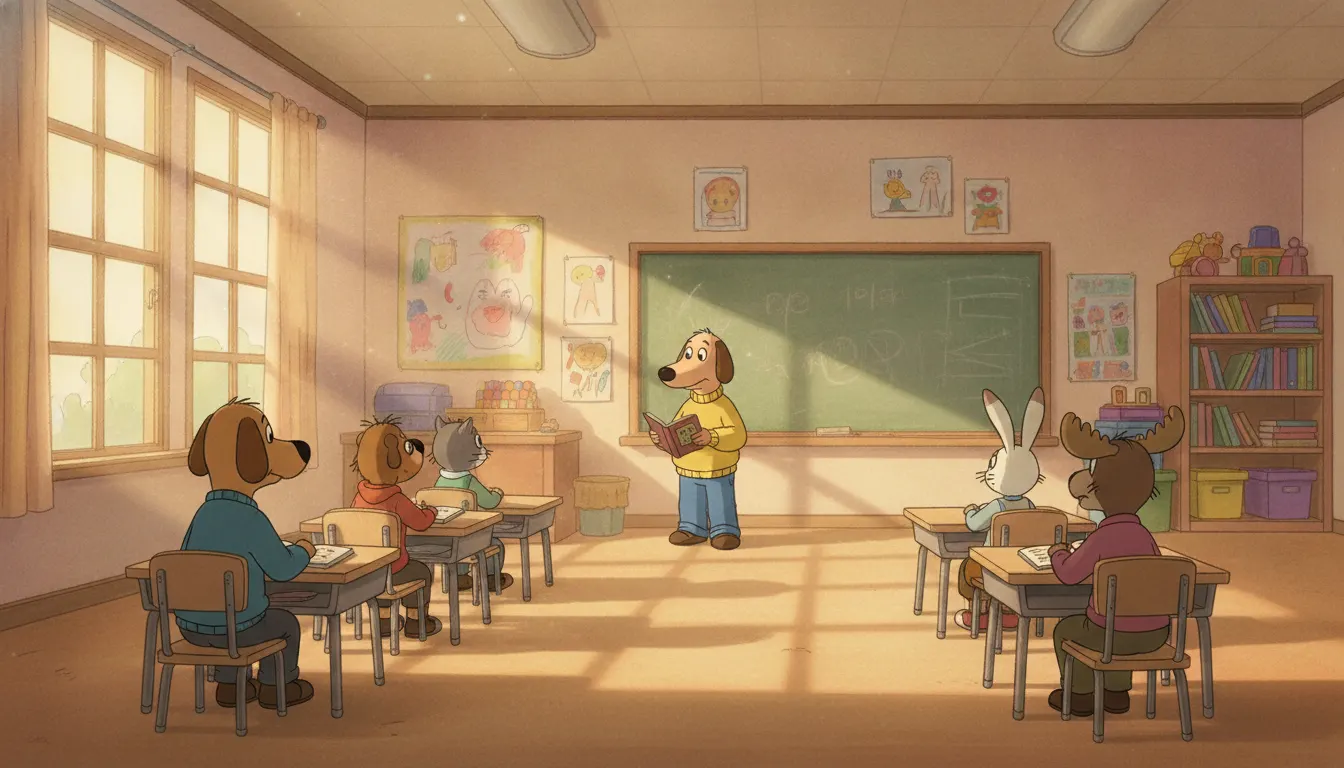
Environments maintain the feel of Marc Brown's original watercolor illustrations, with soft washes and warm afternoon light.
Anthropomorphic animals wear contemporary human clothing and live in human domestic environments without visual incongruity.
Ochres, warm oranges, leaf greens, and sky blues dominate, creating a consistently safe and inviting visual temperature.
Characters display recognizable emotions through simplified but not exaggerated facial expressions calibrated for early childhood recognition.
Elwood City settings -- school, library, kitchen, backyard -- are drawn with accurate domestic detail to support real-world recognition.
Background art uses light paper or watercolor texture overlays that maintain the handmade, picture-book quality even in digital production.
Arthur premiered on PBS Kids on September 2, 1996, based on the Arthur the Aardvark book series by Marc Brown, who began the series in 1976. The television adaptation was produced by CINAR Films (later Cookie Jar Entertainment, then DHX Media) with animation direction by Greg Bailey. The show ran for 25 seasons, concluding on February 21, 2022 -- making it the longest-running animated children's series in American television history.
The Arthur visual style is among the most carefully calibrated children's animation aesthetics in American TV history. Marc Brown's original illustration style -- warm, gentle watercolors with loose, friendly character designs -- was translated to television with exceptional fidelity. The character designs are simplified but not aggressively flat: animals wear human clothing, live in human homes, and have approximately human facial expressions, but retain their animal features in a way that reads as natural rather than incongruous.
The show's most distinctive visual element is its background art, which maintains the feel of children's book illustration rather than television animation. Backgrounds use soft watercolor washes, warm lighting, and gentle texture that references Brown's original book illustrations. The palette is dominated by warm earth tones -- ochres, warm oranges, leaf greens, sky blues -- with a consistent afternoon-light quality that makes Elwood City feel like an idealized New England town.
Arthur was designed from the ground up to support social-emotional learning for the 4-8 age range. The visual language supports this mission: characters are drawn with expressive but not exaggerated emotions, environments are domestic and familiar (school, library, dentist, restaurant), and the color palette is warm and reassuring rather than stimulating.
Character designer Alex Ganetakos maintained extremely consistent model sheets across the show's 25-year run -- an extraordinary achievement in animation continuity. While the production transitioned from traditional cel animation to digital ink-and-paint (around Season 6, 2002) and later to Flash-based production, the core visual vocabulary remained remarkably stable.
Arthur occupied a specific position in the PBS Kids lineup alongside shows like Sesame Street (1969), Mister Rogers' Neighborhood (1968), and Clifford the Big Red Dog (2000). These shows share a visual philosophy: warmth over stimulation, recognizable environments over fantasy worlds, emotional safety over conflict-driven visual energy.
The show addressed serious topics -- disability, death, divorce, autism (in the character Carl introduced in Season 8) -- within this warm visual container. The gentleness of the watercolor aesthetic provided a safe emotional space for difficult subject matter.
Arthur's visual language has become the defining reference for 'PBS Kids aesthetic' in the same way that The Simpsons defines network adult animation. Animation studios producing educational content for the 4-8 demographic routinely reference Arthur as a benchmark for warm, safe, book-illustration-derived visual design.
Marc Brown / PBS Kids / CINAR · 1996
The canonical 25-season run that defined PBS Kids warm-watercolor animation
Scholastic / PBS Kids · 2000
Direct aesthetic contemporary; same picture-book-to-TV watercolor translation
Mike Berenstain / PBS Kids · 2003
PBS Kids adaptation of the Stan and Jan Berenstain books; warm domestic watercolor aesthetic
Marc Brown / PBS Kids · 2004
Arthur spinoff that maintained the visual identity while incorporating documentary footage
Universal / PBS Kids · 2006
Contemporaneous PBS Kids show with a similarly warm, book-illustration-derived palette
Fred Rogers Productions / PBS Kids · 2012
Next-generation PBS Kids series that continued the warm-safe-domestic visual philosophy
A Look is not a filter. It is a set of stored decisions the pipeline reads before it makes a single frame, so two videos in the same Look actually match.