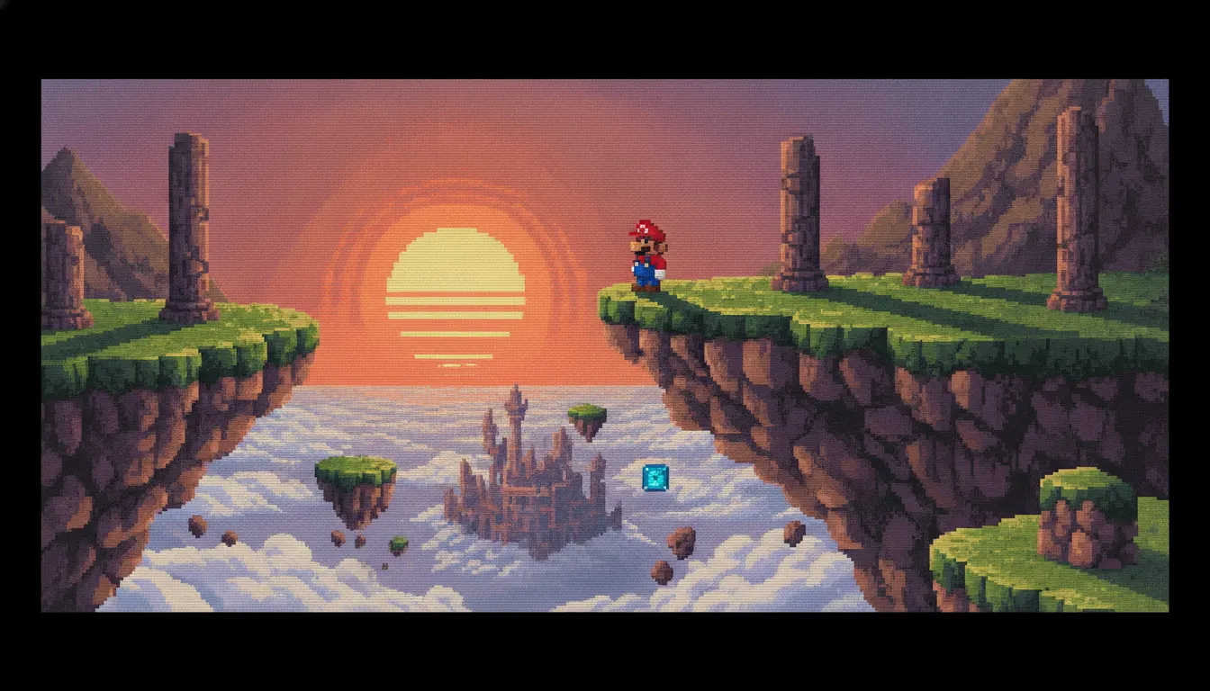
Super Mario Bros.
Nintendo, 1985 (NES) - the defining commercial launch that made the NES aesthetic mainstream
Nintendo Entertainment System 8-bit pixel art. 256x240 resolution, 4-color sprite palette, NTSC scanlines, Mega Man and Super Mario Bros era chunky pixels.
The moves a human crew would use to get here. Cue applies them for you, and knowing their names is how you ask for a change.
all design decisions made for a screen smaller than a modern mobile phone
color hardware palette: bright, distinctive hues with no photorealistic gradients or anti-aliasing
per-tile constraint: every sprite and tile works with exactly three colors plus transparent
characters recognizable as iconic figures at tile scale
NES palette cycling along scanlines to create sky gradients and environmental variation
swapping character graphic banks mid-frame to create the illusion of more sprites
alternating pixels of two colors to simulate an unavailable in-between tone
The Nintendo Entertainment System (NES), known as the Famicom in Japan (released 1983) and the NES in North America (1985), established the visual language of video games for an entire generation. The 2A03 CPU, Picture Processing Unit (PPU), and 8-bit color palette created hard hardware constraints that Nintendo's and third-party artists transformed into an aesthetic vocabulary that remains culturally legible decades later.
The NES displayed a resolution of 256x240 pixels. The hardware color palette was fixed at 52 colors, with each 8x8 pixel tile limited to 3 colors plus transparent. Background tiles used one set of 4-color palettes; sprites used another, with the further constraint that only 8 sprites could appear on the same horizontal scanline before the hardware dropped some. These constraints forced artist to develop extreme efficiency: a Mario sprite at 16x16 pixels needed to communicate 'plumber in red cap and overalls' using a handful of colored pixels.
NES pixel art is a precise technical discipline. Artists designed tiles and sprites in grid editors, counting colors, planning palette assignments, and designing for the characteristic horizontal strip of color change that NES palette manipulation allowed. Scrolling backgrounds used color cycling and CHR banking techniques to create atmospheric variation. The results - the blue-black Koopa shells, the bright yellow coin bricks, the deep blue Mega Man torso - are among the most recognizable graphic symbols in modern culture.
The NES library established the visual identity of Nintendo's most enduring franchises: Donkey Kong (1981 arcade, NES port 1983), Super Mario Bros. (1985), The Legend of Zelda (1986), Metroid (1986), Mega Man (1987), Contra (1987), and Final Fantasy (1987). The character designs, enemy types, and environmental iconography defined in these NES games persist with minimal change across sequels spanning four decades.
NES 8-bit aesthetics have experienced continuous revival: the chiptune music scene, the indie pixel art game movement of the 2010s (Shovel Knight, Undertale, Stardew Valley), and widespread commercial use of pixelated graphics in branding, streetwear, and illustration all trace their visual roots to the NES era.
Nintendo, 1985 (NES) - the defining commercial launch that made the NES aesthetic mainstream
Nintendo, 1986 (Famicom Disk System / NES) - overhead RPG exploration visual grammar
Nintendo / Intelligent Systems, 1986 (Famicom Disk System / NES) - atmospheric dark sci-fi 8-bit
Capcom, 1988 (NES) - considered the peak of NES character and stage visual design
Konami, 1987 (NES) - action sprite design and jungle/alien environment pixel art
Square, 1987 (Famicom/NES) - JRPG overhead world map and battle screen conventions
Yacht Club Games, 2014 - the definitive modern NES-faithful pixel art tribute
A Look is not a filter. It is a set of stored decisions the pipeline reads before it makes a single frame, so two videos in the same Look actually match.