Pitfall! (Activision / David Crane, 1982)
peak 2600 sprite artistry
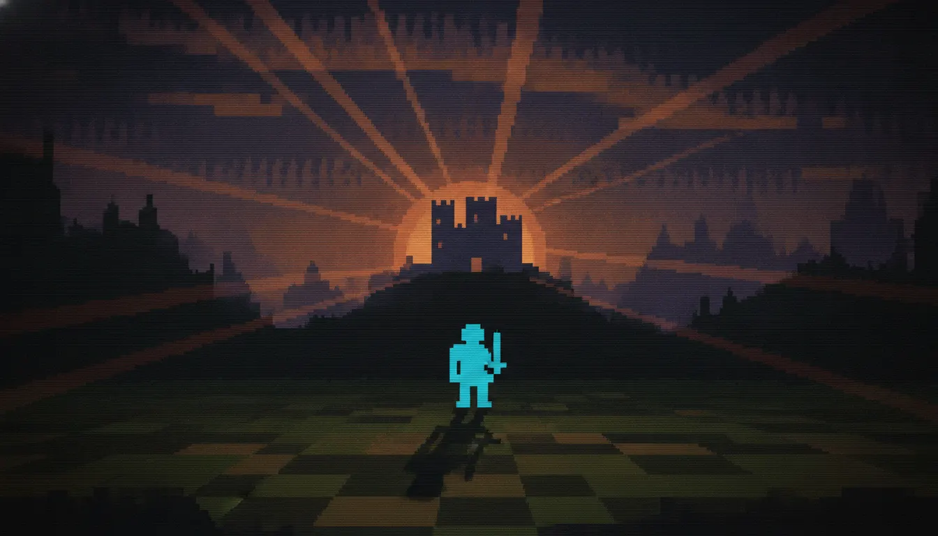
Atari 2600 VCS chunky 8x16 sprite aesthetic. 128-color TIA palette, single-color player sprite, scanline-stretched background, Combat and Adventure era primitive home console.
The moves a human crew would use to get here. Cue applies them for you, and knowing their names is how you ask for a change.
typically 2-4 colors per sprite in the hardware-authentic 128-color NTSC palette
color backgrounds with high-contrast sprite colors for visibility
typically 2-4 frames per action due to ROM constraints
The Atari 2600, launched in 1977, operated under hardware constraints so severe that they became an aesthetic in their own right. The Television Interface Adaptor (TIA) chip could display only two player sprites, a ball object, and a playfield simultaneously, with sprites limited to just a few pixels wide at native resolution. The NTSC television display introduced its own color bleeding and scanline artifacts. The result was a visual language of extraordinary economy: chunky, blocky forms that must communicate an entire concept in a handful of pixels.
The 2600's 128-color palette (actually a subset of NTSC-safe colors generated by phase angle and luminance combinations) produces distinctive hues that never quite appear in other contexts - coral pinks, electric aquas, warm mustards, and murky olive greens that feel unmistakably of that era. Background playfields were often mirrored due to the TIA's architecture, creating symmetrical patterns that look designed but were actually a hardware workaround.
Player sprites at their widest were around 8 pixels, meaning a human figure might be represented by four or five thick pixel rows. This enforced a kind of visual shorthand - a single color block for a head, two for a body, stick-like legs. The art of 2600 graphics was maximizing recognition from minimum information. Designers like Steve Woita, Bob Whitehead, and Warren Robinett developed sophisticated pixel economies to make characters instantly readable.
Parallel to the 2600's raster approach, vector arcade games like Asteroids (Atari, 1979), Battlezone (Atari, 1980), and Tempest (Atari, 1981) used electron beam drawing to create glowing line graphics. The 'chunky vector' aesthetic in this look fuses both traditions - the thick blocky forms of 2600 raster with the line-art energy of vector displays.
This aesthetic carries 'first gaming memories' resonance for audiences who grew up with the platform and functions as a cultural shorthand for 'the beginning of video games.' It reads as retro, lo-fi, and democratically simple.
peak 2600 sprite artistry
first Easter egg and dungeon crawler on platform
system's first killer app
definitive vector arcade aesthetic
creative use of hardware limits
technical showpiece of 2600 capabilities
infamous reference
A Look is not a filter. It is a set of stored decisions the pipeline reads before it makes a single frame, so two videos in the same Look actually match.