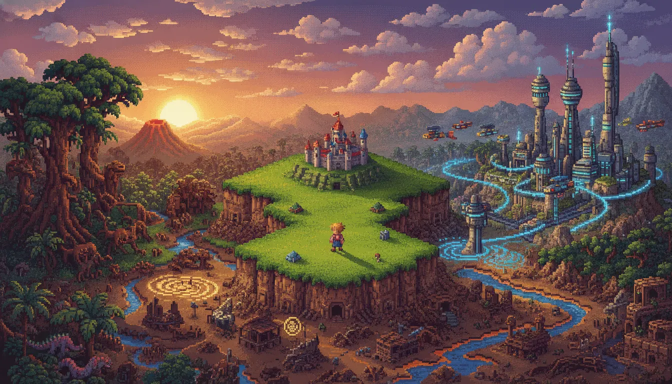
Chrono Trigger (Square, 1995)
the defining reference
Chrono Trigger SNES 16-bit JRPG aesthetic. Akira Toriyama character design, time-period biome variety, vibrant overworld map, classic Square pixel storytelling.
The moves a human crew would use to get here. Cue applies them for you, and knowing their names is how you ask for a change.
style character silhouettes: distinctive hair shapes, round forms, clean outline pixel rendering
color sub-palette sprites with careful hue selection from the 32,768 color hardware space
two resolution tiers within the same game
specific color identities - each time period has a dominant palette communicating mood and technology level
water shimmer, fire flicker, magical auras
7 perspective distortion for map screens and special battle sequences
based environments with animated foreground and background planes for depth
Chrono Trigger (Square, 1995) is the consensus peak of the Super Nintendo Entertainment System's role-playing game era, and its visual design represents the highest expression of 16-bit JRPG pixel art. The game united three visionaries: character designer Akira Toriyama (the creator of Dragon Ball and Dr. Slump), world designer Yoshitaka Amano (whose impressionistic watercolor work defined Final Fantasy's concept art from I through VI), and producer Hironobu Sakaguchi. The result is a visual synthesis that remains beloved thirty years later.
Toriyama's character designs - clean outlines, rounded forms, expressive big eyes, distinctive hair silhouettes - translate to pixel art with unusual fidelity. The sprites are approximately 16x24 pixels for field maps and larger for battle scenes. Crono's spiky hair, Marle's ponytail, and Frog's distinctive amphibian silhouette each read instantly at tiny scale. This is Toriyama's Dragon Ball sensibility applied to medieval-future time-travel fantasy: accessible, dynamic, and immediately endearing.
The SNES hardware supported 32,768 possible colors with 256 on screen simultaneously, using sub-palettes of 16 colors per sprite group. Square's pixel artists pushed these constraints to create rich, nuanced environments: Guardia Castle uses layered stone greys with warm amber torchlight; the End of Time floats in a moody purple void; 2300 AD's Geno Dome glows with oppressive industrial blue-white. Each era in the game's time-travel narrative has a distinct color identity.
Battle sprites are significantly larger than field sprites, allowing greater detail and more expressive animation frames. The active-time battle system made combat feel kinetic rather than static. Spell and technique animations used palette cycling, screen flash effects, and mode-7 perspective tricks to create spectacular visual moments within the hardware's constraints.
The game's visual style has been continuously referenced, remixed, and honored by indie game developers. Its specific combination of Toriyama character design translated to pixel art has defined 'JRPG pixel' as a category of aesthetic shorthand for an entire generation of developers and players.
the defining reference
parallel SNES JRPG peak, Yoshitaka Amano art direction
Toriyama's source character design work
SNES action-RPG with strong pixel art identity
SNES JRPG peer with distinct American-influenced palette
HD-2D revival of SNES JRPG pixel aesthetic
PS1 successor transitioning to 3D
A Look is not a filter. It is a set of stored decisions the pipeline reads before it makes a single frame, so two videos in the same Look actually match.
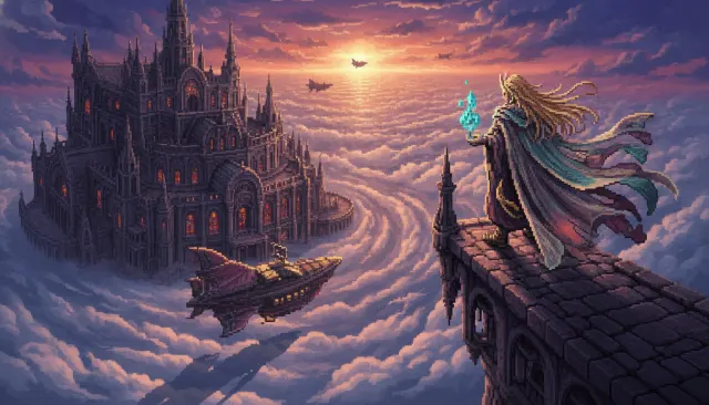 Jrpg ExtendedFinal Fantasy 6 SNES 16-Bit Pixel
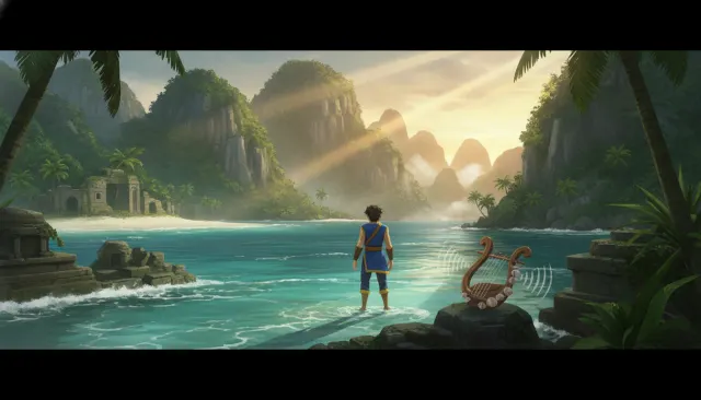 Jrpg ExtendedChrono Cross PS1 Mid-Poly
 Pixel Modern IndieCeleste Mountain Pixel
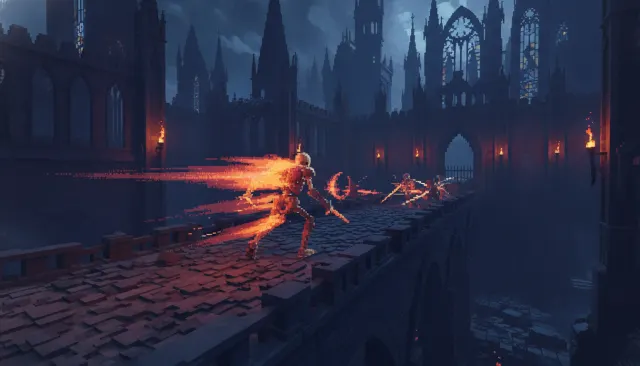 Pixel Modern IndieDead Cells Pixel Roguelike
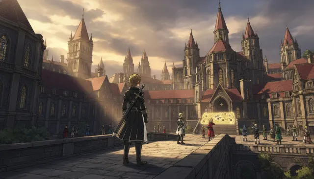 Jrpg ExtendedFire Emblem Three Houses Cel-Shaded JRPG
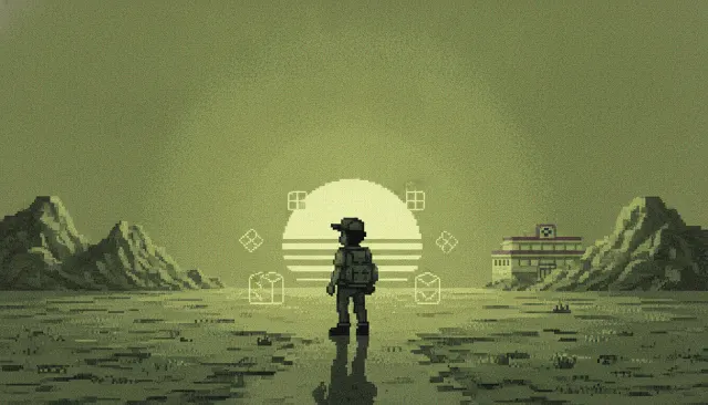 Pixel Era 8Bit 16BitGame Boy Monochrome 4-Color
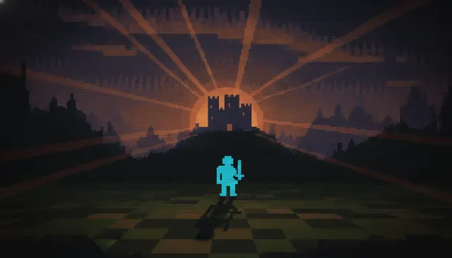 Retro Pre NesAtari 2600 Chunky Vector