The Legend of Zelda: A Link to the Past
Nintendo, 1991 (SNES); GBA port 2002, Virtual Console releases
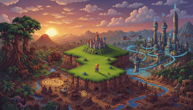
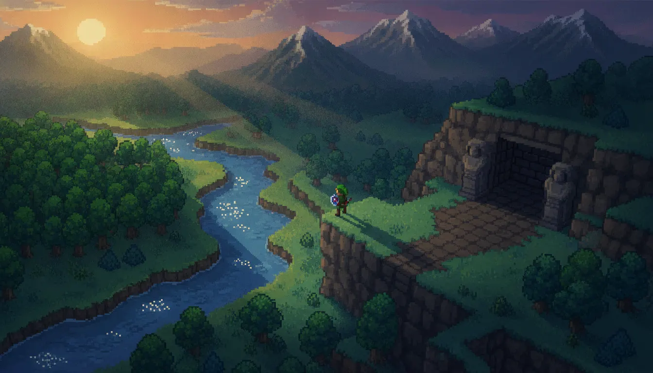
Zelda A Link to the Past overhead 16-bit aesthetic. SNES top-down adventure, Hyrule overworld lushness, dungeon tile detail, classic Nintendo pixel craft.
The moves a human crew would use to get here. Cue applies them for you, and knowing their names is how you ask for a change.
overhead perspective with tile-aligned 16x16 grid movement and four-directional character sprites
Hyrule overworld in grass green/blue; Dark World in purple desaturation
ice blue, desert ochre, forest green each signaling a specific palace
16x24px Link reads as warrior-in-green-tunic at all scales
tree variants, animated water ripples, and wind-sway grass tiles creating world depth
world parallel structure: same geographic layout recolored and redetailed between Light and Dark palettes
to-environment scale ratio maintaining spatial logic across exploration and combat
Nintendo's The Legend of Zelda: A Link to the Past (SNES, 1991) is the foundation stone of the top-down action-RPG visual language. Directed by Shigeru Miyamoto and Takashi Tezuka, it established the pixel vocabulary that defined Hyrule for a generation and influenced the visual grammar of overhead perspective games across the following three decades.
A Link to the Past operates in a 3/4-overhead perspective - slightly angled downward but not strictly isometric. Link and NPC sprites are drawn to roughly the same proportional scale as the environment tiles, maintaining a consistent spatial logic where the player's position and the world's layout are simultaneously readable. Characters face four directions with distinct sprite sets; movement is tile-aligned to a 16x16 grid.
Running on the SNES with its 256-color palette, the game used color with a specificity that made each region instantly identifiable. The Hyrule overworld is grass-green with blue river paths; the Dark World counterpart is purple-desaturated and malevolent. Dungeon interiors use constrained monochromatic schemes: ice blue for the Ice Palace, desert ochre for the Desert Palace. The color language communicates location, danger, and narrative state without text or map labels.
Link's sprite is small - approximately 16x24 pixels - but unmistakably readable as a young warrior in a green tunic. The visual challenge of making a tiny pixel figure legible led Nintendo's artists to develop extremely efficient design: the green hat, pink face, and movement-contextual animation frames communicate character state at a glance. Enemy sprites follow the same philosophy: Stalfos are skull-and-sword readable; Agahnim is dark robes and crackling magic.
The Hyrule overworld is densely populated with environmental detail: trees vary between pine, deciduous, and dead variants; water tiles animate with a two-frame ripple loop; grass sways in wind-tile sequences. This density created the convincing illusion of a world rather than a game board.
The LttP overhead grammar established the template for Secret of Mana (1993), Chrono Trigger (1995), Earthbound (1994/1995), and dozens of indie games from Stardew Valley (2016) to Tunic (2022).
Nintendo, 1991 (SNES); GBA port 2002, Virtual Console releases
Nintendo, 2013 (3DS) - direct sequel in the same overhead grammar
Square, 1993 - SNES overhead action-RPG building directly on LttP's visual template
Square, 1995 - overhead JRPG peak of the SNES era
Nintendo / APE, 1994/1995 - overhead RPG with suburban American twist on the palette
ConcernedApe, 2016 - modern indie game explicitly in LttP's overhead visual lineage
Isometricorp / Andrew Shouldice, 2022 - isometric-adjacent spiritual successor celebrating LttP's mystery
A Look is not a filter. It is a set of stored decisions the pipeline reads before it makes a single frame, so two videos in the same Look actually match.