Hades
Supergiant Games, 2020 (Epic Early Access 2018, full release September 2020)
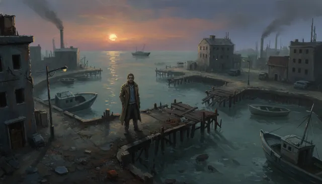
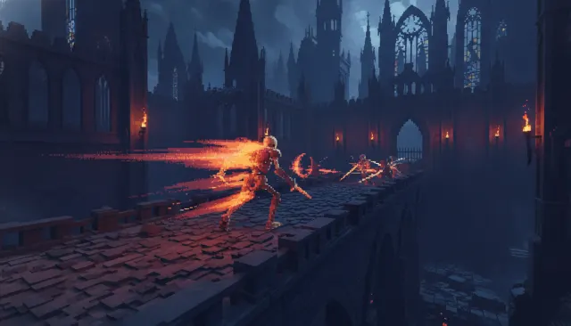
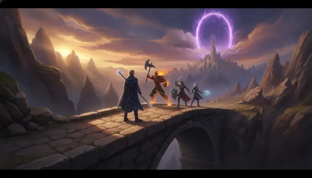
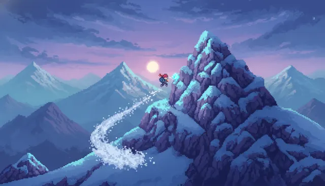
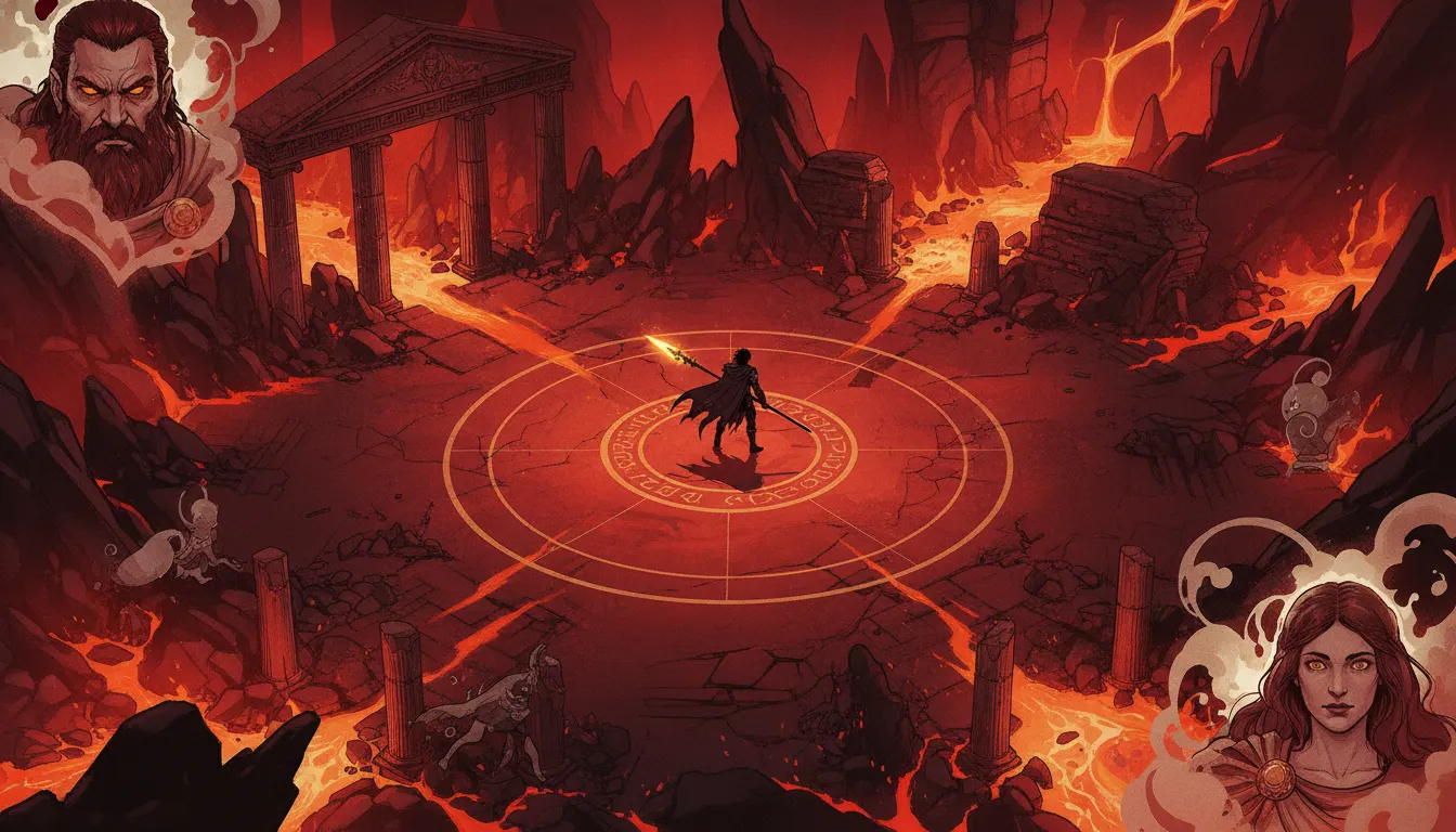
Hades Supergiant Games isometric comic aesthetic. Underworld red-and-amber palette, painted character portraits, dynamic roguelite combat staging.
The moves a human crew would use to get here. Cue applies them for you, and knowing their names is how you ask for a change.
card-scale character art panels used for in-game dialogue and item reveals
effect lighting projected onto environment floors in real time
dense combat: sparks, flames, and brimstone continuously scatter through the playfield
Hades (Supergiant Games, 2020) is the product of a studio that treats art direction as a first-class feature. Art director and lead character illustrator Jen Zee built a visual language that sits at the intersection of Greek vase painting, comic-book splash pages, and oil-portrait character work - all deployed in a real-time isometric action game.
The dungeon environments of Tartarus, Asphodel, Elysium, and the Temple of Styx are rendered in a downward-oblique isometric perspective with roughly 2:1 tile ratios. Each biome has a signature palette: Tartarus is deep plum and obsidian with ember highlights; Asphodel burns with orange magma and volcanic debris; Elysium is a blinding white and gold Olympian paradise. Environments are densely layered with architectural detail - carved stone reliefs, decorative urns, sculpted columns - that communicates mythological location without exposition.
Jen Zee's character portraits are the aesthetic crown of the game. Each deity and shade is drawn with painterly looseness in a style that references classical Greek sculpture while pushing toward graphic novel excess: Dionysus sports deep amethyst skin; Poseidon is lit with iridescent oceanic teal; Ares wears the grimacing intensity of a heavy metal album cover. Portraits appear as large-panel card-art compositions during dialogue, merging comic-book splash with tarot card grandeur.
Gameplay environments use aggressive dynamic lighting: spell effects project colored light pools onto the floor, enemy health bars glow, and particle systems scatter sparks and flame continuously. The overall color density is extremely high - there are rarely neutral greys or desaturated moments. This visual noise is controlled through strong value contrast: hero characters and interactive objects are always the brightest elements in frame.
UI elements use serif classical typography paired with filigree borders reminiscent of ancient Greek meander patterns. The HUD is treated as part of the world's visual language, not a functional overlay layered on top.
Supergiant Games, 2020 (Epic Early Access 2018, full release September 2020)
Supergiant Games, Early Access 2024 - continuation with expanded visual vocabulary
Supergiant Games, 2014 - earlier Jen Zee isometric art direction
Supergiant Games, 2017 - isometric perspective and painted character portraits in a sports-RPG context
Supergiant Games, 2011 - the studio's isometric debut establishing the painterly house style
Motion Twin, 2018 - stylistic peer in isometric action with high visual energy
A Look is not a filter. It is a set of stored decisions the pipeline reads before it makes a single frame, so two videos in the same Look actually match.