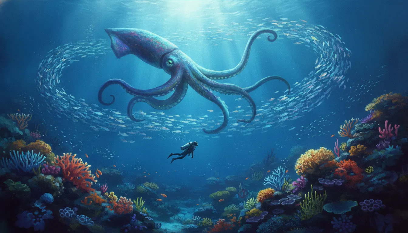
ABZU (Giant Squid, 2016)
the defining reference
ABZU Giant Squid painterly underwater aesthetic. Matt Nava lush oceanic biome, school-of-fish flow physics, meditative diving exploration, vibrant reef palette.
The moves a human crew would use to get here. Cue applies them for you, and knowing their names is how you ask for a change.
based dominant hue families - each scene has a primary emotional color temperature
rays, and light columns
simplified, idealized, never documentary-accurate
no muddy or desaturated neutrals
of-field blur creating dreamlike focus planes in ocean backgrounds
ABZU (Giant Squid, 2016) represents one of the most accomplished artistic achievements in games of the 2010s. Art directed by Matt Nava - who previously served as art director on Journey (thatgamecompany, 2012) - ABZU translates the desert minimalism of Journey into a rich underwater world of luminous color and teeming marine life. The title references the Sumerian concept of the primordial sea, and the visual language reflects that mythic, sacred quality.
Nava built the game around a zone-based color system where each underwater environment has a dominant hue family - bioluminescent purples in abyssal depths, warm coral-reef teals and golds, glacial whites and arctic blues in open ocean passages. Colors are never muddy or naturalistic in a documentary sense; they are curated, heightened, impressionistic. Subsurface scattering of light is exaggerated to create halos and god-ray effects that feel more like stained glass than oceanography.
Fish and marine creatures are designed with simplified, slightly stylized anatomy - not cartoon-distorted, but smoothed and idealized. This sits in the same tradition as Hayao Miyazaki's natural world illustrations: reverent, loving, but never documentary. Shaders create a soft, almost impressionistic surface quality where light diffuses gently rather than producing hard specular highlights.
Creature animation uses fluid, looping motion designed to feel meditative rather than urgent. Schools of fish form coordinated murmuration-like patterns. The player character moves with balletic slowness. This tempo is as much an aesthetic choice as any color decision - the look and the pacing are inseparable.
The style directly descends from Journey's principles and influenced subsequent 'walking simulator' and meditative game aesthetics. Developers like the team behind Flower (thatgamecompany, 2009) explored adjacent emotional-landscape territory earlier, but ABZU pushed the color sophistication significantly further.
the defining reference
Matt Nava's preceding art direction work
emotional landscape predecessor
nature-reverent adjacent
earlier meditative underwater game
documentary counterpart showing real vs. stylized contrast
painterly natural world in parallel tradition
A Look is not a filter. It is a set of stored decisions the pipeline reads before it makes a single frame, so two videos in the same Look actually match.
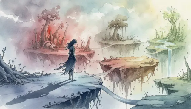 Indie StylizedGris Watercolor Platformer
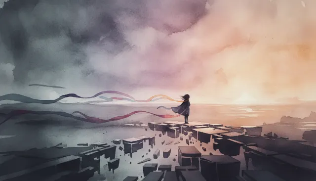 Indie ModernGris Nomada Watercolor Indie Platformer
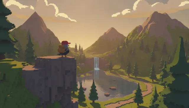 Indie ModernA Short Hike Painterly Pixel
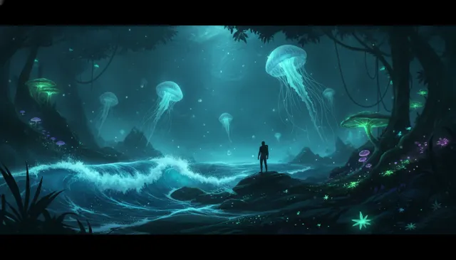 Light ExperimentalBioluminescent Glow Low Light
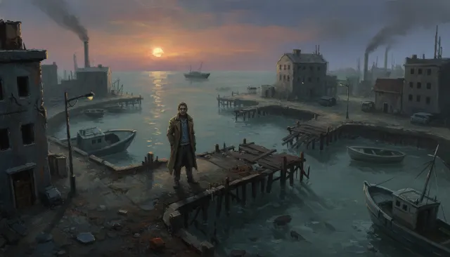 Indie StylizedDisco Elysium Painted RPG
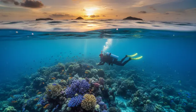 Wildlife NatureDavid Doubilet Underwater
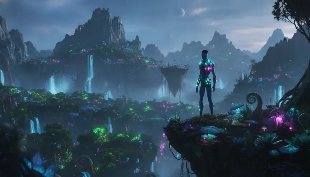 Vfx Blockbuster 3DAvatar Pandora Bioluminescent