Don't Let the Pigeon Drive the Bus!
2003
Hyperion; Caldecott Honor
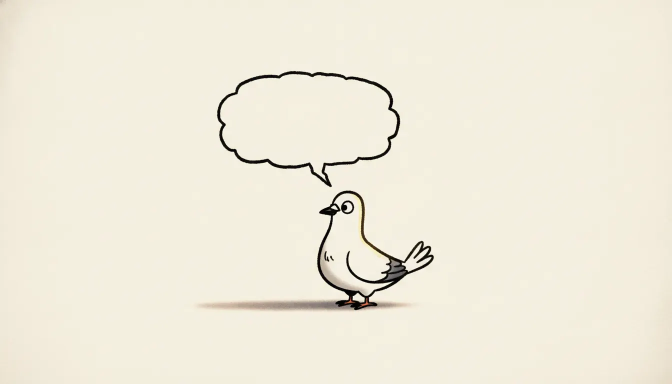
Mo Willems Dont Let the Pigeon Drive the Bus simple shape. Big-headed pigeon character, hand-drawn speech bubble, blank tone background.
The moves a human crew would use to get here. Cue applies them for you, and knowing their names is how you ask for a change.
color background with no environmental detail - pure character and dialogue
bodies reduced to the minimum number of lines required for recognition
Pigeon's whole body leans into desire, frustration, or despair
deliberately computer-drawn in appearance
Willems integrates speech balloons and type into the illustration plane
multiple panels showing emotional intensity rising through posture, not facial complexity
Mo Willems (born 1968) developed one of the most strategically simplified visual styles in contemporary children's picture books, explicitly drawing on his background writing for Sesame Street and the visual grammar of newspaper comic strips to create books that function as beginning reader stage scripts.
Willems's breakthrough as an author-illustrator, Don't Let the Pigeon Drive the Bus! (Hyperion, 2003) won the Caldecott Honor and established his visual approach: a white or near-white background, a single character drawn in the most economical possible line, expressive emotion communicated almost entirely through eye shape and body tilt, and a format in which children are directly addressed by the character (the bus driver tells the reader not to let the Pigeon drive the bus; the Pigeon then attempts to manipulate the reader into compliance).
The Pigeon himself is drawn with perhaps twenty lines: a circular head, a small beak, a single round eye with a tiny pupil, a round body, two stick legs, and minimal wing suggestion. This extreme reduction is not a limitation but a feature - it makes the Pigeon instantly legible to prereaders and allows emotion to be communicated by the most subtle variations in eye orientation and body lean. When the Pigeon is furious, his eye becomes a horizontal slit; when hopeful, it widens; when throwing a tantrum, the entire body tilts and the line weight increases.
The Elephant & Piggie series (beginning with Today I Will Fly!, 2007) applies the same minimalism to two-character dialogue in an early-reader format. Gerald (the elephant) is drawn in gray with large round spectacles; Piggie in pink with spindly legs. Both characters stand against white backgrounds and speak entirely in word-balloon dialogue, making the books function as illustrated scripts that children can perform aloud.
Willems draws digitally, which contributes to the consistent, unvarying line quality - no variation in pressure or speed, no visible hesitation or correction. The line is clearly artificial in origin, which reads as a deliberate choice: this is a constructed world, not a naturalistic one.
2003
Hyperion; Caldecott Honor
2004
Hyperion
2005
Hyperion
2007
first Elephant & Piggie book, Hyperion
2010
Elephant & Piggie; Theodor Seuss Geisel Award
2004
mixed-media photo-background with drawn characters; Caldecott Honor
2009
Elephant & Piggie
2016
final Elephant & Piggie book
A Look is not a filter. It is a set of stored decisions the pipeline reads before it makes a single frame, so two videos in the same Look actually match.