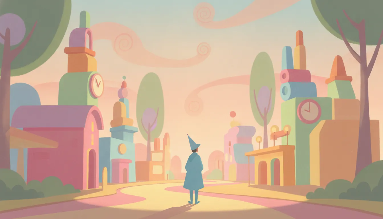
Cinderella concept art
1950
Disney Studios; blue coach sequence color keys
Mary Blair Disney concept art. Its A Small World pastel geometry, flat shape stacks, candy color, mid-century modern theme-park.
The moves a human crew would use to get here. Cue applies them for you, and knowing their names is how you ask for a change.
no gradients, no blending between color areas
naturalistic color pairing: combinations that should clash but create decorative harmony (pink and orange, teal and yellow)
cylinders, spheres, rectangles arranged into recognizable human forms
fabric prints and decorative details rendered as flat pattern rather than three-dimensional texture
bright but not neon - colors at high saturation in the mid-value range
buildings and landscapes reduced to simplified profile shapes stacked on flat picture planes
figures dramatically oversized or undersized relative to settings for fairy-tale effect
Mary Blair (1911-1978) was the most distinctive visual voice of the Disney studio's postwar golden age - a modernist colorist working inside an institution predominantly oriented toward naturalism, who nevertheless shaped the visual DNA of several of the studio's most beloved films and attractions.
Blair joined Disney in 1940 and accompanied Walt Disney on his 1941 goodwill trip to Latin America, producing the research paintings that fed into Saludos Amigos (1942) and The Three Caballeros (1944). But her most significant work came in the trilogy of feature concept paintings she produced for Cinderella (1950), Alice in Wonderland (1951), and Peter Pan (1953).
Her concept paintings for these films were not the final-look guides the studio usually adopted - the actual films were considerably more naturalistic than Blair's sketches. But her color keys and story sketches established the emotional temperature of each sequence. For Cinderella, Blair developed a blue-silver-white palette that the film's background painters ultimately adopted almost wholesale for the iconic coach-and-ball sequences. For Alice in Wonderland, she pushed into hot acid pinks, orange-reds, and verdigris greens - impossible combinations that felt genuinely disorienting in a way the completed film only partially achieved.
Blair's most enduring public work is the visual design of It's a Small World, created for the 1964 New York World's Fair and subsequently installed at Disneyland (1966), Walt Disney World (1971), Tokyo Disneyland (1983), Disneyland Paris (1992), and Hong Kong Disneyland (2008). The attraction's flat, paperdoll-like figures in national dress, rendered against bold graphic backdrops in a deliberately simplified style - no depth cues, no shadows, pure flat pattern - represent her aesthetic philosophy applied at architectural scale.
Blair's signature moves: bold flat color areas with no gradients, color relationships that violate naturalistic expectation (yellow sky against turquoise ground, hot pink against burnt orange), figures simplified to near-geometric abstraction, and a midcentury graphic sensibility that reads simultaneously as folk art and modernist design. Her palette favors pastels pushed to unusual saturation - not the desaturated baby pastels of children's decor, but bright, almost electric versions of the same hues.
1950
Disney Studios; blue coach sequence color keys
1951
Disney Studios
1953
Disney Studios; London and Neverland sequences
1942
Latin America trip studies
1944
color concept contributions
1953
large-scale interior paintings
A Look is not a filter. It is a set of stored decisions the pipeline reads before it makes a single frame, so two videos in the same Look actually match.