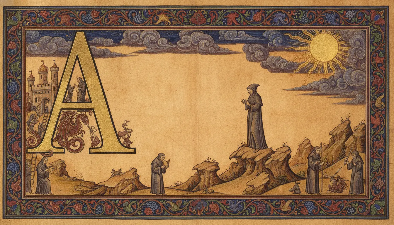
Très Riches Heures du Duc de Berry (c. 1412-1416)
Limbourg Brothers, Musée Condé, Chantilly
Medieval illuminated manuscript page. Drop-cap initial filled with gold leaf, marginalia of monks and dragons, vellum-page warmth.
The moves a human crew would use to get here. Cue applies them for you, and knowing their names is how you ask for a change.
tone: intense, slightly granular, and costly-looking
important figures painted large regardless of spatial logic
large decorated capital letters containing narrative figure scenes
hybrid creature-human-vegetable figures inhabiting the borders of pages
From roughly the sixth century to the advent of the printing press in the mid-fifteenth century, illuminated manuscripts were the most expensive and technically complex visual art objects produced in Europe and the wider Mediterranean world. 'Illuminated' refers specifically to the application of metal - primarily gold, occasionally silver - which literally reflects light back at the reader and gives the pages their luminous quality.
The finest manuscripts required extraordinary material investment. Vellum (calfskin) or parchment (sheepskin) was prepared by scraping and stretching. Scribes wrote text in gall ink; the ruling lines were pricked into the vellum with compass points to ensure geometric regularity. Illuminators worked on top of the finished text, applying gesso (a chalk-and-glue ground) to areas intended for gold, burnishing the metal with a boar's tooth, then applying painted figures and ornament over and around it.
Pigments came from extraordinary distances: lapis lazuli (the blue characteristic of Gothic and Byzantine manuscripts) was mined only in Afghanistan and cost more per ounce than gold in medieval Europe. Vermilion came from cinnabar. Verdigris from copper acetate. Lead white and minium (red lead) were manufactured locally. Binding medium was egg white (glair) or gum arabic - both water-soluble protein binders that created matte, flat surfaces quite unlike oil paint.
Medieval manuscript painting does not attempt the perspectival illusionism of Renaissance painting. Figures are hierarchically scaled - Christ or the Virgin larger than saints, saints larger than donors - rather than spatially correct. Drapery is indicated by schematic line patterns rather than observed folds. Gold grounds replace landscape or sky: the sacred figure exists outside earthly space, in a golden eternal present.
Marginal decoration evolved from purely geometric to include grotesques: hybrid animal-human-vegetable figures in the lower margins - knights jousting mounted on snails, rabbits hunting hunters - operating as visual commentary or pure decorative excess.
The Carolingian Renaissance (late 8th-9th century) produced the Lindisfarne Gospels and Book of Kells. Romanesque manuscripts (11th-12th century) used bold, energetic figure painting with heavy outlines. Gothic manuscripts (13th-15th century) achieved the greatest decorative elaboration - the Très Riches Heures du Duc de Berry (c. 1412-1416) by the Limbourg Brothers represents the tradition's apex.
Limbourg Brothers, Musée Condé, Chantilly
Trinity College Dublin
British Library
Winchester Cathedral
Jean Pucelle, The Cloisters, Metropolitan Museum
British Library; famous for marginal grotesques
Kunsthistorisches Museum, Vienna
British Library
A Look is not a filter. It is a set of stored decisions the pipeline reads before it makes a single frame, so two videos in the same Look actually match.
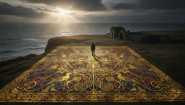 Historical Illuminated ExtendedLindisfarne Gospels Anglo Saxon Gold
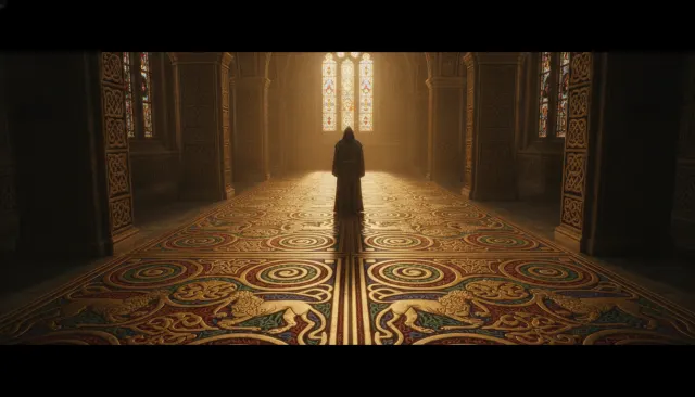 Historical Illuminated ExtendedBook of Kells Celtic Illuminated
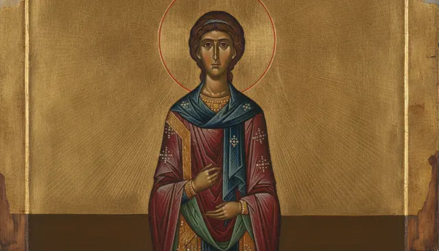 Eastern HistoricalByzantine Icon Gold Leaf
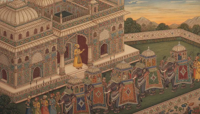 Eastern HistoricalMughal Indian Miniature
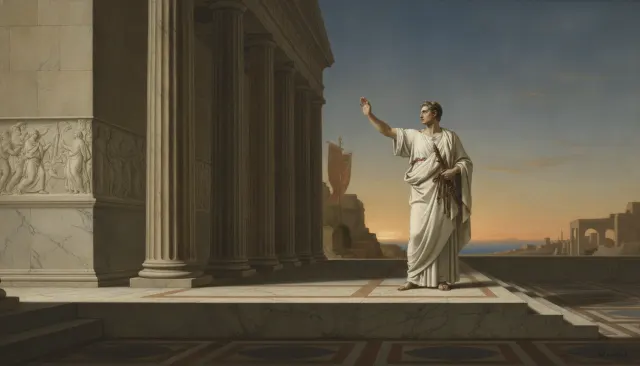 Art Movement ClassicalNeoclassical David
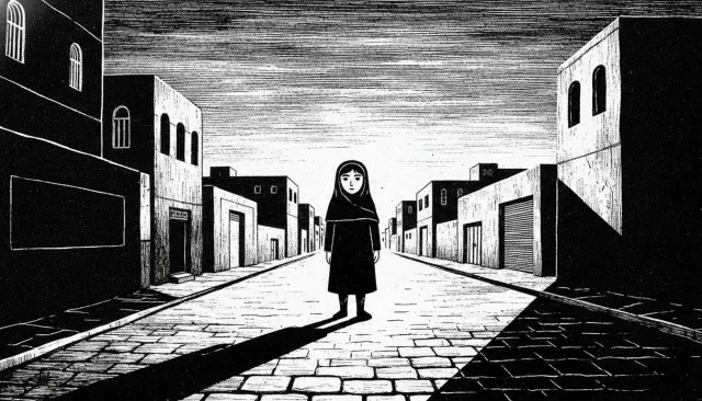 Illustrators ExtendedMarjane Satrapi Persepolis BW Thick Line