Persepolis Vol. 1
2000
L'Association, Paris
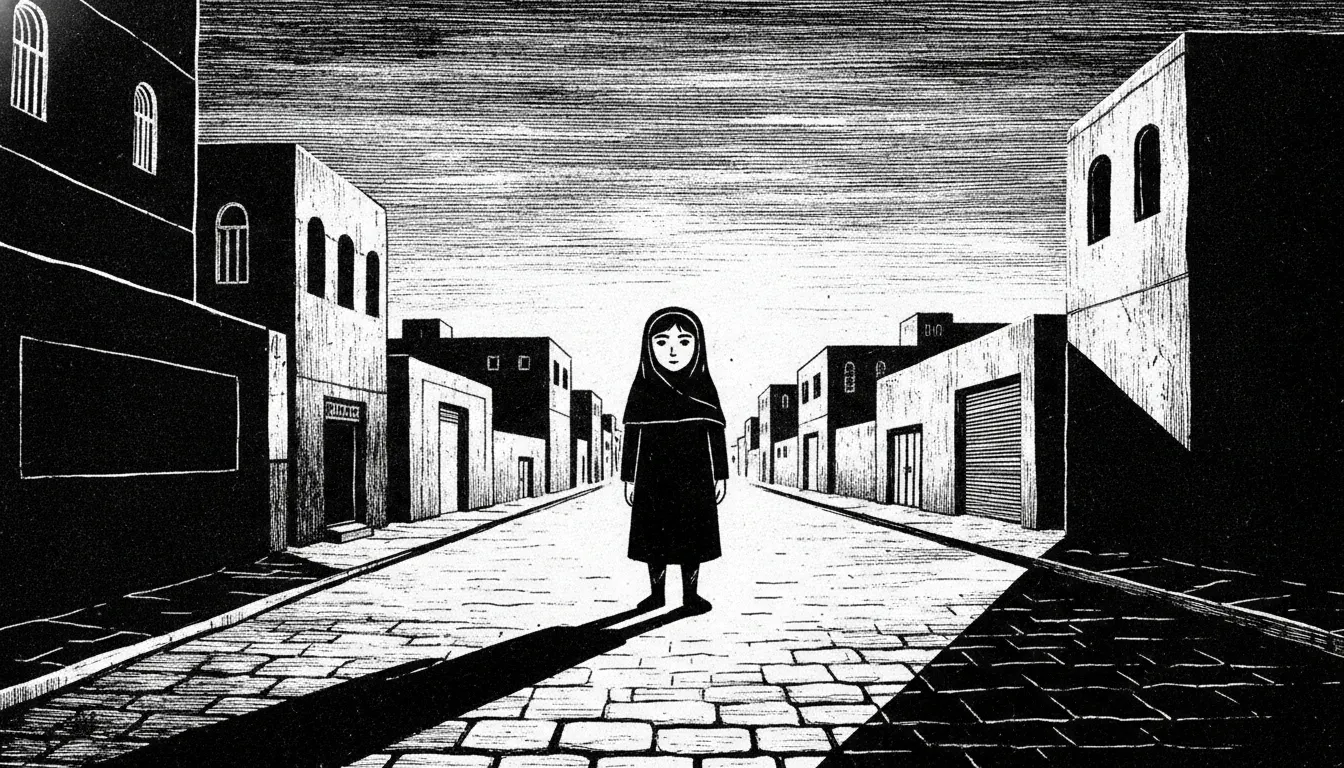
Marjane Satrapi Persepolis graphic memoir. Bold black-and-white thick ink, simplified iconic figures, Iranian Revolution childhood memoir, woodcut feel.
The moves a human crew would use to get here. Cue applies them for you, and knowing their names is how you ask for a change.
closer to woodcut than pen-and-ink hatching
and-white duotone with no gray midtones in the graphic novel original
contrast silhouette: figures rendered as solid black shapes against white, or cut from black grounds
large eyes, minimal nose, strong brow and mouth lines
flat pictorial space, decorative pattern-filling of architectural areas
groups of people reduced to geometric, repeated black shapes
abstract concepts (oppression, grief, dread) rendered as physical black forms enclosing or surrounding figures
Marjane Satrapi's Persepolis - published in French as four volumes between 2000 and 2003 by L'Association, later collected as a single volume - is both a coming-of-age memoir and a political document tracing the Iranian Islamic Revolution through the eyes of a child growing up in Tehran and later Vienna. The 2007 animated film adaptation, co-directed by Satrapi and Vincent Paronnaud, received the Jury Prize at Cannes and an Academy Award nomination for Best Animated Feature.
Satrapi drew Persepolis entirely in black and white with no gray tones - a deliberate formal choice that mirrors the moral absolutism imposed by the revolutionary regime. The line is thick and woodcut-like, drawn with consistent weight, with very little crosshatching or tonal variation. Figures are rendered in a simplified but emotionally expressive style that Satrapi has linked to the tradition of Persian miniature painting - stylized, non-perspectival, hierarchically scaled - filtered through the graphic-novel tradition of her contemporaries at L'Association, particularly David B. (whose Epileptic similarly uses bold black ink).
The compositions frequently deploy high-contrast silhouette work: black figures against white backgrounds or white figures carved from solid black grounds. Political violence and emotional extremity are often rendered in stark, almost abstract silhouette rather than grotesque detail - which makes them more, not less, disturbing. Crowds are stylized into geometric patterns; the Islamic veil becomes a graphic device rather than mere costuming.
Satrapi has cited Persian and Indian miniature painting as a conscious reference. The flat space, the use of full-black shadow areas, and the decorative patterning of architectural backgrounds in Persepolis echo miniature traditions while operating within the Western graphic novel form. This synthesis gives the book a visual identity distinct from either European or American comics.
The animated adaptation maintains the original artwork's visual language but introduces subtle gray tones and motion. The film's opening and closing frame sequences are presented in color (present-day Marji at an airport) while the entire memoir is animated in the original black-and-white idiom.
2000
L'Association, Paris
2001
L'Association
2002
L'Association
2003
L'Association
co-directed with Vincent Paronnaud, Jury Prize Cannes
2003
standalone graphic novel
2004
graphic novel adapted to film (2011)
2014
illustrated fairy tale
A Look is not a filter. It is a set of stored decisions the pipeline reads before it makes a single frame, so two videos in the same Look actually match.
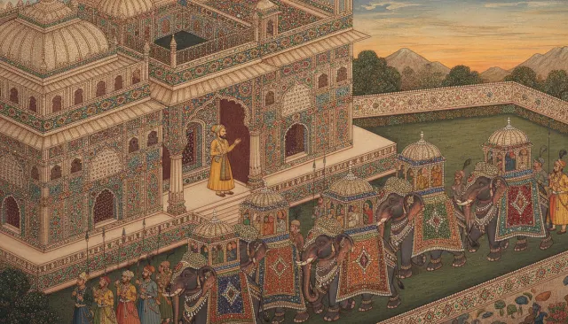 Eastern HistoricalMughal Indian Miniature
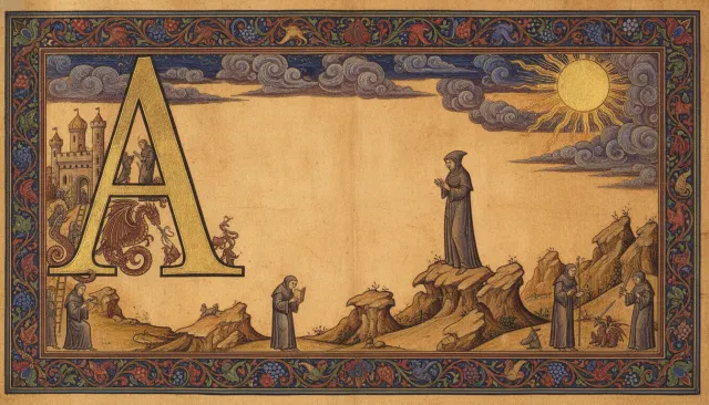 Medieval VictorianMedieval Illuminated Manuscript
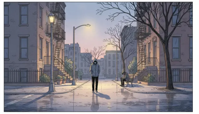 Illustrators ExtendedAdrian Tomine Clean Graphic Novel
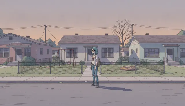 Illustrators ExtendedDaniel Clowes Deadpan Suburban Comic
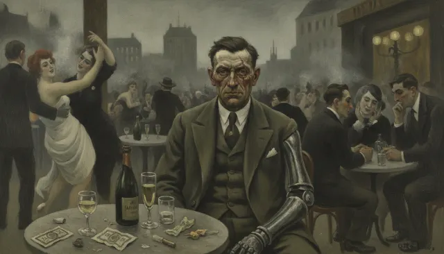 Art Movement ExtendedNeue Sachlichkeit Otto Dix Cold Realism
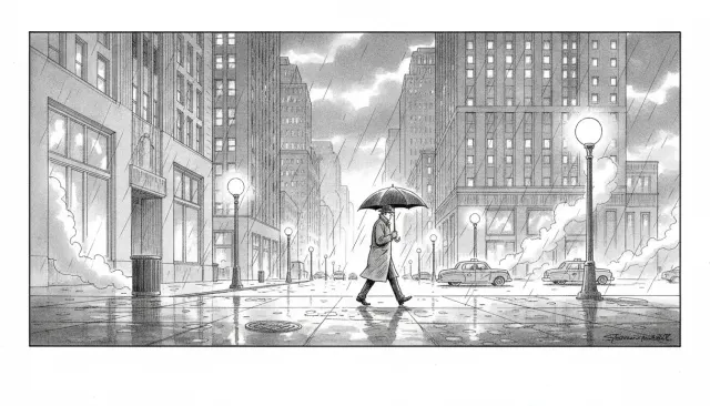 Editorial MagazineNew Yorker Cartoon Single Panel