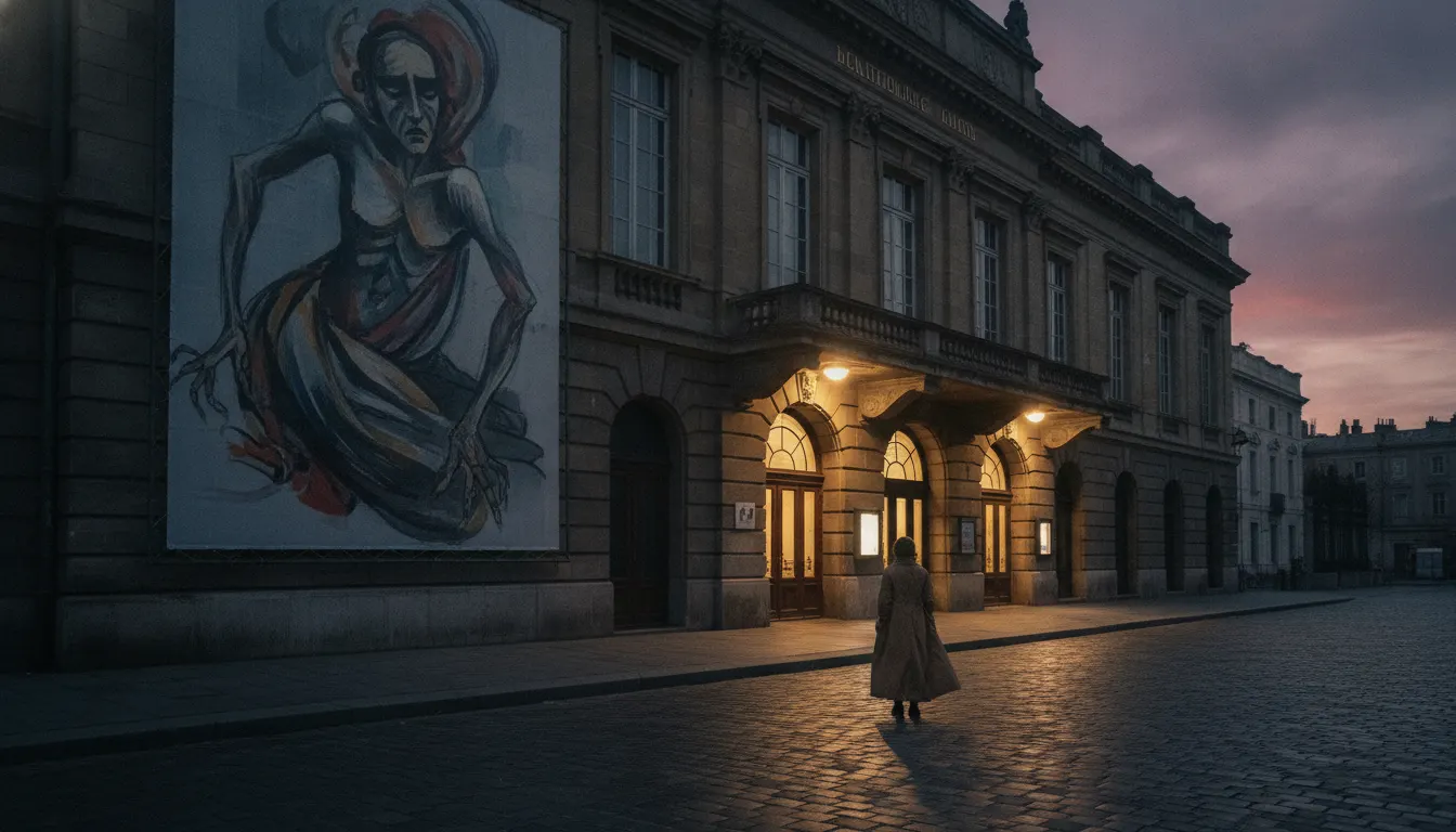
Stasys Eidrigevicius
theatrical and cultural poster series, Warsaw 1980s-2000s
Lithuanian theater bold poster aesthetic. Baltic state-supported theater design, expressive figurative illustration, hand-painted lettering, somber palette.
The moves a human crew would use to get here. Cue applies them for you, and knowing their names is how you ask for a change.
ochre, dark red, charcoal, deep blue-green
lettered or minimal display typography integrated as a visual element into the composition
isolated hands, enlarged eyes, faces as masks, figures in extreme close-up
making visible in printed reproduction - drawn rather than constructed appearance
the viewer reads the poster as they would a symbol, not a description
Lithuanian theatrical poster design developed a distinctive and internationally recognized visual tradition in the Soviet era and continued to flourish after independence in 1990. Working within ideological and material constraints that made commercial printing styles unavailable, Lithuanian designers evolved a graphic language of bold psychological imagery, hand-drawn lettering, and concentrated visual symbolism.
Lithuanian poster art during the Soviet period (1940-1990) existed in an unusual position: theater and cultural institutions were state-funded, which provided budgets for printing, but also imposed thematic constraints. Designers found that theatrical posters could carry symbolic content with more latitude than political or industrial posters. The Vilnius Academy of Arts trained a generation of designers who worked simultaneously as fine artists, and this dual practice - studio painting alongside applied design - gave Lithuanian poster work a painterly, autonomous quality distinct from the systematic modernism of Soviet graphic design schools in Moscow or Leningrad.
The most internationally recognized Lithuanian poster artist, Stasys Eidrigevicius (b. 1949, Grizaiciai), studied at the Kaunas Polytechnic Institute before moving to Warsaw in 1980 where he became a central figure in the Polish School of Poster. His work uses a distinctive surrealist iconography: isolated figures against flat color grounds, distorted faces with enormous expressive features, hands and eyes used as recurring symbolic motifs. His palette tends toward muted ochres, deep reds, and charcoal blacks with a single accent color creating maximum emotional temperature.
The Lithuanian theatrical poster tradition is characterized by a single dominant figurative image, conceptually dense and psychologically loaded rather than descriptive or illustrative. Typography is integrated into the composition, often hand-lettered or set in a limited display font, positioned as a visual element rather than an informational layer on top. Background treatment is reductive - flat color fields, or lightly textured washes suggesting aged paper or stone. The human figure, often isolated, masklike, or formally distorted, is the primary emotional carrier.
After 1990, Lithuanian poster design maintained its cultural prestige. The Vilnius Poster Biennale (established in the 1990s) and Lithuanian designers' strong showings at the Warsaw International Poster Biennale confirmed the tradition's international standing. Contemporary practitioners like Linas Spurga have extended the language while maintaining its psychological seriousness.
theatrical and cultural poster series, Warsaw 1980s-2000s
postage stamps for Lithuanian Post (1990s)
Vilnius theater poster series (2000s-present)
opera and music event posters (1990s-2010s)
A Look is not a filter. It is a set of stored decisions the pipeline reads before it makes a single frame, so two videos in the same Look actually match.