Doraemon
Fujiko F. Fujio · 1969
Foundational kodomomuke franchise establishing the round character and bright-blue color vocabulary that defined CoroCoro aesthetics
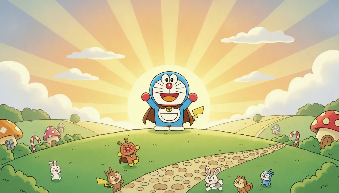
Kodomomuke (children's manga) register (Doraemon, Anpanman, Pokemon manga). Bright primary palette, big round simple linework, friendly mascot characters, wholesome panel pacing.
The moves a human crew would use to get here. Cue applies them for you, and knowing their names is how you ask for a change.
Dominant hues of royal blue, red, yellow, and pink at near-maximum saturation, creating maximum visual energy and merchandise-grade color distinctiveness
Hard-edged character outlines separated from soft-painted background environments for broadcast clarity and toy reproduction legibility
Character faces with minimal complexity -- dot eyes, arc mouths -- that communicate emotional state instantly without requiring nuanced reading
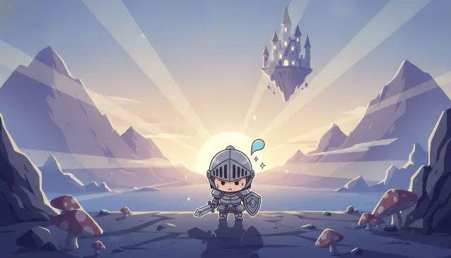
Bodies built from circles, ovals, and simple curves with no angular complexity, signaling safety and friendliness through geometric psychology
Large areas of white or empty panel space used as timing punctuation for gag payoffs, adapted from newspaper comic strip conventions
Protagonists assigned bright warm hues; antagonists given darker, cooler, or gray-tinted versions of the palette to signal alignment without dialogue
Kodomomuke (lit. 'aimed at children') refers to manga and anime targeting the under-12 demographic, published in magazines like Ciao, Nakayoshi, CoroCoro Comic, and the original Monthly Shojo Friend. The aesthetic is defined by maximum visual accessibility: high-key brightness, simplified geometry, bold primary-adjacent color palettes, and character designs that communicate emotion in a single glance.
CoroCoro Comic, home to Doraemon (Fujiko F. Fujio, 1969-1996) and Pokemon Adventures (1997-present), established the boys' side of the aesthetic: bright royal blue, red, and yellow as dominant hues; rounded robot and creature designs; and comic-timing panels that use whitespace and size contrast for gag impact. Doraemon's visual grammar -- a round blue robot with a white belly pouch, expressive dots for eyes -- is one of the most recognizable character design systems in existence.
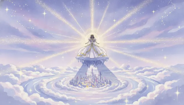
Nakayoshi magazine published Sailor Moon (Naoko Takeuchi, 1991-1997) and Cardcaptor Sakura (CLAMP, 1996-2000), establishing girls' kodomomuke through pastel pinks and yellows, rounded heart-and-star motifs, and transformation sequence visual grammar that influenced two decades of magical girl aesthetics. Character proportions are slightly elongated -- longer legs, smaller faces -- compared to chibi-style boys' designs.
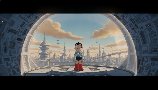
Kodomomuke animation (NHK's productions, Toei Animation's Precure franchise, Studio Pierrot's children's properties) applies maximum contrast between foreground characters and backgrounds. Backgrounds are often hand-painted watercolor environments with soft edges; characters are cel-style with hard outlines. This separation ensures broadcast clarity on low-resolution screens and simple backgrounds for toy merchandise reproduction.
Color choices are deliberately motivational: yellow for curiosity and warmth (Pikachu, Doraemon's tan coloring), red for energy and excitement (Pokemon trainer accents, Precure power attacks), blue for reliability (Doraemon, Sonic's anime variants). Color coding of moral positions is consistent: protagonists bright, antagonists darker with gray or purple undertones.
Fujiko F. Fujio · 1969
Foundational kodomomuke franchise establishing the round character and bright-blue color vocabulary that defined CoroCoro aesthetics
Naoko Takeuchi · 1991
Girls' kodomomuke pinnacle that integrated transformation sequences, heart-star motifs, and pastel sailor uniform designs
CLAMP / Madhouse · 1996
CLAMP's contribution to girls' kodomomuke with elaborate costume-change sequences and detailed magical-girl visual grammar
OLM / Satoshi Tajiri · 1997
Global expansion of kodomomuke reach through monster-collecting narrative and maximum-saturation color design
Toei Animation · 2004
Long-running Toei magical girl franchise maintaining kodomomuke color and design principles across 20+ series
Momoko Sakura / Nippon Animation · 1990
Daily-life kodomomuke classic using simplified everyday environments and child protagonist for domestic warmth
A Look is not a filter. It is a set of stored decisions the pipeline reads before it makes a single frame, so two videos in the same Look actually match.