Rugrats
Arlene Klasky, Gábor Csupó, Paul Germain · 1991
Nickelodeon flagship; baby's-eye-view suburban domestic life with deliberately strange aesthetics
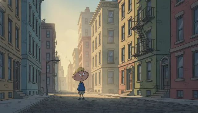
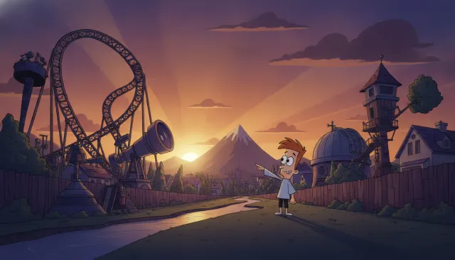
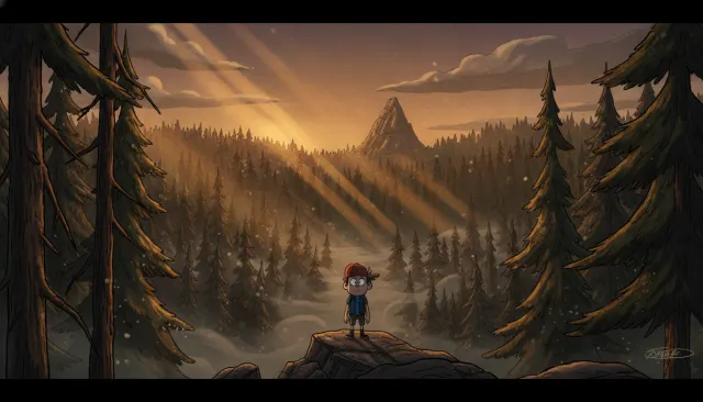
Klasky Csupo studio 90s Nickelodeon irregular linework. Rugrats baby-eye-view living room, wobbly squiggle lines, mottled background texture.
The moves a human crew would use to get here. Cue applies them for you, and knowing their names is how you ask for a change.
Baby characters with proportionally enormous heads, undersized bodies, and anatomical strangeness that communicates childhood from a child's own distorted perspective.
Yellowish greens, dusty oranges, grayish browns, and pale teals - a suburban domestic palette that reads as slightly wrong rather than warmly familiar.
Adult characters designed not as generic exaggerations but with specific, strange anatomical choices that make each feel uniquely awkward.
Frequent low-angle compositions representing how babies experience adult environments - furniture towers overhead, adults are seen from below.
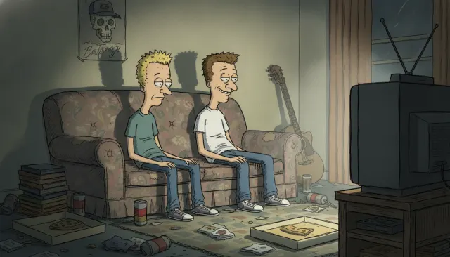
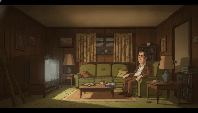
Interiors packed with period-accurate 1990s suburban props rendered with the same slightly acidic palette - nothing is clean or comfortable.
Characters drawn with relatively thin, consistent ink lines that emphasize the strangeness of proportions rather than containing them in thick cartoonish outlines.
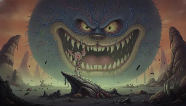
Character and environment design creates low-level unease even in comedic contexts - the visual register hovers between charming and disturbing.
Klasky-Csupo is an animation studio founded by Arlene Klasky and Gábor Csupó in 1982. Their visual aesthetic, most fully expressed in Rugrats (1991-2004), represents one of the most immediately recognizable and deliberately unsettling children's animation styles in American television history. Where contemporaries used bright colors and rounded, appealing forms, Klasky-Csupo built a visual language around misshapen anatomy, sickly color, and a sense of psychological tension barely contained by a children's show framework.
Gábor Csupó's Hungarian background and the studio's early work in music video production (they produced animated sequences for Peter Gabriel and The Simpsons' first episodes) shaped an aesthetic more comfortable with graphic experimentation than mainstream American children's animation. When Arlene Klasky and Paul Germain developed Rugrats for Nickelodeon, they deliberately avoided the 'cute' conventions of contemporary children's animation in favor of something stranger and more neurotic.
The baby characters in Rugrats have genuinely disturbing anatomical proportions when examined objectively: enormous, misshapen heads on undersized bodies, eyes positioned at unexpected heights, mouths that open too wide, and fingers that are either too few or too numerous. The character designs reflect how babies actually experience space - from below, looking up at looming adult forms - but rendered with a designer's eye for maximum strangeness.
Adult characters are equally strange: proportions are caricatured not in a classic editorial cartoon way but in a more idiosyncratic, almost medical-illustration way. Didi Pickles's angular body, Stu's round softness, and Grandpa Lou's hanging jowls are specific and strange rather than generically exaggerated.
The palette is one of the most distinctive in children's animation: not bright primaries but rather slightly acidic, desaturated tones - yellowish greens, dusty oranges, grayish browns, and the specific pale teal of the Pickles' house carpet. This palette communicates a suburban domestic environment where nothing is quite clean and nothing is quite right. The adult world, seen from a baby's-eye-view, is rendered as slightly threatening clutter.
The same basic aesthetic vocabulary was applied across multiple shows: Rugrats (1991), The Wild Thornberrys (1998), Rocket Power (1999), and As Told by Ginger (2000). Each applied the misshapen-anatomy/acidic-palette approach to different settings. John Kricfalusi's Ren & Stimpy (which premiered on Nickelodeon in the same 1991 season) shared some of the same comfort with grotesquerie, creating a Nickelodeon aesthetic identity defined by willingness to unsettle.
Klasky-Csupo's visual style remains a touchstone for animation creators interested in deliberately anti-cute aesthetics. Its influence is visible in Adult Swim's early 2000s output, in the grotesque strains of 2010s internet animation, and in contemporary independent animation that refuses to make its characters appealing in conventional ways.
Arlene Klasky, Gábor Csupó, Paul Germain · 1991
Nickelodeon flagship; baby's-eye-view suburban domestic life with deliberately strange aesthetics
Klasky-Csupo / Arlene Klasky, Gábor Csupó · 1998
Wildlife-documentary family adventure using the same idiosyncratic caricature approach
Klasky-Csupo / Arlene Klasky, Gábor Csupó · 1999
Extreme sports culture for children; same angular character design applied to action
Emily Kapnek · 2000
Teen drama with Klasky-Csupo character design vocabulary; more restrained palette
John Kricfalusi · 1991
Nickelodeon contemporary sharing grotesque visual territory from a different direction
Stig Bergqvist & Paul Demeyer · 2000
Theatrical film extending the visual vocabulary to European settings
A Look is not a filter. It is a set of stored decisions the pipeline reads before it makes a single frame, so two videos in the same Look actually match.