F Is for Family
Bill Burr & Michael Price · 2015
Netflix series; definitive modern use of 1970s suburban animation aesthetic
Bill Burr and Michael Price 1970s Murphy family suburban sitcom. Wood-paneled basements, station wagon palette, Netflix nostalgic adult line.
The moves a human crew would use to get here. Cue applies them for you, and knowing their names is how you ask for a change.
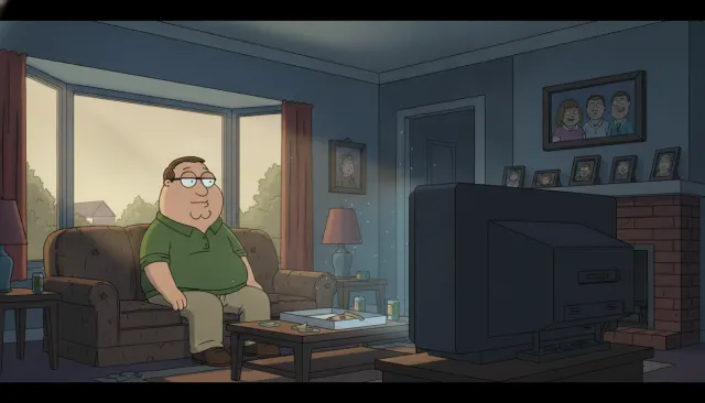
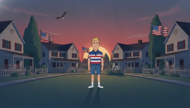
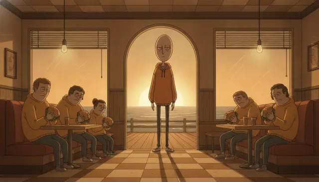
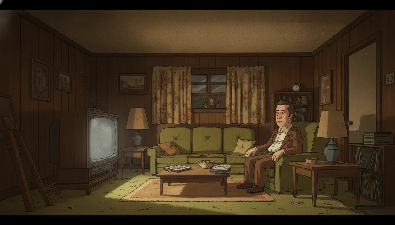
Avocado green, harvest gold, burnt orange, and wood-brown dominate - a palette built from period American consumer goods and 16mm film stock characteristics.
Black ink outlines of uniform weight on all characters, referencing the cel-painting limitations of 1970s broadcast animation.
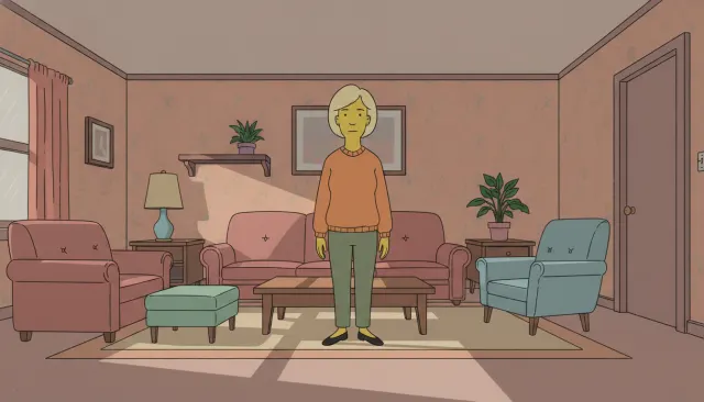
Minimal to zero shading on character fills, with simple highlight dots on glossy surfaces - authentic to the period's budget-driven simplification.
Characters reuse a small library of walk cycles, a deliberate reproduction of 1970s TV animation economy.
Interior backgrounds crammed with period-accurate props: console TVs, rotary phones, plaid furniture, and wood-paneled walls.
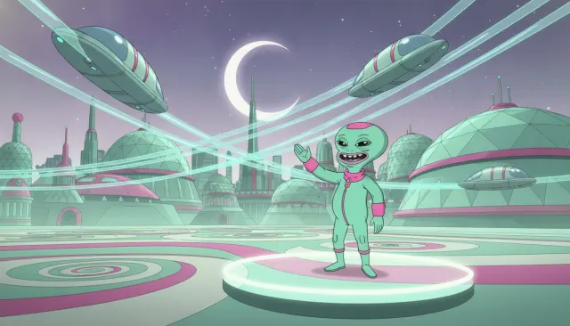
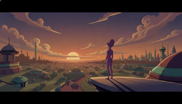
Exterior environments use flat sky gradients and simplified building geometry consistent with period limited-animation background painting.
Frank Murphy-style emotional eruptions use exaggerated color washes and expression holds borrowed from both period cartoons and theatrical acting tradition.
F Is for Family is an adult animated sitcom created by Bill Burr and Michael Price that ran on Netflix from 2015 to 2021. Set in a fictional mid-sized American city in the 1970s, the show follows the Murphy family - working-class, stressed, and culturally representative of the pre-PC American suburbs. The visual style is an intentional act of period recreation: it captures the specific look of Saturday morning and primetime animated television from 1972-1978 rather than simply 'animated.'
The character designs draw directly from the 1970s Filmation and Hanna-Barbera limited-animation tradition but with added production budget. Characters have flat fills with minimal shading, thick black outlines of consistent weight, and expressive but economical faces. Unlike the exaggerated rubber-hose style of 1960s TV cartoons, the 1970s idiom tended toward slightly stockier, more 'realistic' proportions while still being broadly stylized - think All in the Family rendered in animation.
The show's color bible is its most distinctive element. The palette is built from the saturated but slightly dulled colors of period 16mm film: avocado greens, burnt oranges, harvest gold, wood-paneling browns, and sky blues that match period Sears catalogs. Background paintings reference the specific visual texture of 1970s suburban American architecture - split-level ranch homes, plastic lawn furniture, early console televisions, and shag carpeting. The outdoor environments use flat sky gradients without volumetric clouds, consistent with limited animation budget constraints of the era.
The production, animated by Borderline Animation in Dublin, uses modern digital tools to reproduce the specific limitations of 1970s TV animation: reduced frame rates on character secondary motion, limited walk-cycle variety, and mouth animation prioritized over body acting. This is not laziness - it is period-accurate craft. Full animation (Disney-style 24fps with complex pose-to-pose) was largely absent from TV in the 1970s; the show honors that constraint as an aesthetic choice.
The 1970s suburban animation aesthetic captures a specific American cultural moment: blue-collar family life, Vietnam-era anxiety, pre-cable TV monoculture, and a particular variety of aspirational-yet-defeated masculinity. The show uses animation's inherent exaggeration to amplify the period's specific emotional frequencies - Frank Murphy's rage reads more expressively as a cartoon than it would in live action. The style functions as both nostalgia and critique.
Creators use this aesthetic for period-set 1970s content, working-class American storytelling, adult animation with comedic-dramatic tonal range, and any project that benefits from period-specific color associations. The avocado-and-orange palette has also found renewed life in retro interior design content.
Bill Burr & Michael Price · 2015
Netflix series; definitive modern use of 1970s suburban animation aesthetic
Norman Lear · 1971
Live-action reference show whose blue-collar milieu the animation style evokes
Hanna-Barbera · 1972
Direct 1970s animated antecedent; adult-oriented Hanna-Barbera suburban sitcom
Hanna-Barbera · 1960
Foundational Hanna-Barbera limited animation template for suburban family style
Filmation · 1971
Period Filmation style reference for flat-fill 1970s character design
A Look is not a filter. It is a set of stored decisions the pipeline reads before it makes a single frame, so two videos in the same Look actually match.