Journey
thatgamecompany, March 2012 (PS3); PS4 2015, PC 2019
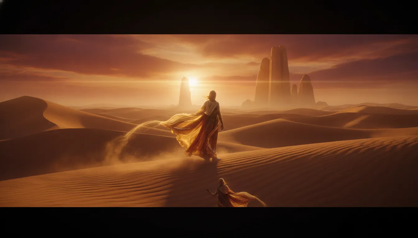
Journey thatgamecompany minimalist desert aesthetic. Jenova Chen flowing-cloth physics, gold-and-amber dune palette, wordless online cooperation, transcendent scale.
The moves a human crew would use to get here. Cue applies them for you, and knowing their names is how you ask for a change.
extreme negative space as design principle
temperature emotional narrative: warm amber for hope, cold blue for dread, blinding white for transcendence
hour lighting angle with particle-level refraction
anonymous protagonist and icon-minimal HUD remove identity barriers
Released in March 2012 by thatgamecompany and directed by Jenova Chen, Journey distilled the video game medium to its philosophical essence: movement, discovery, and connection without a word of dialogue, without a single identified character, without explicit narrative instruction. Its visual design, led by art director Matt Nava, is among the most influential minimalist game aesthetics ever created.
Every design decision in Journey reduces rather than adds. The protagonist is a small red-robed figure with no face, no gender, no name - a pure cipher for the player's projection. The world is a vast desert of warm gold and cream sand dunes rendered with procedural wind-fabric simulation. The only vertical relief is a distant mountain with a radiant beam of white light - the destination, always visible, never rushed toward.
Journey uses color temperature as its primary narrative grammar. The opening desert is warm amber and gold: possibility. As the traveler descends underground, cold blue stone and dormant war-machines create dread. The ascent toward the mountain peak bleaches to white. The game's emotional arc is told in Kelvin degrees, not cutscenes. Nava and the team developed custom shaders for sand that catches golden-hour light at different particle angles, creating a surface that is simultaneously a physical simulation and a painting.
The protagonist's scarf is the game's primary interactive element and its most meaningful visual symbol: it grows as symbols are collected and shrinks in the cold mountain air. The scarf is also how two anonymous online players communicate - by chirping and glowing near each other, their scarves respond. This quiet visual vocabulary of fabric, light, and proximity replaced text chat with a more fundamental language.
Austin Wintory's score, which earned the first Grammy nomination for a video game soundtrack, is choreographed to player motion speed - a visual-audio integration that makes the look and feel inseparable.
Journey's minimal aesthetic has influenced environmental game design, app onboarding UX, meditation app visual language, and fine-art game installations worldwide.
thatgamecompany, March 2012 (PS3); PS4 2015, PC 2019
thatgamecompany, 2009 - the studio's minimal wind-simulation predecessor
Giant Squid (Matt Nava, Journey art director), 2016 - spiritual successor underwater
Thekla Inc. / Jonathan Blow, 2016 - minimalist puzzle-exploration parallel
thatgamecompany, 2019 - Journey's multiplayer spiritual successor for mobile
Devolver Digital / Nomada Studio, 2018 - painterly minimal platformer citing Journey's emotional template
Numinous Games, 2016 - games-as-art emotional journey in Journey's tradition
A Look is not a filter. It is a set of stored decisions the pipeline reads before it makes a single frame, so two videos in the same Look actually match.