JoJo's Bizarre Adventure: Stardust Crusaders
David Production / Hirohiko Araki · 2014
Part 3 that introduced the Stand system and established the anime series' global fanbase
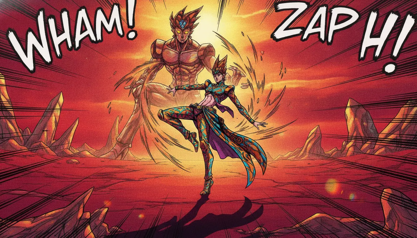
Hirohiko Araki JoJo Bizarre Adventure register. Flamboyant stand poses, hot saturated palette, fashion-runway character design, onomatopoeia overlay, dramatic ink staging.
The moves a human crew would use to get here. Cue applies them for you, and knowing their names is how you ask for a change.
C-curved spine with weight distributed impossibly, limbs extended against anatomical resistance -- a fashion-photography-derived static statement of character identity
Purple, orange, and green skin tones applied without in-universe justification as pure stylistic assertion, particularly prominent in Parts 5 and 6
DOGA DOGA, MUDA MUDA -- onomatopoeic effects rendered as massive bold typefaces integrated into the scene's composition as design elements
Outfits designed as real clothing objects with fabric pattern, accessory layering, and silhouette logic referencing luxury fashion -- Versace, Moschino -- more than anime convention
Each character's supernatural Stand power has a distinct color identity that tints nearby effects and environmental interactions, creating character-branded visual signatures
Scene transitions using circular iris wipes and hard-edge geometric panel borders that reference the manga's page composition
Extended pose-held staredown sequences where opponents assess each other without moving, building tension through stillness and close-up cycling
Hirohiko Araki began publishing JoJo's Bizarre Adventure in Weekly Shonen Jump in 1987, creating one of manga's most visually distinctive aesthetics. David Production's 2012 anime adaptation and subsequent seasons (Parts 2-6 through 2022) translated Araki's evolving art style into animation, preserving and amplifying its defining characteristics: anatomically impossible poses, fashion-forward character design, and an operatically excessive use of color.
The JoJo pose is the aesthetic's foundational technique: characters twist their bodies into contortions that ignore anatomical plausibility in favor of maximum visual impact. Poses reference Western fashion photography (Araki cites Versace campaigns and Michelangelo's sculptures), resulting in characters with C-curved spines, weight distributed improbably, and limbs extended in directions human joints resist. These poses function as character statement -- a JoJo pose communicates personality, threat level, and stylistic identity simultaneously.
Araki's manga-coloring style evolved dramatically across the series' eight parts. Parts 1-2 use relatively conventional shonen palettes; by Parts 5 (Golden Wind, 2018-2019) and 6 (Stone Ocean, 2021-2022), skin tones shift to purple, green, and orange, outfits combine clashing primaries, and the color choices become deliberately anti-realistic. David Production's anime faithfully translates this, with Netflix's Stone Ocean using particularly saturated, poster-flat coloring.
Araki's manga introduces sound effects as typographic design elements: enormous kanji rendered in bold brushstroke styles integrated into the composition. The anime translates these as animated caption cards with period-specific typefaces. Color-panel transitions and iris wipes nod to the panel borders of the source material.
JoJo's influence on streetwear and high fashion is documented: Gucci, Versace, and numerous J-fashion brands have referenced it. Characters' outfits are designed to be worn, not just watched -- detailed fabric patterns, accessory layering, and silhouettes that shift each part to reflect changing fashion eras.
David Production / Hirohiko Araki · 2014
Part 3 that introduced the Stand system and established the anime series' global fanbase
David Production · 2018
Part 5 set in Italy, considered the visual peak of the series' fashion-forward costume and color design
David Production / Netflix · 2021
Part 6 with the most saturated poster-flat color treatment in the anime series to date
Hirohiko Araki · 1987
Ongoing source manga now in Part 9, continuously evolving Araki's visual style across 35+ years
David Production · 2020
Short-series spinoff showcasing the aesthetic in horror-adjacent standalone stories
Hirohiko Araki / Gucci · 2011
Fashion brand collaboration confirming the series' documented influence on luxury fashion aesthetics
A Look is not a filter. It is a set of stored decisions the pipeline reads before it makes a single frame, so two videos in the same Look actually match.