ERA CLASSIC ANIME EXPANDED · 2000S · JAPAN
2000s Naruto Shippuden Modern Shonen
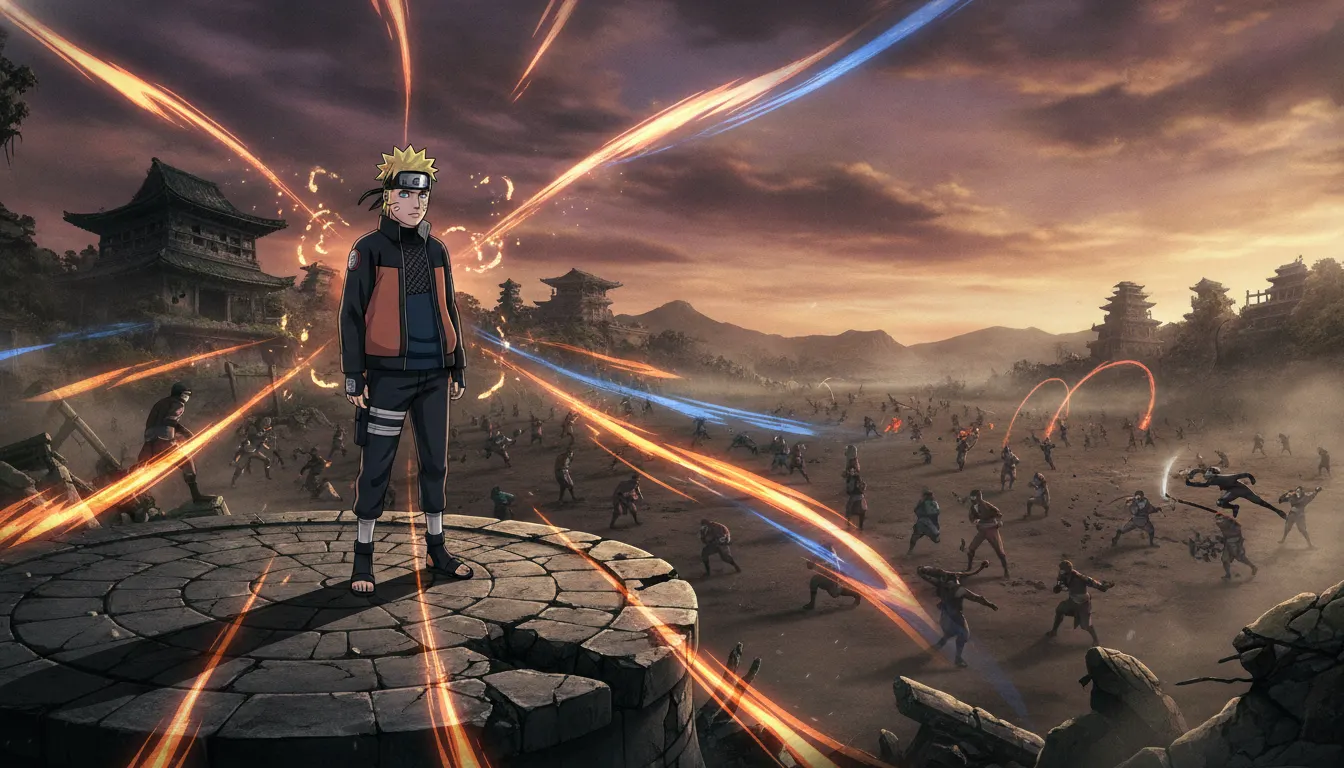
Mid-to-late-2000s Naruto Shippuden modern shonen register. Polished digital cel, hot chakra effect frames, time-skip mature character design, sweeping ninja battle staging.
shonenmaturekineticepic
LUT shippuden-modern-shonen
WHEN TO USE
- Action or training content targeting millennial and Gen-Z audiences with anime familiarity
- Thumbnail and short-form content that needs immediate visual energy and bold contrast
- Brand narratives around determination, rivalry, and coming-of-age (sports, fitness, gaming channels)
- Tutorial or explainer content that benefits from expressive character reactions and reaction-face panels
- Gaming content with ninja, stealth, or RPG themes
- Nostalgia-driven campaign content referencing early 2000s internet and streaming culture
WHEN NOT TO USE
- Luxury, fashion, or high-end product positioning where the bold, flat style reads as juvenile
- Corporate B2B or finance content where audience expects restraint and professionalism
- Horror or dark psychological content where Shippuden's warm energy palette undermines tone
- Documentary or journalistic content requiring photographic realism
SIGNATURE TECHNIQUES
How the look is made.
The moves a human crew would use to get here. Cue applies them for you, and knowing their names is how you ask for a change.
- 01Bold black ink outlines with variable weight, thicker on silhouette edges
- 02Three
value cel shading: bright fill, flat mid-tone, deep shadow with minimal gradient
- 03Speed lines radiating from impact points during action sequences
- 04Glowing chakra energy effects in cyan, orange, or elemental color signatures
- 05Expressive facial distortion
chibi-mode comedy faces alternating with intense close-ups
- 06Headband and forehead protector iconography as character identity shorthand
- 07Dynamic camera angles during fight sequences
Dutch tilts, low-angle power shots
HISTORY & CONTEXT
Where it comes from.
Naruto Shippuden and the Modern Shonen Aesthetic (2000s)
The Naruto Shippuden era (2007-2017, TV Tokyo / Studio Pierrot) codified what audiences worldwide recognize as the definitive modern shonen visual language. Based on Masashi Kishimoto's manga serialized in Weekly Shonen Jump from 1999, the franchise set technical and narrative benchmarks that an entire generation of animators grew up watching.
Visual Foundation and Character Design
Kishimoto's character design philosophy married traditional ninja iconography with contemporary fashion sensibility. Protagonist Naruto Uzumaki's orange tracksuit became one of anime's most recognizable silhouettes. The series introduced a bold three-value lighting model: bright ambient fill, saturated mid-tone, and a deep ink shadow with minimal gradient blending. Faces use exaggerated expressive eyes during emotional beats while collapsing to simple two-dot pupils during comedy, a technique Kishimoto inherited from Akira Toriyama's Dragon Ball (Toei Animation, 1986).
Action Choreography and FX Animation
Shippuden elevated shonen fight animation to cinematic quality. Director Masahiko Minami and series composition by Yasuaki Kurotsu brought in specialist animators for key battles. Episode 166-167, the Pain invasion arc (2009), showcased rough, kinetic FX work from animator Norio Matsumoto, whose fluid smear frames and overlapping action redefined TV anime fight choreography. Chakra effects introduced glowing energy signatures in cyan and orange, layered over ink-outline foreground characters - a technique now standard across the genre.
Color Palette and Environmental Design
The series uses a desaturated earth-tone background palette punctuated by violent color accent during jutsu activation. Village Konoha is rendered in warm ochres and forest greens; underground cave sequences drop to near-monochrome blues. This environmental color language was formalized by color designer Atsuko Nakamura and became a production template across Studio Pierrot's subsequent shonen productions.
Influence on the Genre
By 2010, Naruto had sold over 200 million manga volumes globally. The visual aesthetic it established - bold ink outlines, speed-line action panels, glowing chakra energy, highly expressive facial distortion for comedic moments - became the entry point for international audiences discovering anime. Series including Bleach (Studio Pierrot, 2004), Fairy Tail (A-1 Pictures / Satelight, 2009), and later My Hero Academia (Bones, 2016) all build on the Shippuden visual template while adding their own studio signatures.
Modern Usage in Content Creation
The Shippuden aesthetic remains highly legible to audiences aged 18-35. Speed lines, headband-wearing protagonists, and glowing jutsu effects appear in brand campaigns, YouTube thumbnails, and social video content referencing late-2000s nostalgia. The orange-and-blue complementary color scheme is particularly effective for action-forward content.
NOTABLE WORKS
Where you have seen it.
*Naruto Shippuden* anime, Studio Pierrot, TV Tokyo, 2007-2017 (500 episodes)
*Naruto: Road to Ninja* film, Studio Pierrot, 2012
*Boruto: Naruto Next Generations*, Studio Pierrot, 2017-2023
*Fairy Tail* by Hiro Mashima, A-1 Pictures / Satelight, 2009
*My Hero Academia* by Kohei Horikoshi, Bones, 2016 (inherits shonen template)
*Black Clover* by Yuki Tabata, Pierrot, 2017
*Demon Slayer: Kimetsu no Yaiba* by Koyoharu Gotouge, ufotable, 2019 (next-gen evolution)
THE RECIPE
The exact knobs
the renderer turns.
A Look is not a filter. It is a set of stored decisions the pipeline reads before it makes a single frame, so two videos in the same Look actually match.
SettingValue
GradeColour LUT applied to every frame
shippuden-modern-shonenTransitionHow one shot becomes the next
hard cuts · 160ms · ease-outKen BurnsCamera move applied to stills
Slow push · 0.07 · centerTypographyDisplay / body / mono pairing
Sawarabi Mincho · Inter · JetBrains MonoMusic moodWhat the bed under the voice sounds like
shonen-anthemic · taiko-orchestralPrompt suffixAppended to every shot prompt in this Look
2000s Naruto Shippuden modern shonen anime, polished digital cel, hot chakra effect frames, time-skip mature design, sweeping ninja battle stagingPALETTE
Primary
#F97316
Secondary
#1E40AF
Accent
#FACC15
Text/Light
#1A140E
Text/Dark
#F4ECDC
BG 900
#10100A
BG 800
#1F1810
RELATED LOOKS
Next to it on the shelf.
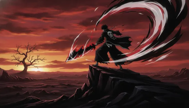 Era Classic Anime Expanded90s Bleach Shinigami Aesthetic
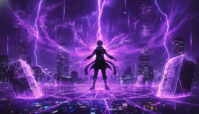 Era Classic Anime Expanded2020s Jujutsu Kaisen Cursed Energy
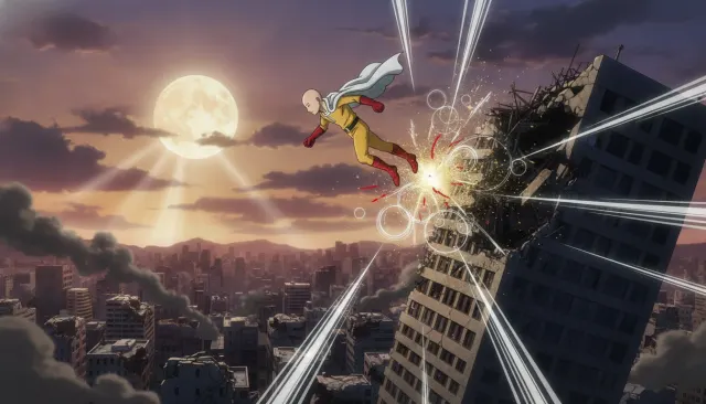 Era Classic Anime Expanded2010s One Punch Man Bouncing Comic
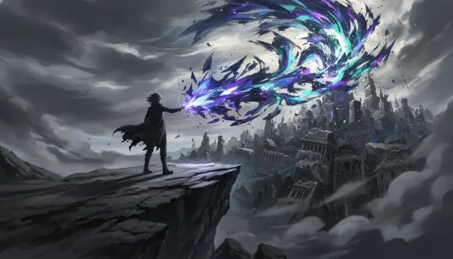 Studio Aesthetic ExpandedBones Studio Mob Psycho Action
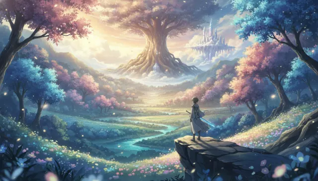 Studio Aesthetic ExpandedA-1 Pictures Sword Art Online
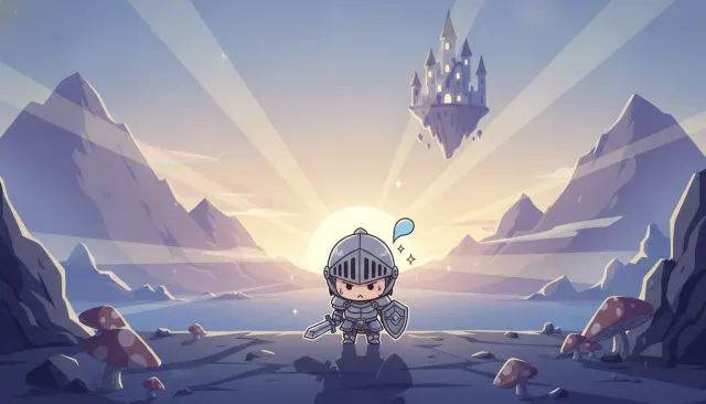 Subgenre ChibiChibi Super Deformed
Your first cut
is on us.
+ New videoFree plan · no card · 1080p export