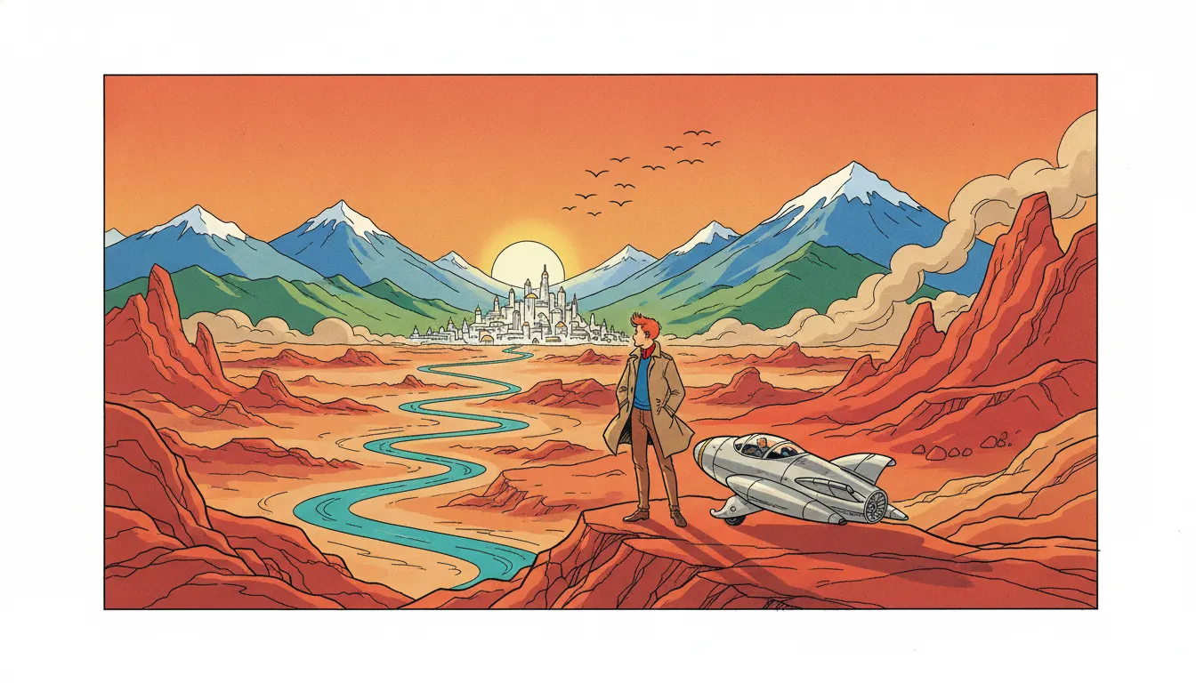
Tintin in the Land of the Soviets
Hergé (Georges Remi) · 1929-1930
First Tintin album; serial in Le Vingtième Siècle; pre-ligne claire visual style
Herge Tintin ligne claire Belgian school. Uniform unmodulated outline, flat unbroken color planes, no shading, mid-century adventure-album look.
The moves a human crew would use to get here. Cue applies them for you, and knowing their names is how you ask for a change.
A single consistent ink line of equal thickness describes all elements - figure outline, facial feature, shadow edge, architectural detail, background environment - without hierarchical variation.
Color areas filled flat with no gradation, shading, or texture within the area - shadow and light implied by tonal contrast between adjacent flat areas rather than within them.
Protagonists drawn with semi-abstract facial treatment (large simplified eyes, minimal detail) against realistically detailed environments - creating broad identification while grounding the story.
From The Blue Lotus (1936) onward, backgrounds and props drawn from photographic and archival research - Chinese architecture, Scottish islands, Himalayan valleys rendered with documentary accuracy.
Panel compositions borrowing from cinema: establishing wide shot, medium two-shot, close-up on reaction - a vocabulary that makes the reading experience feel like edited film.
Figures and environments rendered with equal care and line quality, preventing the background from becoming a flat stage flat behind the action.
Ligne claire (clear line) is the name given to the drawing style developed by Belgian cartoonist Georges Remi (1907-1983), who worked under the pen name Hergé, in the Tintin series that ran from 1929 to 1986. The term was coined retroactively by Dutch cartoonist Joost Swarte in 1977 to describe the visual approach Hergé had been developing across five decades: a uniform ink line of consistent weight outlining all elements of the image, combined with flat color fills and compositions in which figures and environments are rendered with equal visual weight and clarity.
Hergé's Tintin began as a weekly strip in the Belgian Catholic newspaper Le Vingtième Siècle on January 10, 1929, with Tintin in the Land of the Soviets. The character - a young Belgian reporter accompanied by his fox terrier Milou (Snowy) - became the subject of 24 completed albums published by Casterman, with two left incomplete at Hergé's death.
The visual style evolved substantially between 1929 and the mature period. The early black-and-white strips used varied line weight; by The Blue Lotus (1936), the first album substantially researched for factual accuracy (with assistance from Tchang Tchong-jen, a Chinese art student in Brussels), the ligne claire vocabulary was established: uniform line weight, flat color, cinematic composition, and a commitment to research-based environmental detail that made the fictional adventure stories visually documentary in their background accuracy.
Tintin in Tibet (1960) is widely considered the finest album: Hergé at the height of his visual development, the Himalayan mountain environment rendered in precise environmental research, and the narrative at its most emotionally direct. The Castafiore Emerald (1963) is the formal experiment - an adventure story in which almost nothing happens, set entirely in the Marlinspike Hall estate, working as a detective novel in which the audience gradually realizes there is no crime.
Other essential albums: The Calculus Affair (1956), a Cold War thriller; The Black Island (1937, revised 1965 with photographic research from Scotland); The Secret of the Unicorn / Red Rackham's Treasure (1943-44), the Marlinspike Hall duology introducing Captain Haddock's ancestral home.
The defining visual properties: uniform ink line of equal weight regardless of whether it describes a figure's outline, a facial feature, a shadow edge, or a background detail; flat color fills with no gradation or shading within areas; clear spatial separation of figure and ground through tonal contrast rather than atmospheric perspective; visual equality between characters and environments (a character's face and the brick wall behind them are drawn with the same care and line quality); and the quality of featurisation - the semi-abstract treatment of main characters (large eyes, minimal facial detail) against realistically detailed environments.
Hergé (Georges Remi) · 1929-1930
First Tintin album; serial in Le Vingtième Siècle; pre-ligne claire visual style
Hergé · 1936
First album with research-based environmental accuracy; ligne claire fully established
Hergé · 1943
Introduces Marlinspike Hall; Captain Haddock's back story; the Tintin world at full cast development
Hergé · 1960
Widely considered the finest album; Himalayan research; most emotionally direct narrative
Hergé · 1963
Formal experiment: an adventure story set entirely in one location in which nothing happens; detective novel structure
Hergé · 1956
Cold War thriller; European landscape research; ensemble cast at full development
Hergé · 1965
Scotland location research; Hergé and studio revisit an early album with photographic accuracy standards
A Look is not a filter. It is a set of stored decisions the pipeline reads before it makes a single frame, so two videos in the same Look actually match.
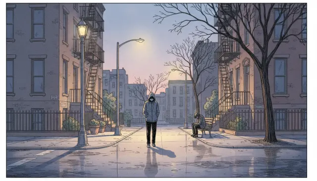 Illustrators ExtendedAdrian Tomine Clean Graphic Novel
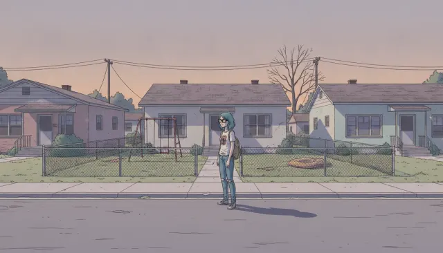 Illustrators ExtendedDaniel Clowes Deadpan Suburban Comic
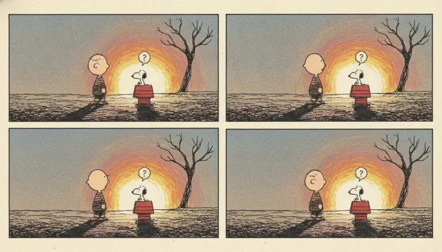 Illustrators ExtendedCharles Schulz Peanuts Minimalist Strip
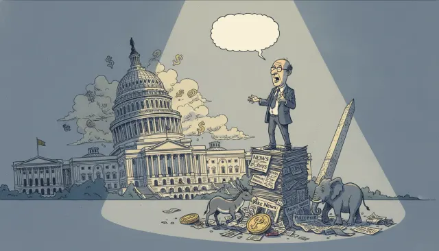 Illustrators ExtendedGarry Trudeau Doonesbury Political Strip
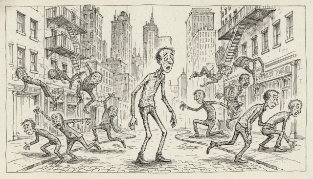 Illustrators ExtendedJules Feiffer Political Cartoon Line
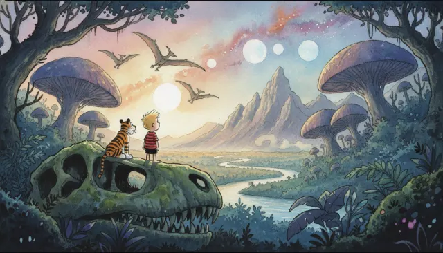 Illustrators ExtendedBill Watterson Calvin Hobbes Painted Sunday