The Legend of Zelda: The Wind Waker
Nintendo EAD / Eiji Aonuma · 2002
Defining text of GameCube vibrant cell: Ghibli-influenced ocean world with hard toon shading and expressive character design
GameCube vibrant cel-shaded era. Wind Waker bright cel-shade, Metroid Prime FPS shine, Smash Bros cartoonish 3D.
The moves a human crew would use to get here. Cue applies them for you, and knowing their names is how you ask for a change.
Two or three discrete light bands replacing smooth gradients, creating the cel animation light-to-shadow snap
Slightly enlarged back-face-culled shell rendered in black to produce character outline without post-process overdraw
Animation holds on exaggerated character poses at emotional beats, referencing 2D animation timing charts rather than motion capture data
Environment color schemes built on strong complementary pairs -- ocean blue / gold, leaf green / alien purple -- for immediate visual harmony
Toon shader specular placed by artists at a fixed screen-space position, giving characters a consistent 'shine' regardless of light direction
Exaggerated body deformation on impacts and jumps borrowed from 2D animation principles, reinforcing the hand-crafted feel
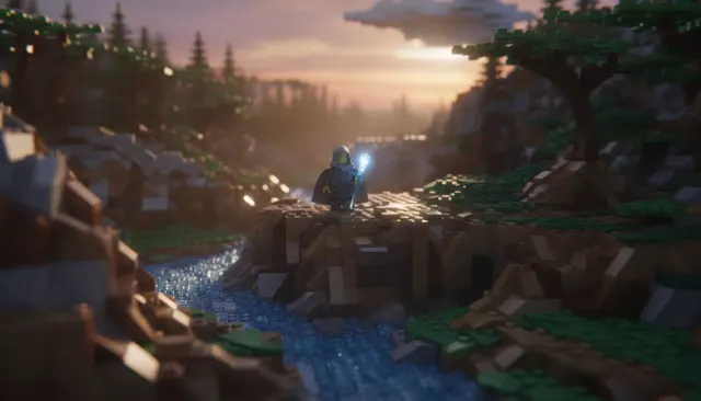
The Nintendo GameCube era (2001-2006) produced a distinctive cluster of stylized 3D aesthetics that stood apart from the hyper-realism race dominating PlayStation 2 titles. Art directors at Nintendo EAD and second-party studios deliberately pushed toward painterly, vibrant cel-influenced looks that aged far more gracefully than their polygon-accurate counterparts. Wind Waker (2002, directed by Eiji Aonuma) is the defining text: a Ghibli-influenced toon-shaded world that drew controversy on reveal but became a benchmark of intentional artistic direction over technical showcase.
GameCube vibrant cell renders use a two-tone or three-tone shading model where light-to-shadow transitions are hard-stepped rather than smoothly graduated, creating the flat-fill look of animation cels. Edge outlines are drawn via inverted-hull or post-process passes. Specular highlights are placed manually or via toon shaders rather than physically derived, giving artists precise control over where the 'shine' lives on each surface.
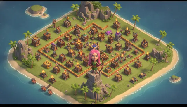
Palettes are saturated and complementary - Wind Waker's ocean blues against the golden Triforce yellows; Pikmin's (2001) leaf greens against the alien purple of enemy creatures. Environments use bold shape language: chunky trees, round rocks, simplified architecture that reads immediately in a low-poly budget without feeling incomplete. Cel-shading hides polygon count; a 500-triangle character can read as charming rather than underpowered.
Character animation in this era emphasized squash-and-stretch and hold poses over motion-capture naturalism. Link in Wind Waker uses exaggerated eye expressions that became a foundational template for expressive game character design. Kirby Air Ride (2003), Luigi's Mansion (2001), and Super Mario Sunshine (2002) each applied the vibrant-cell approach to different genre conventions, proving its versatility.
The GameCube vibrant cell look directly influenced Breath of the Wild's art direction (2017), Okami (Capcom, 2006), and the entire indie toon-shader revival of the 2010s-2020s.
The Wind Waker's cel-shaded look was revealed at Nintendo Space World 2001 to audience confusion -- fans expecting a continuation of Ocarina of Time's darker realism were confronted with a cartoon ocean. Nintendo EAD's decision to proceed despite the backlash is now studied as a case study in artistic conviction over market research. The game's release reception was mixed commercially but unanimous critically, and its reputation has only grown in the two decades since: it consistently appears on lists of the most beautifully designed games ever made.
GameCube hardware had a fixed graphics budget that made hyper-realism genuinely impossible against PlayStation 2 competition. The vibrant cell approach reframed the hardware limitation as a creative strength: by committing to a stylized look that didn't ask the hardware to simulate reality, Nintendo EAD could devote GPU cycles to environmental scale, draw distance, and particle density that technical-showcase games could not afford. The aesthetic wasn't a consolation prize for low polygons -- it was a discovery about what games could be when freed from the mimesis race.
Nintendo EAD / Eiji Aonuma · 2002
Defining text of GameCube vibrant cell: Ghibli-influenced ocean world with hard toon shading and expressive character design
Nintendo EAD / Shigeru Miyamoto · 2001
Leaf-green saturated world where toon shading made hundreds of tiny characters legible simultaneously
Nintendo EAD · 2001
Dark-but-vibrant cel-lit ghost-hunting adventure demonstrating the range of the style beyond bright daylight settings
Nintendo EAD · 2002
Tropical vibrant-cell world that pushed the palette toward warm sunset hues and water caustic effects
HAL Laboratory · 2003
Racing title applying vibrant cell aesthetics to vehicle-based gameplay with stark sky gradients
Nintendo EAD · 2006
Late-era deliberate departure from vibrant cell toward darker realism, illustrating what the style was consciously moving away from
A Look is not a filter. It is a set of stored decisions the pipeline reads before it makes a single frame, so two videos in the same Look actually match.