And to Think That I Saw It on Mulberry Street
Dr. Seuss (Theodor Geisel) · 1937
Debut children's book establishing the wonky-line visual world
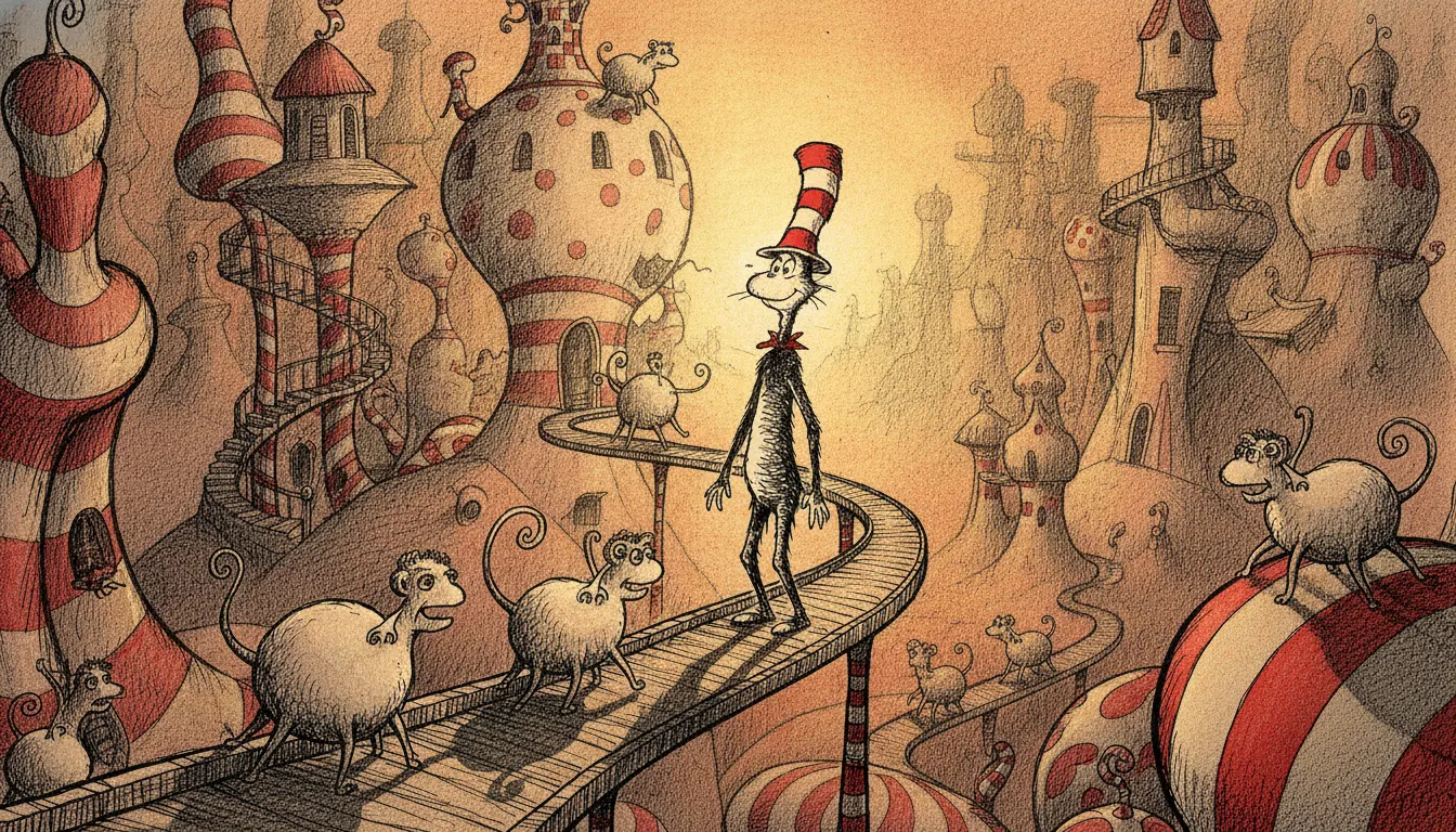
Dr Seuss Cat in the Hat wonky pen line. Curved improbable architecture, red-white striped hat, anapestic-rhyme creature menagerie.
The moves a human crew would use to get here. Cue applies them for you, and knowing their names is how you ask for a change.
Buildings, walls, and floors drawn with gentle bows and tilts, defying structural logic to create a sense of benevolent physical impossibility.
Characters feature long necks, oversized heads, expressive eyebrows, and limb proportions that defy human anatomy while remaining warmly readable.
Hats, objects, and food piled improbably high, exploiting vertical space as a comedy and wonder device.
Solid areas of primary and secondary hues with no gradation, using tight palettes (often 2-3 colors per spread) to maximize visual clarity.
Vegetation rendered as large circular pom-pom canopies on thin single trunks - a proprietary plant vocabulary that functions as a biome marker.
Text designed to feel continuous with the illustration, maintaining the organic line quality of the drawings rather than sitting as a separate typographic layer.
Theodor Seuss Geisel (1904-1991), writing and drawing as Dr. Seuss, created a visual language so distinct it became a genre category of its own: organic, slightly unstable line work in which nothing is quite parallel or perpendicular, producing a world that feels physically impossible yet spatially coherent.
Geisel studied at Dartmouth and briefly at Lincoln College, Oxford before abandoning academia for commercial illustration. His earliest work appeared as advertising cartoons in the 1920s-30s, but the children's book voice emerged fully with And to Think That I Saw It on Mulberry Street (1937). The breakthrough works that defined the visual style came in the late 1950s: The Cat in the Hat (1957), written under a deliberate vocabulary constraint of 236 sight words, and Green Eggs and Ham (1960), restricted to 50 unique words.
The visual system these books established is immediately recognizable: tall, unstable architecture that leans at angles defying physics; creatures with elongated necks and expressive eyebrows; hats stacked improbably high; vegetation drawn as oversized Dr. Seuss trees - circles of foliage on impossibly thin trunks. How the Grinch Stole Christmas (1957) and The Lorax (1971) extended the vocabulary into more overtly political territory without departing from the visual grammar.
The defining technical property is the deliberate avoidance of straight lines. Walls bow slightly; floors undulate; every vertical has a gentle lean. This is not clumsiness but systematic stylization - a world where the laws of physics are suspended in favor of emotional logic. Buildings seem about to tip over, amplifying the unease or excitement of the narrative moment.
Color in Seuss is simple and flat - areas of solid primary or secondary hue without gradation, bounded by the same wonky ink line. The palette is typically limited per spread: red and white for the Cat's hat against a grey winter world; Grinch green against snowy Whoville. This restraint makes the color choices feel absolute rather than decorative.
Type integrates into the drawings: Seuss's hand-lettered or closely-set type feels like part of the illustration rather than a caption overlaid upon it.
The Seuss visual language is probably the most widely recognized children's illustration style in North American culture, referenced in theme park environments (Universal's Seuss Landing), animated adaptations (the Chuck Jones television special How the Grinch Stole Christmas, 1966), and countless parody contexts. Its combination of accessible simplicity with architectural instability makes it a powerful signal for wonder, humor, and benevolent chaos.
Dr. Seuss (Theodor Geisel) · 1937
Debut children's book establishing the wonky-line visual world
Dr. Seuss · 1957
Defining text; 236-word vocabulary constraint, red-and-white palette against grey domestic world
Dr. Seuss · 1960
50 unique words; most concise demonstration of Seuss visual grammar
Dr. Seuss · 1957
Green-on-white palette; the visual vocabulary applied to moral fable
Dr. Seuss · 1971
Environmental allegory; the Seuss tree design at its most iconic
Dr. Seuss · 1990
Final major work; the visual vocabulary used for adult graduation messaging
A Look is not a filter. It is a set of stored decisions the pipeline reads before it makes a single frame, so two videos in the same Look actually match.