Bauhaus Ausstellung poster
1923
Herbert Bayer
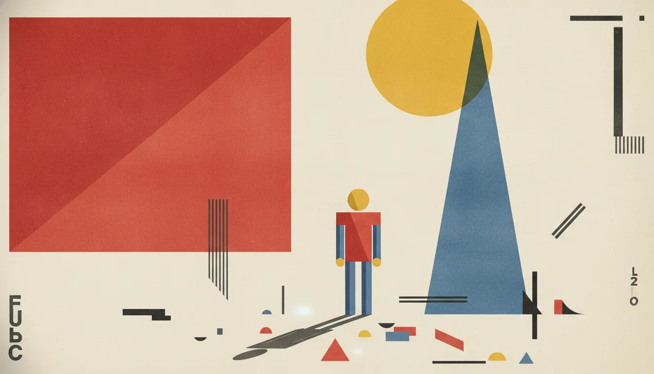
Bauhaus graphic design. Primary geometry, Herbert Bayer Universal type, red square / blue triangle / yellow circle, asymmetric typography.
The moves a human crew would use to get here. Cue applies them for you, and knowing their names is how you ask for a change.
red, yellow, blue on white or black fields
serif typography, often tightly tracked uppercase
The Bauhaus school, founded by Walter Gropius in Weimar in 1919, produced the most influential design philosophy of the 20th century. Its graphic output - posters, books, exhibitions, typography - established a visual grammar still legible in contemporary digital design. The school operated in three cities: Weimar (1919-1925), Dessau (1925-1932), and Berlin (1932-1933), until the Nazis forced its closure. In 14 years it compressed a century of modernist thought.
The Bauhaus grid is not merely a layout tool; it is an argument. Johannes Itten's preliminary course introduced students to the tension between systematic structure and intuitive expression. Paul Klee taught theory of form. Wassily Kandinsky taught color theory. Together they built a pedagogy where every design decision was interrogated for necessity.
László Moholy-Nagy, who joined in 1923, brought constructivist influence and photography. His photomontages and typographic compositions used the grid as a dynamic field where text and image collided at angles. The diagonal - almost absent from Swiss modernism that followed - was a Bauhaus signature, implying movement and force.
Herbert Bayer, who studied and then taught at Bauhaus from 1921 to 1928, designed the Universal typeface in 1925. The typeface abolished capital letters - Bayer saw uppercase as unnecessary bourgeois convention - and reduced letterforms to geometric primitives: circles, arcs, and straight lines. It was the first serious attempt to design a typeface purely on rationalist principles. Universal was never widely produced commercially, but it became the template for later geometric sans-serifs including Paul Renner's Futura (1927).
The Bauhaus primary palette - red, yellow, blue, with black and white as structural elements - was codified through Kandinsky's color theory and Itten's contrast studies. Primary colors on white ground with black rules became a visual shorthand for the school's values: clarity, rationality, universality. The circle, triangle, and square as Bayer's famous 1923 poster form the geometric vocabulary underneath all Bauhaus graphic work.
1923
Herbert Bayer
1925
Herbert Bayer
László Moholy-Nagy (1926-1929)
1923
Bauhaus Dessau
1927
1925
applying Bauhaus form principles to furniture
Walter Gropius (1925-1926)
1937
A Look is not a filter. It is a set of stored decisions the pipeline reads before it makes a single frame, so two videos in the same Look actually match.