Arnold Skolnick
1969
Woodstock Festival official poster
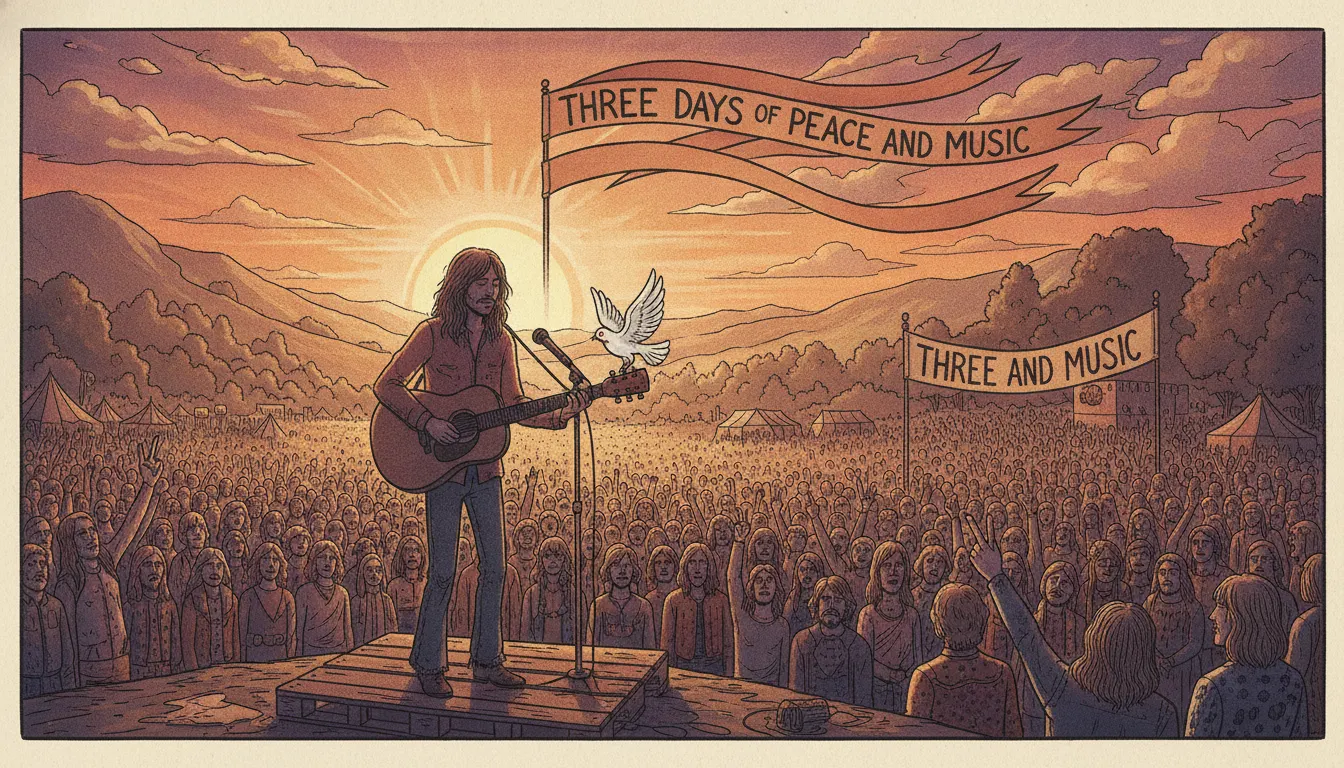
Woodstock 1969 Arnold Skolnick festival poster. White dove on guitar neck, three days of peace and music, hand-drawn folk-festival flat illustration.
The moves a human crew would use to get here. Cue applies them for you, and knowing their names is how you ask for a change.
tone palette: warm brown, olive green, cream, ochre, terracotta - no neon, no fluorescent
lettered organic typography: letters that curve, vary in thickness, and integrate with the image rather than sitting in a separate typographic zone
a single clear symbolic object (dove, guitar, sun, hand) at the compositional center
color moves from dark at edges to light at center or from warm to cool through the sky
lettered face, integrated into the poster as a design element
The Woodstock Music and Art Fair ran August 15–18, 1969, at Max Yasgur's farm in Bethel, New York, drawing an estimated 400,000 attendees. Its official promotional poster - designed by Arnold Skolnick (b. 1935) in 1969 - became one of the most recognized graphic design objects of the 20th century. Unlike the psychedelic neon visual acid of San Francisco's Fillmore and Avalon Ballroom posters (Wes Wilson, Victor Moscoso, Stanley Mouse, 1966–1968), Skolnick's Woodstock image is quieter, more folk-oriented, and ultimately more durable.
Skolnick was commissioned to design the poster with minimal brief and turnaround time. The central image - a white dove perched on the neck of a guitar against a graduating earth-tone background - was reportedly inspired by a parakeet Skolnick owned. The lettering is hand-drawn in an organic, slightly irregular style, the letters curving and adapting to the composition rather than sitting in a rigid grid. The color palette is earthy: warm brown, olive green, pale gold, cream, with no psychedelic neon. The result feels like a document of the folk revival rather than the acid rock scene, emphasizing peace over energy, nature over urban speed.
The poster text is meticulous in its specificity: "3 Days of Peace and Music" is the tagline; every major performer is listed. The graphic hierarchy moves from the dove-guitar image to the festival name to the tagline to the lineup, in a single clean read.
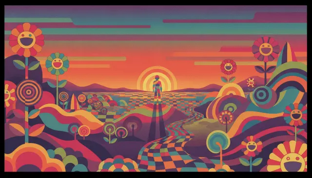
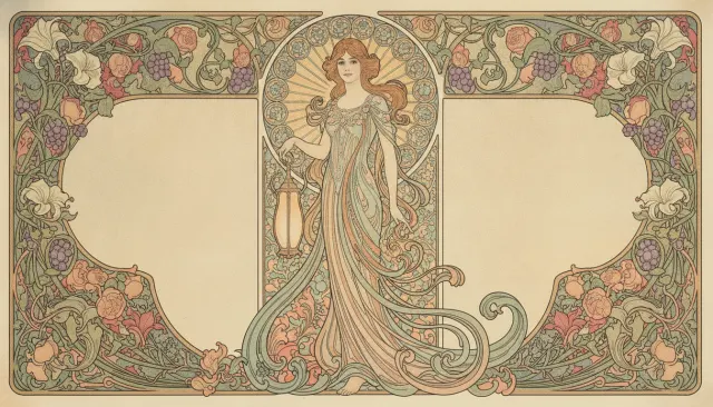
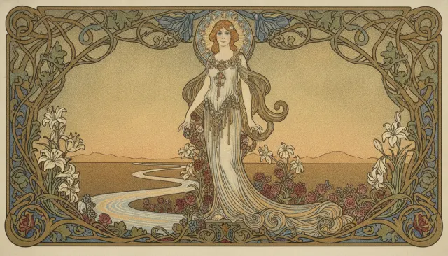
The Woodstock poster belongs to a family of late-1960s folk and counterculture graphic work that drew on different sources than the Fillmore psychedelia. Where Fillmore posters applied Art Nouveau lettering and color vibration at the limits of legibility, the folk-poster tradition prioritized organic form, earthier palette, and a connection to nature and handcraft that aligned with the environmental and back-to-the-land movements emerging at the same time.
Key adjacent visual sources: the Whole Earth Catalog (first issue September 1968, design by Stewart Brand and others), which used a plain, utilitarian grid but positioned its content within an ecological worldview; Rolling Stone magazine's early covers (Ethan Russell, Baron Wolman); and the hand-lettered community posters of Haight-Ashbury and the San Francisco Oracle.
The 1970 Woodstock documentary film (directed by Michael Wadleigh) extended the visual language into motion: split-screen multi-image compositions, grainy super-8 and 16mm footage, a color temperature that is always slightly warm and golden. The film won the Academy Award for Best Documentary Feature and defined the visual grammar of the "rock documentary" genre.
The dove-on-guitar image has been reproduced on merchandise in quantities that rival any commercial logo. Its formal simplicity - a recognizable bird on a recognizable instrument, no complex composition required - makes it endlessly reproducible. As a look for video content, the Woodstock folk-poster register communicates authentic community, ecological awareness, and a specifically American strain of idealism that remains aspirationally potent.
1969
Woodstock Festival official poster
1970
Woodstock documentary film
Fillmore Auditorium posters for Jefferson Airplane, Grateful Dead (1966–67)
Neon Rose concert poster series (1966–68)
Skull and Roses (Grateful Dead poster, 1966)
Altamont concert poster (1969, dark counterpart to Woodstock)
A Look is not a filter. It is a set of stored decisions the pipeline reads before it makes a single frame, so two videos in the same Look actually match.