Andre the Giant Has a Posse -- original sticker, RISD skateboarding culture
1989
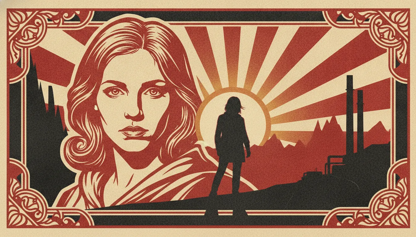
Shepard Fairey OBEY Andre the Giant poster art. Cream-red-black palette, propaganda-style portrait, decorative ornament border.
The moves a human crew would use to get here. Cue applies them for you, and knowing their names is how you ask for a change.
contrast, posterised photographic portraits reduced to two to four flat colour areas simulating stencil cuts
serif typography (often Bank Gothic or similar) as a structural compositional element
screen patterns as texture within flat colour areas
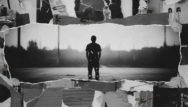
paste aesthetic: apparent paper tears, paste residue, and layering as design features
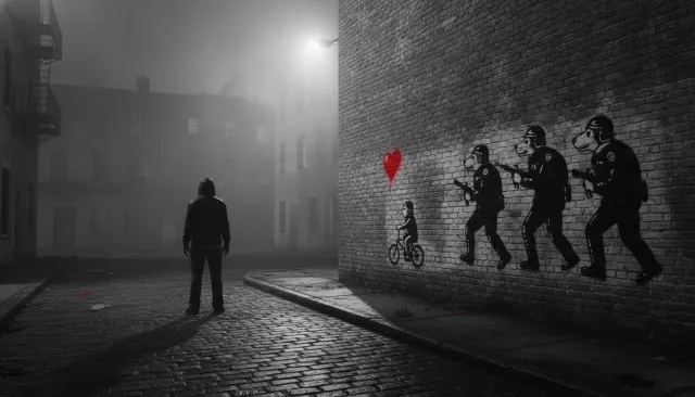
Shepard Fairey (born 1970) developed one of the most distinctive and widely reproduced graphic styles of the late 20th and early 21st centuries -- a visual language that fuses Soviet Constructivist poster aesthetics, stencil street art, and a marketing-savvy deployment of symbolic imagery across both public space and commercial design.
Fairey's career began at the Rhode Island School of Design in 1989, when he created a sticker based on a newspaper photograph of professional wrestler André the Giant (1946-1993), with the text "ANDRE THE GIANT HAS A POSSE" and his face and measurements (7'4", 520 lb). He distributed these stickers as a skateboarding culture in-joke. The campaign evolved into the OBEY GIANT brand, dropping the wrestler's name in the early 1990s due to trademark concerns. By the late 1990s, the Andre face had been wheat-pasted across cities worldwide, and Fairey had developed a full design language around it.
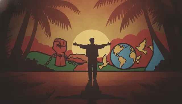
Fairey draws heavily on Soviet Constructivist poster design (Rodchenko, El Lissitzky), Cuban revolutionary posters, and Cold War-era propaganda graphics. The characteristic visual formula is: high-contrast, two- to four-colour image; strong diagonal composition; bold text in blocky, sans-serif typefaces; star, fist, or portrait symbols drawn from propaganda traditions; flat colour areas with fine-line detail creating textural interest. The palette is typically red, black, and cream -- the Constructivist tricolour.
Fairey's most widely seen single work is the Hope poster (2008) produced in support of Barack Obama's presidential campaign. The portrait uses a photo by Mannie Garcia (subject of a subsequent copyright lawsuit), reduced to four stencil-cut colour areas: dark blue for shadows, medium blue for mid-tones, red for highlights, and cream for the lightest areas. The word HOPE in Gotham typeface runs below. The poster became one of the most reproduced political images in American history.
1989
2008
A Look is not a filter. It is a set of stored decisions the pipeline reads before it makes a single frame, so two videos in the same Look actually match.