Hamlet Poster
Henryk Tomaszewski · 1959
Skull dissolving into brushstrokes - the defining example of symbolic compression in theater graphics
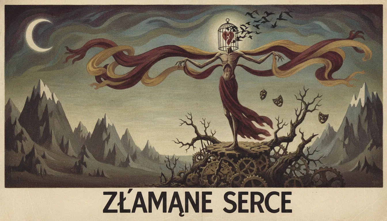
Polish Poster School theater poster. Henryk Tomaszewski and Jan Lenica painterly surreal illustration, hand-lettered title, expressive metaphor.
The moves a human crew would use to get here. Cue applies them for you, and knowing their names is how you ask for a change.
Imagery derived from painting or collage techniques rather than commercial illustration; recognizable but not photographic.
Title fonts drawn or painted as part of the composition, not set from a type catalog and placed separately.
Single-hue backgrounds in saturated primaries or near-black, printed with the flatness of lithographic ink.
Entire dramatic narrative reduced to a single metaphorical image - a skull, a hand, an eye - that carries multiple interpretive levels.
Central image silhouetted sharply against background with near-zero intermediate tones.
Imagery designed to generate multiple readings, rewarding literate audiences without excluding casual viewers.
The Polish Poster School produced one of the twentieth century's most distinctive graphic traditions, and its theater division - the posters designed for the Teatr Wielki, the Teatr Dramatyczny, and the touring productions of the 1950s through 1980s - represents its most intellectually ambitious output. Unlike the jazz posters, which drew energy from American music, the theater posters were rooted in European literary and dramatic traditions: Shakespeare, Brecht, Chekhov, Wyspiański, Mrożek. The challenge was to distill a complex dramatic work into a single arresting image that functioned simultaneously as art object and street advertisement.
Henryk Tomaszewski (1914-2005) is considered the father of the Polish Poster School. His work for the Warsaw theaters in the 1950s and 1960s established the formal vocabulary: bold, simplified imagery derived from painting and collage rather than commercial illustration; hand-drawn typography that grew organically from the figurative elements; and a willingness to be abstract or ambiguous rather than literally descriptive. His poster for Shakespeare's Hamlet used a single skull-like form dissolving into painterly brushstrokes - the play's content implied rather than depicted.
Roman Cieslewicz (1930-1996), who later relocated to Paris, brought a harder-edged photomontage sensibility while maintaining the flat-color print discipline. His work used found photography combined with bold flat graphic elements, a strategy that influenced French editorial design after his emigration.
Wojciech Fangor (1922-2015) worked in both fine art and applied poster design. His theater work explored optical effects and color interaction derived from his painting practice, making posters that were perceptually active in ways that standard commercial graphics were not.
Polish theater posters of this period share a set of visual strategies: the refusal of photographic representation in favor of painted, drawn, or collaged imagery; the use of bold flat colors against white or dark grounds; the integration of hand-rendered or custom letterforms that are components of the image rather than labels applied to it; and a tolerance for symbolic ambiguity that assumes a literate, art-aware audience. Sizes were typically A1 or B1 (roughly 23x33 inches), designed for display in theater lobbies, on community bulletin boards, and in the cultural center windows that served as informal gallery spaces.
The Polish Poster School was institutionalized through the Poster Museum at Wilanów, founded in 1968 - the world's first museum dedicated entirely to poster art. International recognition came through the Warsaw International Poster Biennale (first held 1966), which introduced the tradition to Western European and American designers. Designers including Milton Glaser acknowledged the influence of the Polish School on the Push Pin Studios aesthetic.
Henryk Tomaszewski · 1959
Skull dissolving into brushstrokes - the defining example of symbolic compression in theater graphics
Waldemar Świerzy · 1962
Bold gestural figure in primary colors for the Polish State Circus touring production
Roman Cieslewicz · 1960s
Found-photo and flat-color hybrid posters introducing photomontage to the Polish tradition
Wojciech Fangor · 1960s
Perceptually active color field compositions applied to theater promotional context
Various Polish designers · 1966-present
Institutional survey crystallizing the tradition for international audiences
Tadeusz Kantor · 1960s-80s
Experimental theater-maker whose posters matched his performance work in visual risk-taking
A Look is not a filter. It is a set of stored decisions the pipeline reads before it makes a single frame, so two videos in the same Look actually match.