COLLAGE CUTOUT · CONTEMPORARY · INTERNATIONAL
Polaroid Pinned Corkboard Mood Board
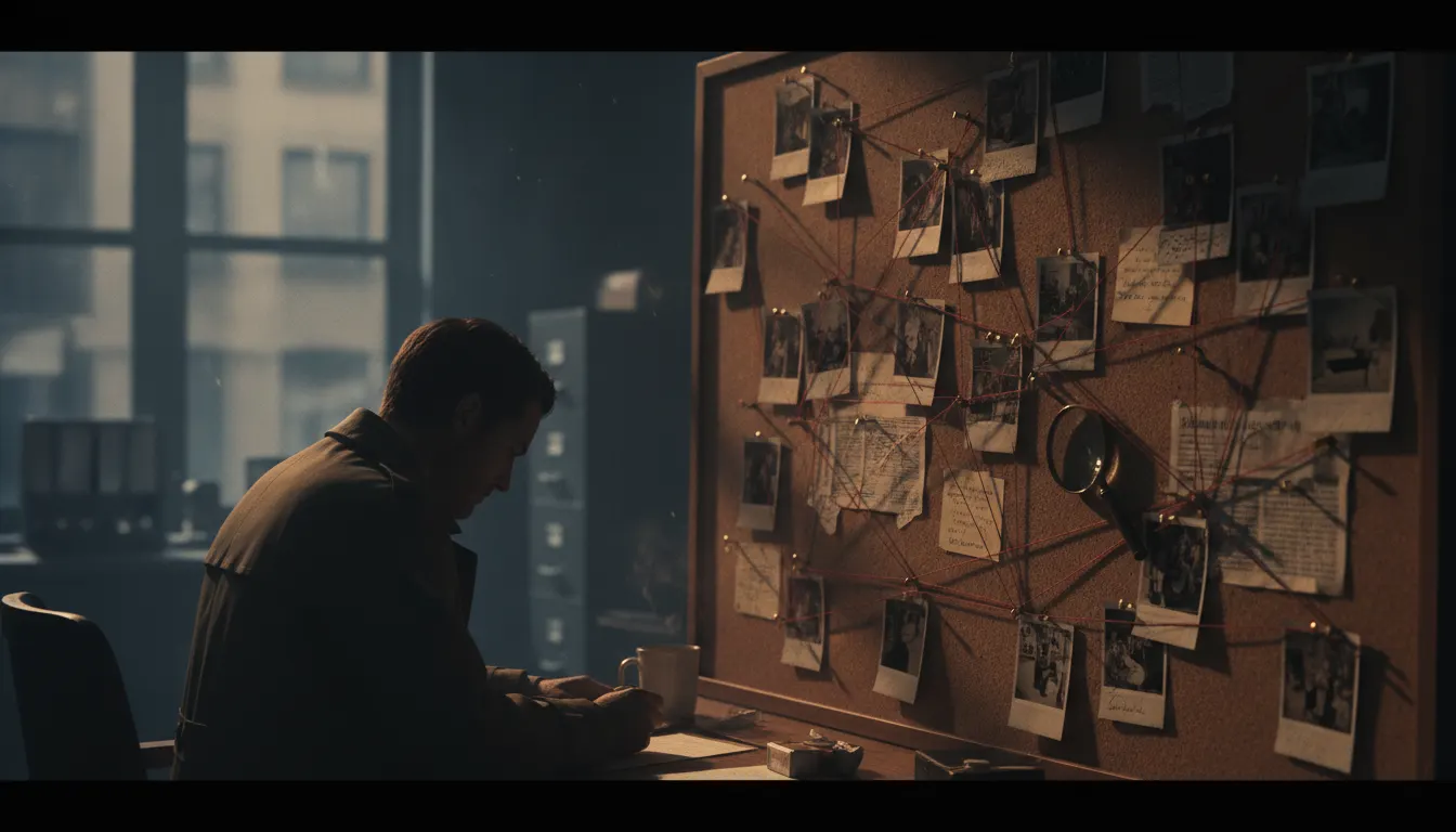
Detective mood-board corkboard aesthetic. Polaroid snapshots pinned with red thread connecting them, handwritten note cards, push-pins, evidence-board investigation energy.
evidence-boardpinnedinvestigativetactile
LUT corkboard-warm-pin
WHEN TO USE
- Behind-the-scenes or process content for creative agencies, designers, or filmmakers
- Lifestyle brand campaigns where the curated, personal selection communicates authenticity
- Fashion or beauty editorial where pre-production process is the story
- Social media content for creative businesses where pinned references signal expertise
- Music video or film title sequences where the mood board doubles as narrative world-building
- Concept presentation videos where showing the inspiration sources adds depth
WHEN NOT TO USE
- Corporate content where the casual, pinned-ephemera aesthetic reads as unpolished
- Technical or financial content where the messy creativity look undermines authority
- Minimalist brand identities where visual density conflicts with the design system
- Content for audiences who associate mood boards with cliche creative-class signaling
SIGNATURE TECHNIQUES
How the look is made.
The moves a human crew would use to get here. Cue applies them for you, and knowing their names is how you ask for a change.
- 01Polaroid white
frame prints pinned or taped at slight angles, never perfectly aligned
- 02Push
pin shadows: small circular shadow beneath each pin creating tactile depth
- 03Mixed scales
large central reference with smaller satellites and detail crops around it
- 04Handwritten annotations in ink or marker directly on the board or on sticky-note overlays
- 05Washi tape, masking tape, or paper tabs used as connectors between related elements
- 06Cork texture visible in gaps between pinned material
warm tan, slightly graned
- 07Layering
newer pins partially overlap older ones, implying accumulated editing
HISTORY & CONTEXT
Where it comes from.
Polaroid Pinned Corkboard Mood Board
The polaroid pinned corkboard mood board is the visual language of creative pre-production made into an aesthetic in its own right. Design agencies, art directors, and stylists have pinned reference images, fabric swatches, color chips, and handwritten notes to corkboards for decades; the mood board became the symbolic container of creative direction. When this analog process became a visual style in itself – deployed in photography, video, and digital design – it carried the connotations of authentic creative process, human curation, and the pleasurable messiness of ideas in motion.
The Mood Board Tradition
Design agencies formalized mood boards as client-presentation tools in the 1970s and 1980s. The process was practical: gather references, pin them physically, stand back, edit. The corkboard became a background material in fashion advertising and editorial photography through the 1990s, particularly in contexts where creative-behind-the-scenes authenticity was the message.
The Polaroid print – integral film format popularized by Edwin Land and the Polaroid Corporation from 1948, with the SX-70 camera arriving in 1972 – became the preferred reference print for mood boards because of its small scale, instant availability, and distinctive white frame. Polaroids were pinned, taped, written on. The SX-70 and later 600 series cameras made the instant print a marker of casual creative intelligence.
Pinterest (launched 2010) digitized the mood board completely, replacing physical corks and pins with an infinitely scalable digital surface. The platform's rapid growth through 2012–2014 made the grid-of-images format ubiquitous in design, fashion, food, and lifestyle sectors. Simultaneously, the physical corkboard aesthetic became nostalgic – desirable precisely because it was no longer the default.
Contemporary Deployment
Film directors use the corkboard as a narrative device: the detective's evidence board, the writer's plot map, the designer's concept wall. The It's Always Sunny in Philadelphia "Pepe Silvia" scene (2009) became a meme template for obsessive visual thinking. In brand content, the mood board aesthetic signals creative process transparency and pre-production craft.
The Polaroid as Material Object
The Polaroid print has physical properties that make it irreplaceable as a mood board element: the distinctive thick border (wider at the bottom due to the reagent chemistry pack position), the slightly chemical sheen of the finished surface, the way writing implements – Sharpie, ballpoint, pencil – grip the surface differently. Andy Warhol famously used Polaroid Big Shot and SX-70 portraits as preparatory material for his silkscreen paintings. David Hockney used Polaroids in his Joiners collages (1982–1986). The Polaroid was the tool serious artists used for quick visual notation before digital cameras.
Impossible Project (founded 2008, later becoming Polaroid Originals in 2017) relaunched integral film production after the original Polaroid Corporation ceased film manufacturing in 2008. The new generation of instant film introduced new characteristics – slightly dreamier tonality, sometimes unpredictable chemical variation – that added to rather than diminished the format's aesthetic appeal. This material revival reinforced the corkboard aesthetic's cultural currency precisely as digital alternatives proliferated.
NOTABLE WORKS
Where you have seen it.
Pinterest platform launch and growth (2010–2014, Ben Silbermann and Evan Sharp)
*It's Always Sunny in Philadelphia*
'Pepe Silvia' corkboard scene (Season 4, 2009)
Wes Anderson
production design mood boards (widely circulated, particularly for *The Grand Budapest Hotel* 2014)
Kate Middleton / William wedding mood boards published in *Vogue* (2011, setting trend for visible creative process)
Nike
2013
mood board campaign photography series *Making It*
Anna Wintour
2009
*Vogue* fashion closet corkboard aesthetic in *The September Issue* documentary
THE RECIPE
The exact knobs
the renderer turns.
A Look is not a filter. It is a set of stored decisions the pipeline reads before it makes a single frame, so two videos in the same Look actually match.
SettingValue
GradeColour LUT applied to every frame
corkboard-warm-pinTransitionHow one shot becomes the next
soft cuts · 260ms · ease-in-outKen BurnsCamera move applied to stills
Slow push · 0.03 · centerTypographyDisplay / body / mono pairing
Caveat · Lora · CourierMusic moodWhat the bed under the voice sounds like
lo-fi-piano-tension · noir-bass-pulsePrompt suffixAppended to every shot prompt in this Look
detective mood-board corkboard, Polaroid snapshots pinned with red string connecting them, handwritten index cards, push pins, evidence-board investigationPALETTE
Primary
#C8893E
Secondary
#5C4A35
Accent
#E83C2E
Text/Light
#2A1F10
Text/Dark
#F2EADB
BG 900
#2A1F10
BG 800
#3D2E1A
RELATED LOOKS
Next to it on the shelf.
Your first cut
is on us.
+ New videoFree plan · no card · 1080p export