Ettore Sottsass
1981
Carlton room divider
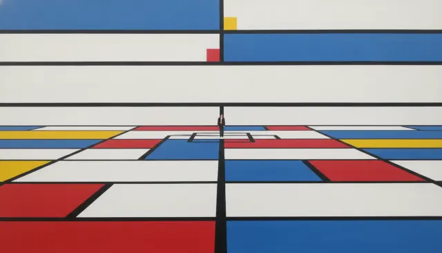
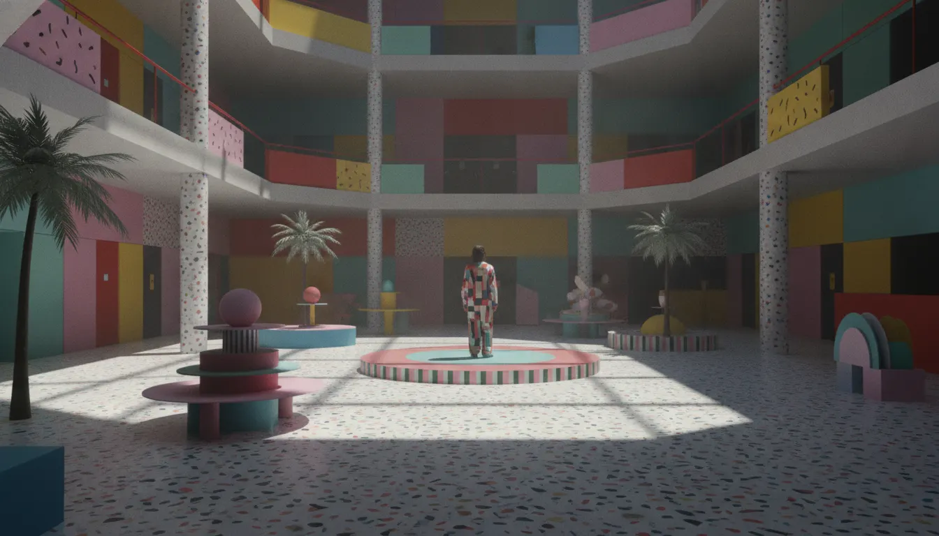
Memphis Group postmodern design. Ettore Sottsass laminate patterns, squiggles, terrazzo confetti, clashing pastel and primary, intentional naivety.
The moves a human crew would use to get here. Cue applies them for you, and knowing their names is how you ask for a change.
Bacterio (organic blobs), geometric squiggles, diagonal stripes
harmonious color combinations: primaries plus pastels plus neons in the same composition
dimensional objects with no concern for visual rest
neon palette: coral, mint, yellow, teal, magenta simultaneously
classical column capitals recontextualized in brightly colored plastic
Memphis was a Milan-based design collective founded on December 11, 1980, when Ettore Sottsass convened a group of architects and designers in his apartment. Taking its name from a Bob Dylan song that was playing that evening ('Stuck Inside of Mobile with the Memphis Blues Again'), the group produced furniture, ceramics, glass, and textiles for just eight years (1981-1988) but created a visual language so distinctive that it became shorthand for the entire postmodern decade.
Ettore Sottsass (1917-2007) was 63 when he founded Memphis. An architect and designer who had worked for Olivetti (the Valentine typewriter, 1969) and had spent decades adjacent to the Italian Radical Design movement, Sottsass viewed Memphis as a deliberate provocation against the prevailing modernist good taste of Italian design culture. The founding group included Andrea Branzi, Michele De Lucchi, Peter Shire, Nathalie du Pasquier, George Sowden, and Masanori Umeda. Memphis deliberately rejected the idea that design should be rational, functional, or restrained.
Sottsass's Carlton room divider (1981) is the canonical Memphis object. A shelf-unit-cum-sculpture roughly 2 meters tall, Carlton uses bright plastic laminate surfaces in multiple Memphis patterns - the Bacterio print (an irregular organic blob motif in black and white), colored plastic laminates in red, yellow, and blue - on an asymmetric structural form that acknowledges no functional convention. It cannot hold books efficiently; it is not balanced; it is emphatically not beautiful in a modernist sense. That was the point.
Memphis developed a visual vocabulary of surface patterns that became the group's most widely reproduced contribution. Nathalie du Pasquier designed dozens of flat surface prints: Bacterio (organic blobs), Fishy (diagonal stripes of dots), Tahiti (tropical imagery in flat color), and geometric squiggle patterns. These were printed on plastic laminates (Abet Print supplied the material) in combinations that violated every classical harmony rule. Horizontal stripes next to polka dots next to organic blobs, in colors spanning the full spectrum simultaneously.
Memphis disbanded in 1988 when Sottsass felt the movement had said what it needed to say. The aesthetic experienced a major revival starting around 2014-2016, when the squiggle patterns, pastel-neon color combinations, and geometric forms reappeared extensively in social media graphic design, music video aesthetics, branding for youth-oriented brands, and surface pattern design for fashion and homeware.
1981
Carlton room divider
1983
First chair : tubular metal with ball feet and bright upholstery
1982
Brasil sofa : asymmetric, multi-colored leather
1981
Tawaraya boxing ring bed
Bacterio and Fishy surface patterns (1981-1988)
1981
Plaza dressing table
Objects and Furniture Design exhibition catalogue (1981, first year)
A Look is not a filter. It is a set of stored decisions the pipeline reads before it makes a single frame, so two videos in the same Look actually match.