Google I/O 2014
Material Design debut presentation by Matias Duarte
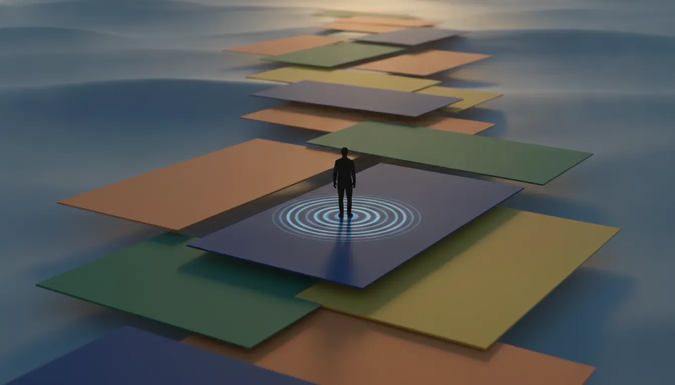
Material Design Google 2014. Physical paper metaphor, elevated cards with subtle shadow, bold color and white space, Roboto typeface, ink ripple feedback.
The moves a human crew would use to get here. Cue applies them for you, and knowing their names is how you ask for a change.
components cast realistic drop shadows proportional to their z-axis position (2dp, 4dp, 8dp, 16dp, 24dp)
circular primary-colored button at highest elevation for the most important action
app bar, status bar, and FAB in primary hue; background white or 50-tint
level type scale and precise weight/size specifications
cubic-bezier acceleration curves, shared element transitions, ripple touch feedback
based layout with defined margin, padding, and elevation hierarchy
Material Design is Google's comprehensive design language, introduced at Google I/O in June 2014 under the leadership of Matias Duarte, Vice President of Design at Google. It unified the visual and interaction design of Android, Google's web products, and third-party apps under a single coherent system grounded in a physical metaphor: digital interfaces behave like physical paper and ink, obeying real-world physics including light, shadow, and motion.
Duarte joined Google in 2010 from Palm, where he had designed webOS. His central contribution to Material Design was the 'material' metaphor itself: UI components are treated as sheets of paper with defined elevation, casting realistic drop shadows and responding to touches with physical-feeling animations. A button that is 'raised' sits at 2dp elevation and casts a correspondingly sized shadow. A card overlapping another card casts a shadow on the one below. Motion follows physics - objects accelerate and decelerate following cubic bezier curves, never teleporting or stopping abruptly.
Material Design introduced a comprehensive color palette organized into primary, secondary, and surface roles, with each hue available in nine tonal steps (100 through 900). The 2014 palette featured bold, saturated primaries (Teal 500, Indigo 500, Pink A400) that pushed back against iOS 7's stark white minimalism. App bars, floating action buttons (FABs), and status bars all received the primary color, creating strong color-blocked identity.
Material Design adopted Roboto as its system typeface, a neo-grotesque with humanist proportions designed by Christian Robertson in 2011 and revised for Material in 2014. The type scale specified six levels of hierarchy with defined weights and sizes. Google also developed the Material Design icon set - over 1,000 outlined and filled icons using a consistent 24x24 grid, a uniform stroke weight, and precise corner radius treatment.
In 2021, Google launched Material You (Material Design 3), which introduced dynamic color - the system extracts palette colors from the user's wallpaper and applies them across the UI. This shifted Material from a prescriptive color system to a personalized one, maintaining the physical metaphor and elevation system while dramatically expanding color flexibility.
Material Design debut presentation by Matias Duarte
2014
2021
A Look is not a filter. It is a set of stored decisions the pipeline reads before it makes a single frame, so two videos in the same Look actually match.