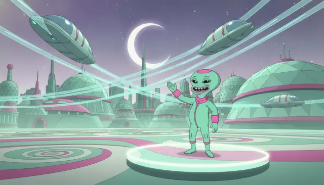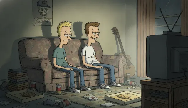
Archer
Adam Reed / FX / Floyd County Productions · 2009
The canonical work; defined the flat retro Cold War spy aesthetic
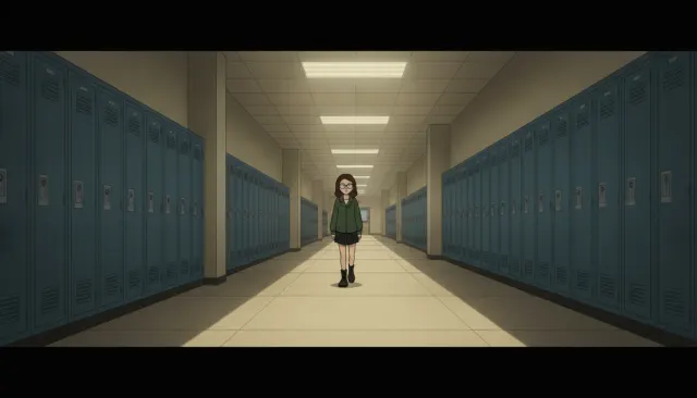
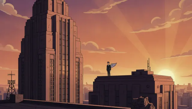
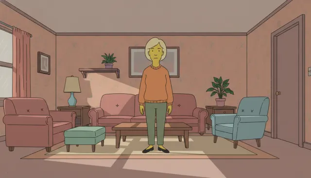
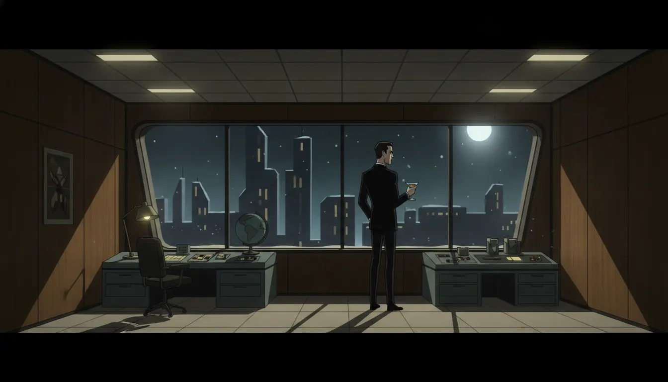
Adam Reed flat-vector retro Cold War spy comedy. ISIS / Figgis office interiors, mid-century Mad Men palette with anachronistic gadgets, sharp clean line.
The moves a human crew would use to get here. Cue applies them for you, and knowing their names is how you ask for a change.
Characters were traced from live actor photography, giving unusually specific facial expressions and clothing detail.
Browns, tans, olive greens, and dusty yellows evoke 1960s film stock, locating the show in its era without explicit period title cards.
Office furniture, architecture, and props are drawn from 1960s modernist design catalogs with deliberate accuracy.
Title cards, transitions, and establishing shots use flat geometric shapes and bold typography in the Saul Bass tradition.
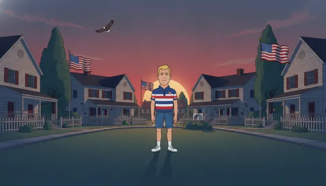
Despite detailed linework, characters use flat color without gradients -- a deliberate graphic-design choice that keeps the period illustration feel.
Character costumes are drawn with specific decade-accurate fashion detail, functioning as visual shorthand for setting and personality.
Archer premiered on FX on September 17, 2009, created by Adam Reed and produced by Floyd County Productions. The show's visual direction was led by production designer Neal Holman, who developed a rigorous visual system drawing from midcentury graphic design, Cold War spy aesthetics, and modernist illustration.
Archer's look is one of the most deliberately designed visual identities in modern animation. Neal Holman and his team drew from a specific constellation of influences: Alex Toth's Ghost Rider and Space Angel comics of the 1950s-60s, the graphic design of Saul Bass's film title sequences, the illustration work found in Playboy magazine circa 1962-1970, and the spy film poster art of the Bond era.
The show uses an unusual production pipeline: characters are photographed as live actors, traced to create extremely detailed linework, then converted to flat-color animation. This gives Archer characters an uncanny, slightly-off-model quality -- they look almost like real people filtered through a photographic tracing process. This is most visible in facial expressions and clothing wrinkles, which have a specificity rare in American animation.
The show's setting -- an independent spy agency that shifts from the 1960s to the '70s to the '80s across its run -- is expressed through meticulous production design. ISIS headquarters features mid-century modernist furniture, rotary phones, and wood-paneled offices. Character wardrobes reference specific decades of men's and women's fashion.
Color director Keith Tucker developed a warm, slightly muted palette that evokes Ektachrome film stocks from the 1960s -- browns, tans, olive greens, dusty yellows -- giving the show a perpetually sepia-adjacent warmth even in bright scenes. This palette choice locates the show emotionally in a specific historical moment without requiring explicit period signposting.
Archer was part of a wave of FX adult animation attempting to apply prestige-TV production values to the format. The show's visual sophistication was cited by animation critics as demonstrating that adult animation could achieve genuine artistry rather than defaulting to the Simpsons-Family Guy template.
The show's visual language has been enormously influential in motion design, particularly in the practice of combining flat-color illustration with photographic reference tracing. The 'Archer aesthetic' is now a recognized reference point in brand design, particularly for craft cocktail bars, boutique hotels, and men's lifestyle brands.
The show deliberately shifted settings multiple times -- Archer Vice (Season 5, 2014) as a Miami Vice-esque drug cartel drama, Archer: Dreamland (Season 8, 2017) as a 1940s noir, Archer: Danger Island (Season 9, 2018) as a 1938 adventure serial. Each setting shift came with a corresponding visual recalibration while maintaining the core graphic design vocabulary.
Adam Reed / FX / Floyd County Productions · 2009
The canonical work; defined the flat retro Cold War spy aesthetic
Adam Reed / FX · 2014
Season 5 Miami Vice reimagining that tested the visual language in a new era
Adam Reed / FX · 2017
1940s noir setting that demonstrated the visual system's period-shifting flexibility
Williams Street / Adult Swim · 2001
Precursor flat-retro adult animation that Archer refined and elevated
Matthew Weiner / AMC · 2007
Live-action contemporaneous with Archer that shared the mid-century color and design obsession
Sam Rolfe / NBC · 1964
One of the primary Cold War spy TV sources the show's design vocabulary draws from
A Look is not a filter. It is a set of stored decisions the pipeline reads before it makes a single frame, so two videos in the same Look actually match.