Toradora!
J.C. Staff / Yuyuko Takemiya · 2008
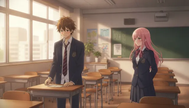
Foundational pastel romcom establishing the warm domestic interior aesthetic
Harem rom-com register (The Quintessential Quintuplets, Nisekoi, Oreimo). Bright pastel palette, ensemble heroine framing, sweat-drop comedy beats, fan-service polish.
The moves a human crew would use to get here. Cue applies them for you, and knowing their names is how you ask for a change.
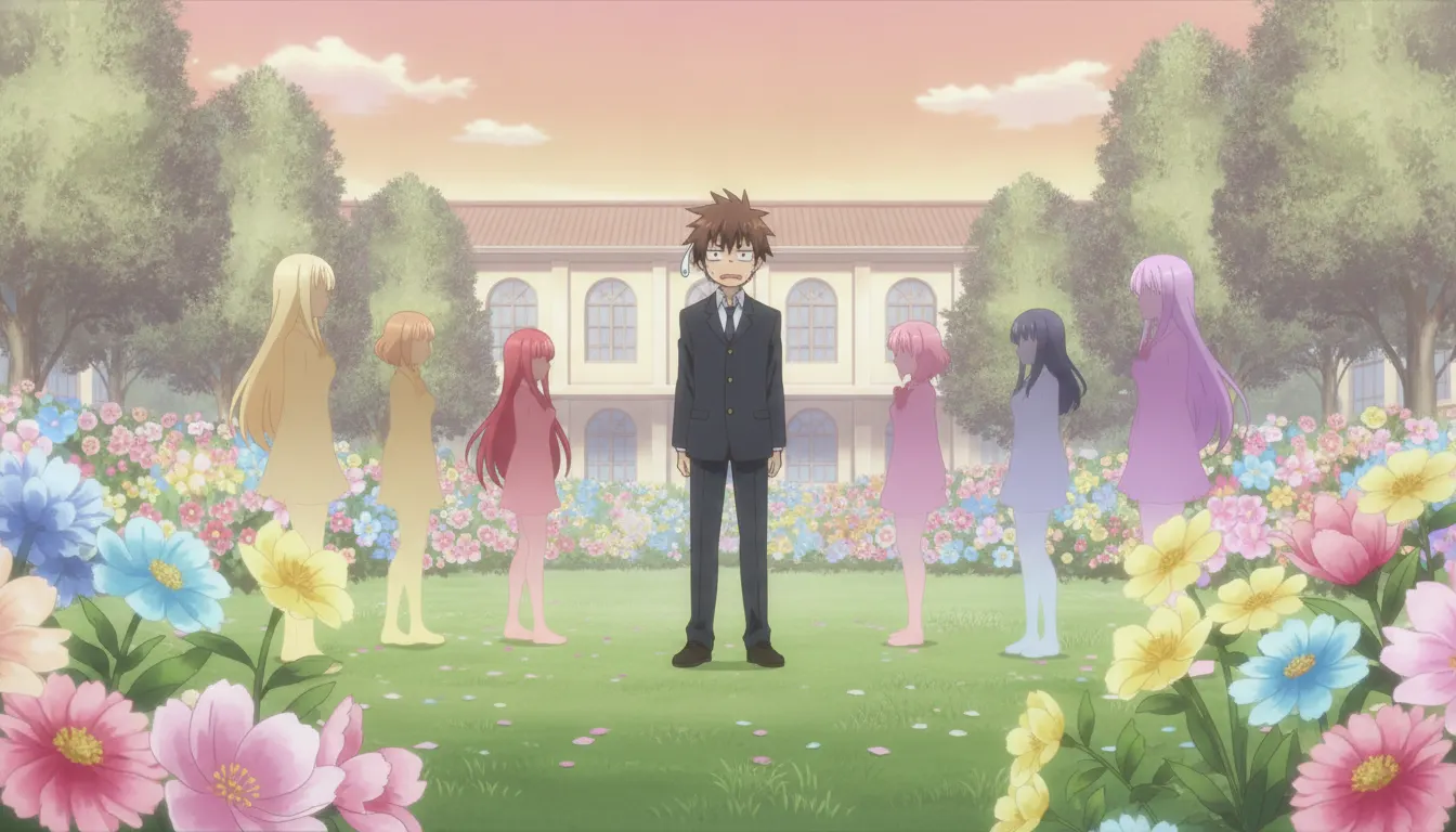
Each character assigned a unique signature hue applied consistently to hair, eyes, and costume for instant identification
Flat, slightly soft-edged pink or peach blush marks drawn as translucent washes rather than hard-edged fills
Temporary super-deformed exaggeration of faces and bodies during comedic reaction moments, returning to normal after the beat
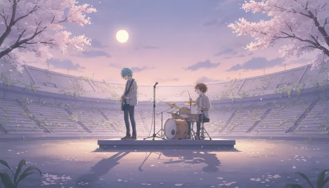
Out-of-focus circular light blobs layered over backgrounds in outdoor scenes, creating dreamy photo-mimicking depth
Carefully detailed but desaturated home and school environments that recede behind the vibrant character designs
Cherry blossoms, summer humidity haze, autumn leaves, and winter snow used as emotional shorthand for episode tone
Floating vein marks, sweat drops, music notes, and exclamation symbols placed above character heads as readable emotion tags
The harem romcom pastel aesthetic crystallized in the 2010s through productions from studios like J.C. Staff, Brain's Base, and Doga Kobo, driven by light novel adaptations with ensemble female casts competing for a single male protagonist. The visual language is deliberately soft, approachable, and fantasy-adjacent -- designed to keep emotional conflict perpetually unresolved while maximizing character differentiation.
Each heroine receives a distinct signature hue applied to hair, eye color, and recurring costume accents, enabling instant identification in group shots. Hair colors range from naturalistic to fantastical (pink, silver, purple) with no grounding justification. Character designs emphasize large eyes, clean linework with minimal internal detail, and soft rounded faces. Blush marks appear frequently, drawn as simple flat watercolor-style washes.
Backgrounds favor domestic interiors: school classrooms, family homes, shared apartments. Environments are drawn with high care but subdued saturation, ensuring characters pop against them. Sunlight through curtains, cherry blossom petals, and lens-flare bokeh circles are recurring atmospheric elements. Seasonal markers -- summer fireworks, winter snow on windows -- anchor episode structure emotionally.
Slapstick timing borrows from classic anime chibi-shift techniques: characters temporarily deform into super-deformed expressions for reaction gags before returning to normal proportions. Sweat drops, vein marks, and floating icons appear over characters as emotion shorthand. Comedic transitions use fast wipes, spinning-frame transitions, and exaggerated zoom-ins on surprised faces.
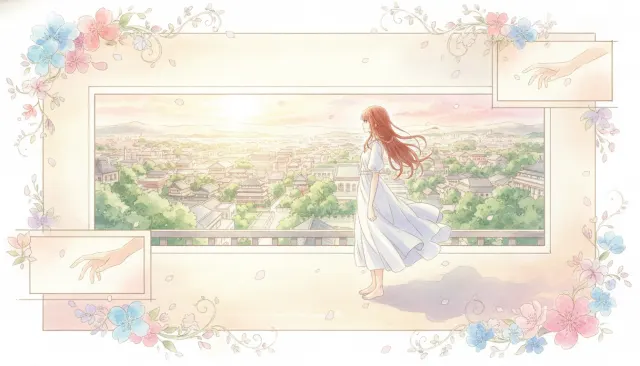
The overall look favors soft diffused lighting with warm pastel overlays. Outdoor scenes during golden hour use a blown-out highlight treatment that turns backgrounds semi-abstract. This softness signals emotional safety -- nothing in a harem romcom environment is ever truly threatening.
J.C. Staff / Yuyuko Takemiya · 2008
Foundational pastel romcom establishing the warm domestic interior aesthetic
SHAFT / Naoshi Komi · 2014
Color-coded heroine system pushed to its visual extreme with five distinct hue identities
Tezuka Productions / Negi Haruba · 2019
Single-color-per-quintuplet coding across identical faces, the ultimate harem color-coding challenge
Brain's Base / Wataru Watari · 2013
Pastel romcom with unusually grounded color restraint and psychological character depth
TMS Entertainment / Reiji Miyajima · 2020
Contemporary example of the harem visual grammar applied to a modern urban setting
Silver / Taishi Tsutsui · 2019
Classic five-heroine ensemble with saturated pastel differentiations and school-setting staging
A Look is not a filter. It is a set of stored decisions the pipeline reads before it makes a single frame, so two videos in the same Look actually match.