Bienal de Flamenco de Sevilla poster series
Various; Antoni Tàpies, Eduardo Arroyo, Miquel Barceló among commissioned artists · 1980-present
Annual fine-art poster series; most prestigious commission in Spanish cultural graphic design
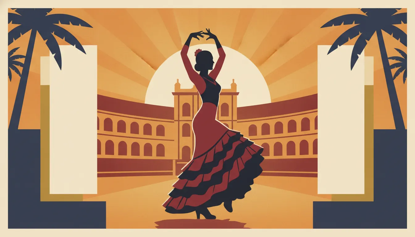
Inspired by mid-century Spanish flamenco festival and bullfight poster tradition from Sevilla and Andalusia. Bold flat color silhouette of dancer in ruffled bata, red-and-black palette, art-deco lettering reserve.
The moves a human crew would use to get here. Cue applies them for you, and knowing their names is how you ask for a change.
Deep saturated red (often close to Pantone 485 or 186) as the dominant field against which all other elements are read.
White or contrasting-colour circular dots on solid-colour fields; applied to dress, background, or decorative borders as the signature Flamenco motif.
Compositional focal point is a female dancer with arms raised and circular skirt spread; figure silhouette must read in a single clear graphic statement.
Figure and ground rendered in flat unmodulated colour blocks rather than photographic or illustrated tonal rendering.
Event names and performance details set in bold Art Deco or vernacular Spanish display lettering integrated into the colour field.
Strong black outlines or silhouette shadows anchor figures against the saturated ground and unify the graphic composition.
Flamenco poster art is a distinct strand of Spanish commercial illustration that fused the lithographic traditions of early 20th-century European poster design with the visual iconography of Andalusian Romani (gitano) culture: polka-dot trajes de flamenca, mantillas, carnations, castanets, and the gestural vocabulary of cante, toque, and baile. At its peak in the 1960s-1980s, this genre produced some of the most saturated, emotionally charged printed imagery in European popular culture.
Flamenco as a stage art became commercially promoted through posters, programa covers, and lithographic prints from the late 19th century onward, centred on Sevilla, Jerez de la Frontera, and Cádiz - the Andalusian triangle of flamenco's development among Romani communities. The art form's Romani origins are inseparable from its visual representation: the polka-dot lunares dress, the high-combed mantilla, the use of shawls (mantones de Manila), and the exaggerated somatotype of arms and hands in motion are all iconographic markers with specific cultural roots.
Francisco Fortunato, Pepe Gómez, and later designers working for the Bienal de Flamenco de Sevilla (founded 1980) produced poster work that became the visual standard. The Bienal's annual design commissions - often given to major contemporary artists including Antoni Tàpies, Eduardo Arroyo, and more recently Miquel Barceló - elevated the flamenco poster to a fine-art object alongside its functional role.
The saturated flamenco poster aesthetic uses maximum chroma: red is the dominant hue, supported by black, deep magenta, chrome yellow, and sometimes electric green or cobalt blue. The typical composition centres a single female figure (the bailaora) in motion, with arms raised and skirt in full rotational spread, set against a flat or minimally textured ground. Polka dots (lunares) - white or contrasting colour against a solid field - are the surface decoration marker for both dress and background. Typography is bold, often hand-lettered in Art Deco or display sans-serif styles, integrated into the composition's colour field.
Various; Antoni Tàpies, Eduardo Arroyo, Miquel Barceló among commissioned artists · 1980-present
Annual fine-art poster series; most prestigious commission in Spanish cultural graphic design
Various anonymous commercial illustrators · 1920s-1970s
Lithographic ferias posters defining the canonical red-and-polka-dot Andalusian visual vocabulary
Various · 1961-present
La Unión, Murcia; annual festival with significant poster design heritage
Various; Spanish Tourism Ministry commissions · 1960s-1980s
State tourism posters that disseminated the flamenco visual stereotype internationally
Pepe Gómez · 1960s-1980s
Highly influential commercial illustrator whose bailaora imagery became the international visual shorthand for flamenco
Various Spanish record label art directors · 1960s-1970s
Record sleeve art applying flamenco poster aesthetic to music marketing
A Look is not a filter. It is a set of stored decisions the pipeline reads before it makes a single frame, so two videos in the same Look actually match.