Céline campaigns under Phoebe Philo
Juergen Teller photography (2008-2017)
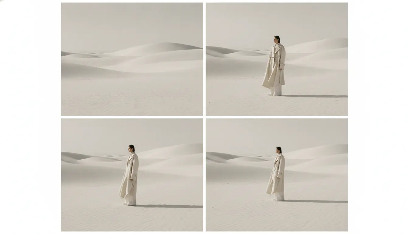
Modern fashion brand editorial minimalism. Acne Studios and Aesop lineage, off-white cream backdrop, all-caps thin sans, oversized image grid, refined.
The moves a human crew would use to get here. Cue applies them for you, and knowing their names is how you ask for a change.
not absence but presence
serif typography set at small size with wide tracking
pure white or neutral backgrounds
and-white photography for seasonal campaign imagery
serif at minimum legible size
based editorial layouts with asymmetric placement of images and text
Fashion brand editorial minimalism is a specific register of the broader minimal design tradition, distinguished by its relationship to luxury pricing and the claim that reduction is itself a form of opulence. Where mass-market minimalism removes ornamentation for efficiency, fashion minimalism removes it to demonstrate that the brand can afford to waste space.
The definitive contemporary expression of this aesthetic is Céline under creative director Phoebe Philo (2008-2017). Philo's Céline - with its accent on the first 'e' of the brand's name - defined the decade's most influential luxury fashion visual language. The brand identity was built on restraint: the logo in a sans-serif face at modest weight, fashion campaigns shot by Juergen Teller and later other photographers on near-white or deeply neutral backgrounds, lookbooks that used extreme white space to isolate garments.
The campaign imagery often featured non-traditional models or the photographers themselves (Teller famously shot Joan Didion for Céline in 2015 at age 80, a casting choice that summarized the brand's values more precisely than any aesthetic decision). The visual language was simultaneously minimal and demanding: it assumed the viewer's attention and rewarded close looking.
A wave of luxury fashion logo reductions between 2012 and 2018 both drew on and reinforced the editorial minimal aesthetic. Céline dropped its accent mark (a decision by Hedi Slimane upon his arrival in 2018). Burberry switched to a sans-serif wordmark (2018). Rimowa dropped its umlaut. The critical term was 'blanding' - the homogenization of luxury logos toward similar sans-serif wordmarks - but the underlying logic was genuine: in the editorial minimal context, the quieter the logo, the louder the confidence.
The Row, founded by Mary-Kate and Ashley Olsen in 2006 and consistently cited as the benchmark of 'quiet luxury' since the early 2020s, uses an editorial visual language so spare it borders on absence. Campaign images by Venetia Scott and others show garments in natural light, often outdoors, with the product as the only visual event in an otherwise empty frame. The aesthetic communicates: we have nothing to prove, and the clothes speak for themselves.
Juergen Teller photography (2008-2017)
2015
Juergen Teller
Venetia Scott and others (2006-present)
2009
2018
Peter Saville
Peter Saville collaboration (2016-2018)
sustained minimal fashion identity
A Look is not a filter. It is a set of stored decisions the pipeline reads before it makes a single frame, so two videos in the same Look actually match.