Bee and PuppyCat web series
2013
Natasha Allegri, Cartoon Hangover / Frederator Studios
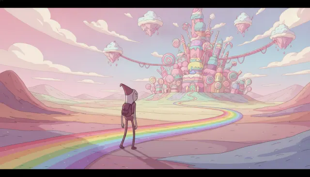
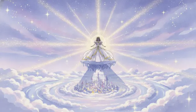
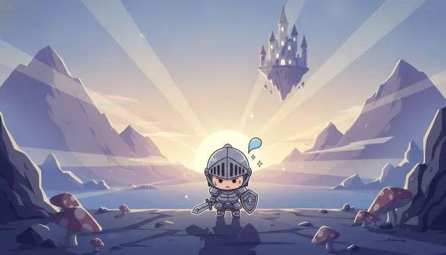
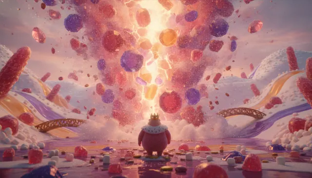
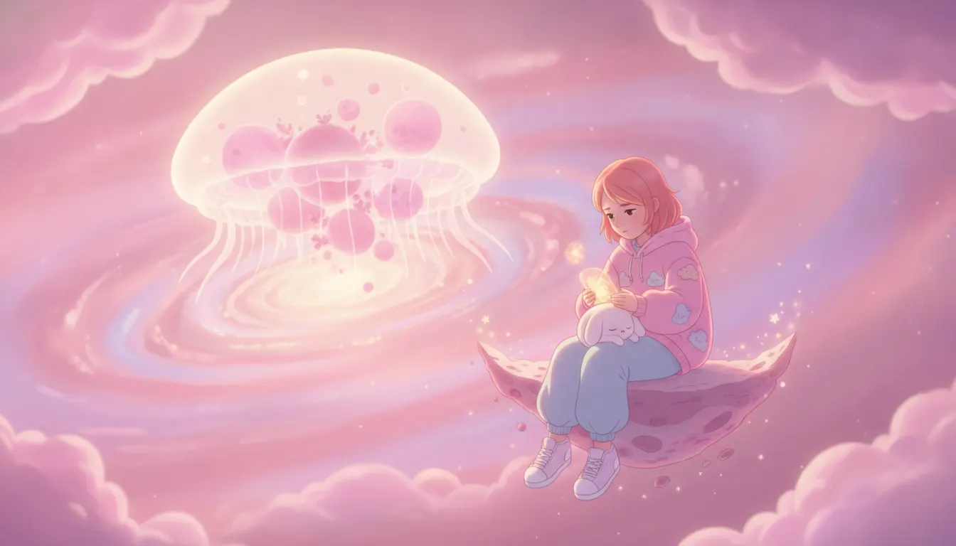
Bee and Puppycat-style soft CG. Pastel-pink space-fantasy, cute character design, melancholic young-adult tone.
The moves a human crew would use to get here. Cue applies them for you, and knowing their names is how you ask for a change.
soft character silhouettes with near-zero straight lines and baby-face proportions (high cranium, small lower face)
contrasting shadow values in same-hue tints rather than darker, cooler shadow colors
soft color washes and simplified geometric shapes suggesting space without defining it
influenced facial deformation on emotional peaks
Bee and PuppyCat began as a Cartoon Hangover (Frederator Studios) web series in 2013, created and designed by Natasha Allegri, a background and character designer who had previously worked on Adventure Time (Cartoon Network). The series' visual style-distinctive for its soft-edged character silhouettes, chalky pastel palette, and magical girl anime influence adapted through an indie American animation sensibility-became one of the most influential indie animation aesthetics of the 2010s, particularly for internet-native animation.
Allegri's designs are characterized by rounded, pillow-soft character forms with minimal hard angles. Characters have large, low-placed eyes in a 'baby face' structure (high forehead, small lower face), thick simple outlines that suggest felt or fabric rather than ink, and almost no visible musculature or bone structure under clothing. This gives characters a stuffed-animal or plush quality even when animated. The approach draws directly from early 2000s magical girl anime-Ojamajo Doremi (Toei, 1999), Shugo Chara! (Satelight, 2007)-while flattening the anatomical detail to a more graphic, Western cartoon-friendly shape vocabulary.
The series' color world is defined by desaturated, chalky pastels: lavender, powder pink, mint, butter yellow, warm cream. Shadows are barely-contrasting value steps in the same hue rather than darkened colors-preserving the washed-out, soft-light quality throughout. This is a deliberate departure from the high-contrast, saturated palette of contemporaneous Cartoon Network shows. The effect is dreamy, slightly melancholic, and distinctly feminine in its cultural coding.
A defining tension in Bee and PuppyCat is the combination of visually childlike softness with emotionally adult themes-precarity, loneliness, aimless adulthood, financial anxiety. This tension became a template for a wave of millennial indie animation (Steven Universe, Gravity Falls, Over the Garden Wall) that uses cute aesthetics as a Trojan horse for emotional depth.
The series was revived as Bee and PuppyCat: Lazy in Space on Netflix in 2022, co-directed by Natasha Allegri and Liz Artinian, expanding the original 10 episodes into a full series while maintaining the original visual style with upgraded production values from ZACK (formerly Cartoon Hangover).
2013
Natasha Allegri, Cartoon Hangover / Frederator Studios
2022
Netflix, dir. Natasha Allegri, Liz Artinian
Cartoon Network - Allegri's background design influenced the palette
2014
Cartoon Network mini-series - adjacent soft-pastel indie animation
Rebecca Sugar / Cartoon Network - related aesthetic lineage
A Look is not a filter. It is a set of stored decisions the pipeline reads before it makes a single frame, so two videos in the same Look actually match.