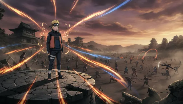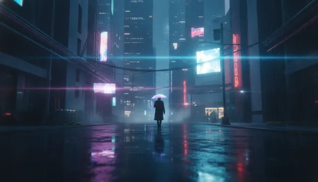
Sword Art Online S1 Aincrad arc
2012
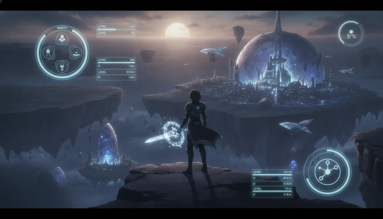
A-1 Pictures, isekai game-UI template
Isekai / trapped-in-MMORPG anime register (Sword Art Online, Log Horizon, Overlord). Fantasy MMO UI overlays, crystalline magic, party HUDs, level-up windows.
The moves a human crew would use to get here. Cue applies them for you, and knowing their names is how you ask for a change.
teal holographic UI panels floating in organic environments -- usually sans-serif typeface, geometric icons, grid lines
polygonal particle explosions, tessellated shield barriers, digital-looking geometric damage indicators
motion-blur streaks rendered as luminous colored lines rather than traditional speed lines
up and skill-acquisition visual celebrations: particles exploding outward from character with UI text confirming acquisition
eye map overlay: minimap/world-map hologram appearing in frame to establish spatial position
Sword Art Online premiered in 2012, produced by A-1 Pictures (director Tomohiko Itou, character design by Shingo Adachi), adapted from Reki Kawahara's light novel series (ASCII Media Works, 2009+). The first season's Aincrad arc established the visual vocabulary of the isekai game-world subgenre and became the template for a decade of imitators.
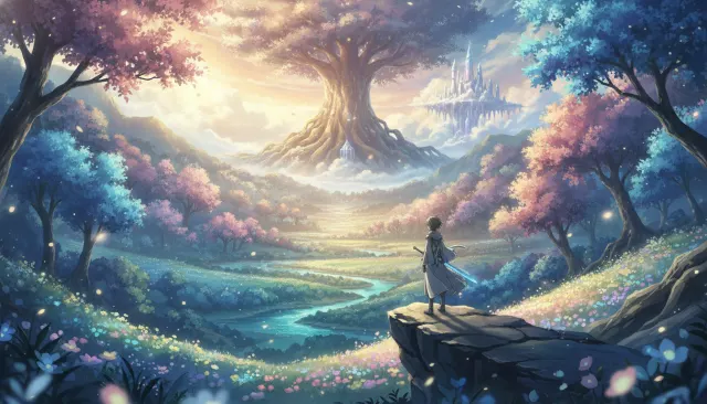
The defining visual contribution of SAO and its contemporaries is the diegetic game interface -- holographic menus, status windows, health bars, and map overlays that exist within the story world rather than as external narrative devices. This creates a distinctive double visual layer: organic fantasy environments rendered in painterly detail beneath crisp, translucent blue-teal UI panels, sans-serif digital typography, and geometric icon systems drawn from MMORPG interface design (World of Warcraft, EverQuest, Final Fantasy XIV).
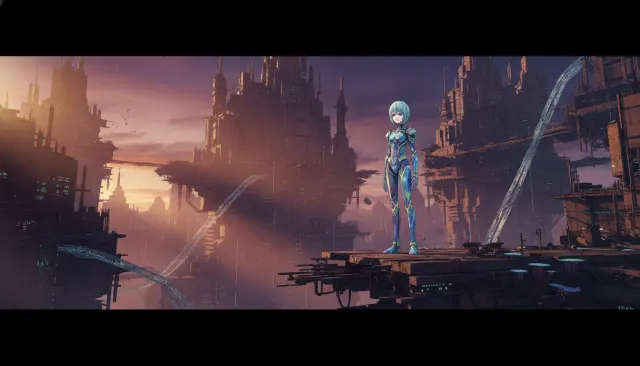
The primary setting, Aincrad, is a 100-floor floating castle with each floor presenting a distinct biome and architectural style. The art direction by Shingo Adachi and background team created environments ranging from pastoral European medieval to industrial dungeon. The 2014 SAO II (Phantom Bullet arc) shifted to a post-apocalyptic American Western aesthetic with grey-brown deserts and corroded steel architecture -- demonstrating the isekai convention of setting each arc in a distinctive genre world.
SAO crystallized the isekai ('another world') subgenre's visual conventions that had been developing since . hack//SIGN (2002, Bee Train) and Log Horizon (2013, Satelight). The genre's visual signature -- ordinary-seeming protagonist transported into a hyper-detailed fantasy world with game-derived rules made visually explicit through UI elements -- became the dominant mode of light novel adaptation through the 2010s and 2020s. Re:Zero (2016, White Fox), Overlord (2015, Madhouse), and That Time I Got Reincarnated as a Slime (2018, 8bit) all descend from the SAO template.
A-1 Pictures maintained above-average animation quality for A-1's output of the era, particularly in sword-fighting sequences where fluid blade clash choreography was a production priority. The 2012-2014 era A-1 style used slightly warmer skin tones, cleaner line work than competing studios, and more elaborate costume detail than typical isekai productions.
SAO established the dominant commercial pattern for anime production in the 2010s: light novel to anime adaptation. Light novels (ranobe) are published through imprints like ASCII Media Works' Dengeki Bunko (which published SAO), Fujimi Shobo's Fujimi Fantasia Bunko, and Kadokawa's MF Bunko J. These productions typically use the light novel's existing fanbase as a guaranteed audience for an anime adaptation, with the anime in turn driving manga adaptation sales and game tie-ins. The visual aesthetic described here -- particularly the game-UI layer and isekai world design -- is substantially driven by this production pipeline's conventions: designs that read clearly on small mobile screens, protagonist designs that project audience-insert rather than strong individuality, and visual shorthand drawn from MMORPG interfaces already familiar to the target audience.
2012
A-1 Pictures, isekai game-UI template
2014
A-1 Pictures, post-apoc western variant
2002
Bee Train, early game-world isekai precursor
2013
Satelight, more system-focused isekai variant
2015
Madhouse, dark variant of trapped-in-game premise
2016
White Fox, subversive approach to isekai conventions
2018
8bit, status-window-heavy descendant
2014
Madhouse, maximalist color + game-UI aesthetic
A Look is not a filter. It is a set of stored decisions the pipeline reads before it makes a single frame, so two videos in the same Look actually match.