Persona 5
Atlus, 2016 (PS3/PS4 JP); 2017 worldwide
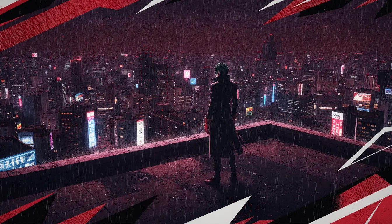
Persona 5 Royal Atlus stylish anime 3D JRPG aesthetic. Shigenori Soejima character design, comic-panel UI, red-black-white acid-jazz palette, Phantom Thieves Tokyo.
The moves a human crew would use to get here. Cue applies them for you, and knowing their names is how you ask for a change.
black-white protest-poster palette applied with near-absolute consistency across all UI and game elements
menu elements slam, slide, and fly with entertainment value
Out Attack illustrated silhouette splash screens - victory expressed as a single graphic design image
civilian outfits reflect personality; Phantom Thief costumes theatrically exaggerate it
shaded Tokyo 3D environments: recognizable neighborhoods filtered through graphic novel visual logic
each villain's inner world has a distinct architectural and color motif
as-decoration: large display type used as graphic element in backgrounds, transitions, and cutscenes
Atlus' Persona 5 (2016 JP, 2017 worldwide) and its expanded version Persona 5 Royal (2019 JP, 2020 worldwide) constitute the most UI-focused art direction achievement in JRPG history. Character designer Shigenori Soejima and art director Masayoshi Suto created a visual language so aggressively distinctive that the game's menu screens and battle transitions became as widely discussed as the gameplay and story.
Persona 5's core palette is red, black, and white with white typography. This is not merely a color scheme - it is a visual ideology. The Phantom Thieves are rebels against a corrupt society, and the red-black-white palette references 1960s protest poster design, A Clockwork Orange's Kubrickian graphic violence, and the anarchic energy of punk zines. Every UI element, from battle menus to save screens, subscribes to this palette with near-religious consistency.
Menu transitions in Persona 5 are choreographed sequences: selecting an attack causes the menu to SLAM and FLY in from one corner; victory screens erupt in red-and-white ticker-tape typography; the All-Out Attack finisher replaces the screen with an illustrated silhouette splash and cartoon word art. These animations are so elaborately produced that players slow down during menus to appreciate them. UI design was elevated from functional necessity to entertainment.
Shigenori Soejima (also responsible for Persona 3 and Persona 4) designed a cast of high-school-to-adult characters with distinctly fashionable sensibilities: Ryuji in skull-print streetwear, Ann in a leopard-print parka, Yusuke in a long coat with art-student formality. Each Phantom Thief costume is a theatrical exaggeration of their civilian personality - Joker's black coat and white gloves referencing 1960s French cinema and Lupin III simultaneously.
The real-world Tokyo environments are rendered in stylized 3D with flat-shaded building facades and neon-sign textures. Shibuya, Shinjuku, and Yongen-Jaya are recognizable but aesthetically filtered - more graphic novel Tokyo than documentary recreation. Metaverse palaces take this stylization further: a black-and-gold casino, a red-and-gold European-style castle, a space station in deep red.
Atlus, 2016 (PS3/PS4 JP); 2017 worldwide
Atlus, 2019 (PS4 JP); 2020 worldwide; Switch/Xbox/PC 2022 - expanded definitive version
Atlus / Omega Force, 2020/2021 - action RPG spin-off maintaining the visual language
Atlus, 2023 - tactical RPG with simplified but faithful aesthetic application
Atlus, 2024 - remake demonstrating Soejima's decade-spanning character design consistency
Atlus, 2012 (Vita) - predecessor with gold-and-yellow aesthetic identity establishing the P-series UI tradition
A Look is not a filter. It is a set of stored decisions the pipeline reads before it makes a single frame, so two videos in the same Look actually match.