Daring Fireball
John Gruber's blog (2002-present): minimal warm web design standard-setter
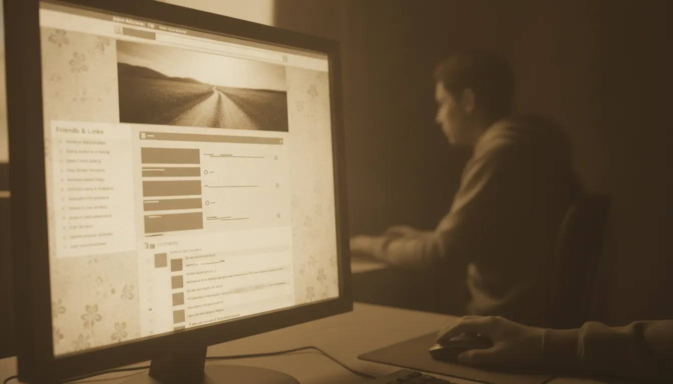
Mid-2000s personal blog warm aesthetic. Movable Type / Blogger custom template, sidebar blogroll, Adsense banner top, sepia photo header, comment thread culture.
The moves a human crew would use to get here. Cue applies them for you, and knowing their names is how you ask for a change.
sage green, dusty blue, cream, burnt orange, terracotta
linen grain, paper noise, or light watercolor wash
16px with generous line height
or three-column fixed-width layout (760-960px wide) with a main column and sidebar
small-type links to related sites as visible community signal
illustrated or warmly color-graded header areas with personal identity elements
The mid-2000s blog aesthetic represents a distinct visual era in web design - roughly 2003 to 2008 - shaped by the constraints and conventions of Movable Type, WordPress, and Blogger templates. Its defining qualities are warmth, intimacy, and a handcrafted quality that positioned personal publishing as an alternative to corporate media.
Blogging became mainstream with platforms like Blogger (acquired by Google in 2003), Movable Type (widely adopted by independent bloggers from 2002-2004), and WordPress (launched 2003). By 2005, Technorati was tracking over 15 million blogs. The design ecosystem developed through freely distributed themes - the WordPress theme economy was substantial by 2005-2006, with designers like Alex King (Connections theme), the Happy Cog studio, and the early Tumblr aesthetic all contributing to the era's visual vocabulary.
The dominant palette was warm: muted sage greens, dusty blues, warm creams, burnt oranges, and terracotta tones. This was partly influenced by the dominant design software (Adobe Photoshop's default gradients and stock photography of the era) and partly by a self-conscious rejection of the clean corporate blue of Microsoft-era web design. Textures were common - linen, paper grain, subtle noise applied to backgrounds. Fonts were constrained to web-safe choices (Georgia, Verdana, Trebuchet MS) or early web font experiments. Georgia became the definitive blog typeface, combining readability with bookish warmth.
The two- or three-column layout was nearly universal: a main content column with a narrower sidebar listing blogroll (links to other blogs), archives by month, recent comments, and category lists. Header areas featured hand-drawn or painted illustrations, often of the blogger's face in a cartoon style, or photographic treatments with warm color grading. The sidebar's blogroll was both functional (navigation) and social (a public declaration of community affiliation).
The mid-2000s blog occupied a specific cultural position: personal and professional simultaneously, amateur in production but serious in intent. Design bloggers like Jason Santa Maria, Jon Tan, and Andy Rutledge theorized and modeled what good web typography could look like within platform constraints. Food blogs, personal journals, design critique, and political commentary all shared the same visual grammar, creating an aesthetic that felt simultaneously intimate and earnest.
The era effectively ended between 2008 and 2010 as Twitter (2006) and Facebook (opened 2006) absorbed the conversational and community functions of blogging, Tumblr (2007) attracted image-forward content, and responsive design requirements pushed layouts away from the fixed-width column model.
John Gruber's blog (2002-present): minimal warm web design standard-setter
A Look is not a filter. It is a set of stored decisions the pipeline reads before it makes a single frame, so two videos in the same Look actually match.