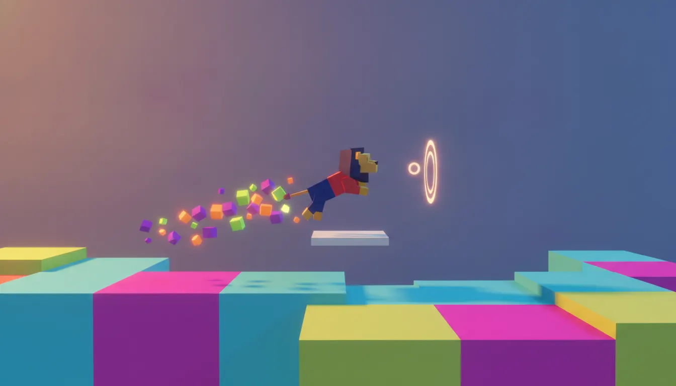
Helix Jump
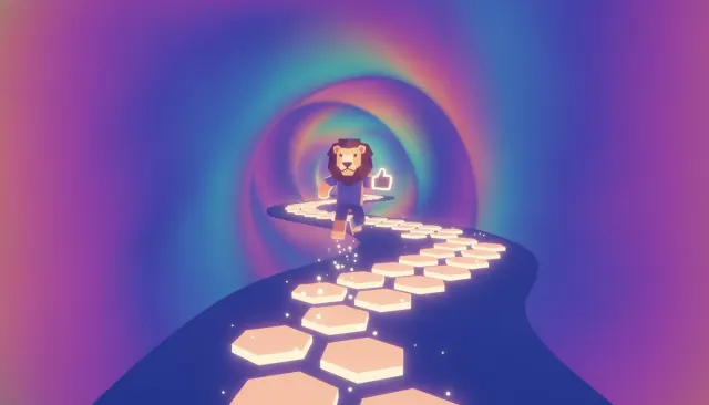
Voodoo, 2018 - the archetype that popularized the pastel obstacle-dodger format
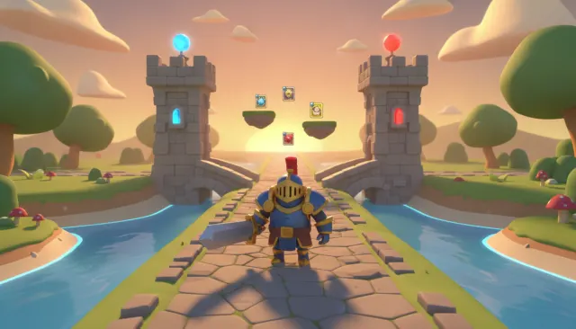
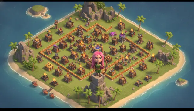
Hyper-casual mobile-game flat aesthetic. Voodoo Lion Studios single-tap mechanic, primary-color flat 3D, satisfying juice feedback, one-thumb playability.
The moves a human crew would use to get here. Cue applies them for you, and knowing their names is how you ask for a change.
poly rounded 3D geometry with flat pastel color fills and no surface normal complexity
color or minimal-gradient backgrounds that isolate gameplay objects
light color logic: red/danger, green/safe, blue/player - functional color-coding at a glance
serif UI typography optimized for one-thumb vertical phone use
edge object design with a physical toy or LEGO block aesthetic
optimized icon compositions: one clear object, one action, one color story
Hyper-casual games dominate App Store and Google Play download charts. Titles like Helix Jump (Voodoo, 2018), Hole.io (Voodoo, 2018), Crowd City (Voodoo, 2019), Stacker (various publishers), and hundreds of competitors from studios like Kwalee, Rollic, and Lion Studios established a visual grammar so consistent it functions as its own design system.
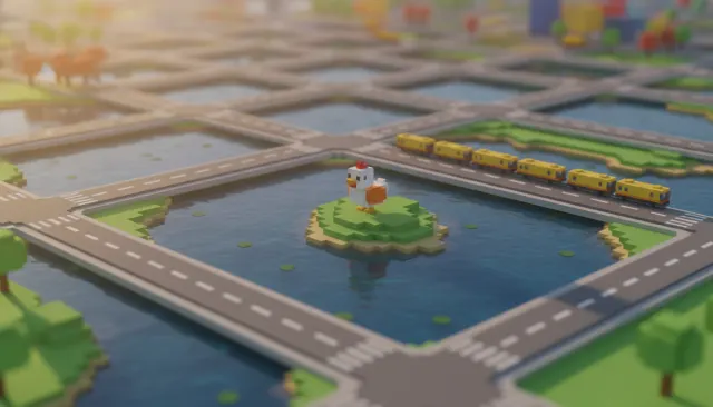
Hyper-casual flat mobile games use low-poly 3D objects rendered with flat or near-flat shading - simplified geometry with no normal mapping, minimal specularity, and pastel color fills. The look is closer to physical toy design than photorealistic game rendering. Think chunky plastic blocks, rounded cube characters, and beveled-edge environments with the tactile appeal of children's building toys.
Palettes are bright, saturated pastels: coral pinks, mint greens, sky blues, butter yellows. Backgrounds are typically a single solid color or a very subtle gradient - no environmental complexity that would distract from the single-mechanic gameplay loop. Color is used functionally to signal player vs. obstacle vs. safe zone, often with a traffic-light logic (red = danger, green = go, blue = player).
UI elements use rounded sans-serif fonts in heavy weights, oversized and center-aligned. Progress bars are chunky. Score numbers are enormous. The entire screen hierarchy optimizes for one-thumb play and split-second legibility on a 6-inch phone screen held vertically.
Objects cast soft, blurred drop shadows on single-color floors - a subtle cue that grounds 3D objects without needing a detailed environment. Ambient occlusion bakes into the base color rather than appearing as a separate pass, maintaining the flat visual impression while preserving depth legibility.
The look is engineered for the App Store grid: a 512x512 icon must communicate the game's core loop instantly. The chunky, bold, colorful aesthetic reads at any size and in any light condition, from a bright outdoor screen to a dark bedroom.
Voodoo, 2018 - the archetype that popularized the pastel obstacle-dodger format
Voodoo, 2018 - minimalist city-eating mechanic with flat toy-world aesthetic
Voodoo, 2019 - pastel crowd mechanics pushing the look's social dynamics
Voodoo, 2019 - slide-racing with bright gradient waterpark color palettes
Supersonic Studios, 2020 - crowd battle with chunky soldier designs
Supersonic Studios, 2021 - competitive bridge building with bold block colors
casual physics game extending the genre's block-toy vocabulary
A Look is not a filter. It is a set of stored decisions the pipeline reads before it makes a single frame, so two videos in the same Look actually match.