Breakfast on the Grass (Hommikusöök rohus)
Priit Pärn / Tallinnfilm · 1987
26-minute Soviet-era allegory; his most celebrated and internationally distributed film
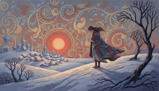
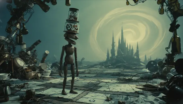
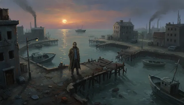
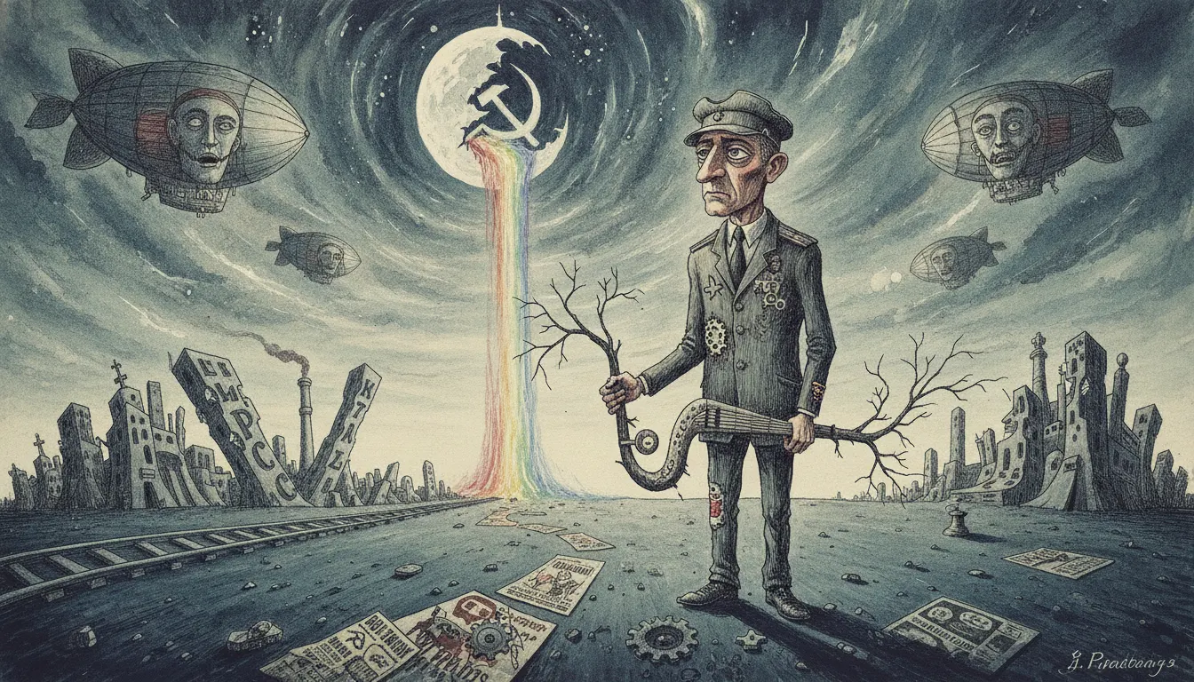
Inspired by Priit Parn Estonian surrealist animation tradition. Scratchy ink-and-watercolor line, distorted Soviet-era characters, absurdist dream-logic narratives.
The moves a human crew would use to get here. Cue applies them for you, and knowing their names is how you ask for a change.
Deliberately imprecise, trembling contours that signal anxiety and reject commercial animation smoothness.
Elongated limbs, oversized hands, mismatched eyes, and clothing from multiple eras on the same figure.
Backgrounds alternate between solid flat colour fields and dense editorial-illustration crosshatching.
Cuts are motivated by visual shape similarity rather than narrative causality, creating dreamlike associative logic.
Saturated colour appears selectively against grey grounds to mark moments of desire, memory, or transgression.
Text, diagrams, and direct-address moments break narrative immersion to foreground political or allegorical meaning.
Everyday Soviet objects - queues, food, bureaucratic forms - behave according to surreal internal rules that parody their real social function.
Priit Pärn (born 1946, Tallinn) is the defining figure of Estonian auteur animation and one of the most distinctive voices in European independent animation since the 1980s. Working at Tallinnfilm and later Nukufilm (now Eesti Joonisfilm), Pärn developed a style that fuses Brechtian political allegory, black humour, and a deliberately ugly, scratchy drawing aesthetic - a visual language explicitly opposed to both Soviet-sanctioned socialist realism and Western commercial smoothness.
Breakfast on the Grass (Hommikusöök rohus, 1987) is Pärn's most celebrated film: a 26-minute allegory in which four characters each embody a facet of Soviet social dysfunction - food scarcity, bureaucratic paralysis, desire, and spiritual emptiness - and must assemble a picnic. The film passed Soviet censors partly because its surrealism made literal reading difficult. The title references Manet's Le Déjeuner sur l'herbe, but the pastoral ideal is rendered as crumbling grey tenements and absurdist non-sequitur.
Time Out (Aeg maha, 1984) and Some Exercises for an Independent Life (Harjutusi iseseisvaks eluks, 1980) established his early grammar of graphic flatness and narrative paradox. Hotel E (1992), co-directed with wife Janno Põldma, extended the surreal political allegory into the post-Soviet transition. 1895 (1995) and Frank and Wendy (2004, co-dir. Janno Põldma) demonstrate his range from silent-era homage to digital production.
Pärn draws with a deliberately scratchy, imprecise line that reads as anxious and unstable. Figures are elongated with disproportionate limbs, blank or mismatched eyes, and clothing that seems to belong to multiple eras simultaneously. Backgrounds combine flat geometric planes with dense crosshatching that evokes Eastern European editorial illustration of the 1960s-1970s. Colour is used sparingly and often symbolically - patches of saturated hue against grey grounds signal moments of desire or transgression. His editing logic is associative and dreamlike, cutting on graphic rhymes rather than narrative cause-and-effect.
Pärn studied biology at Tartu University and worked as a graphic designer before entering animation, and the scientific-analytical gaze is palpable in his work. His films circulated internationally through festival circuits (Annecy, Oberhausen) where they were received as documents of Soviet-bloc absurdism. After Estonian independence (1991), his work shifted from anti-Soviet allegory toward broader critiques of consumerism and cultural confusion under globalisation.
Priit Pärn / Tallinnfilm · 1987
26-minute Soviet-era allegory; his most celebrated and internationally distributed film
Priit Pärn / Tallinnfilm · 1980
Early short establishing his scratchy graphic style and absurdist social observation
Priit Pärn / Tallinnfilm · 1984
Meditation on leisure, desire, and surveillance under late socialism
Priit Pärn and Janno Põldma / Eesti Joonisfilm · 1992
Post-Soviet transition allegory; co-directed with wife Janno Põldma
Priit Pärn / Eesti Joonisfilm · 1995
Homage to silent-era cinema origins; formally experimental
Priit Pärn and Janno Põldma · 2004
Feature-length co-production extending surreal domestic allegory into digital production
A Look is not a filter. It is a set of stored decisions the pipeline reads before it makes a single frame, so two videos in the same Look actually match.